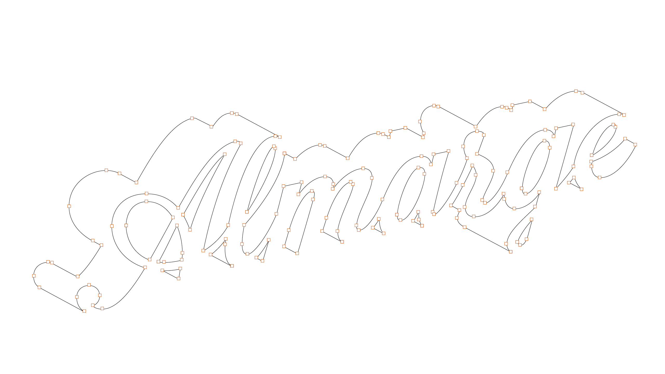
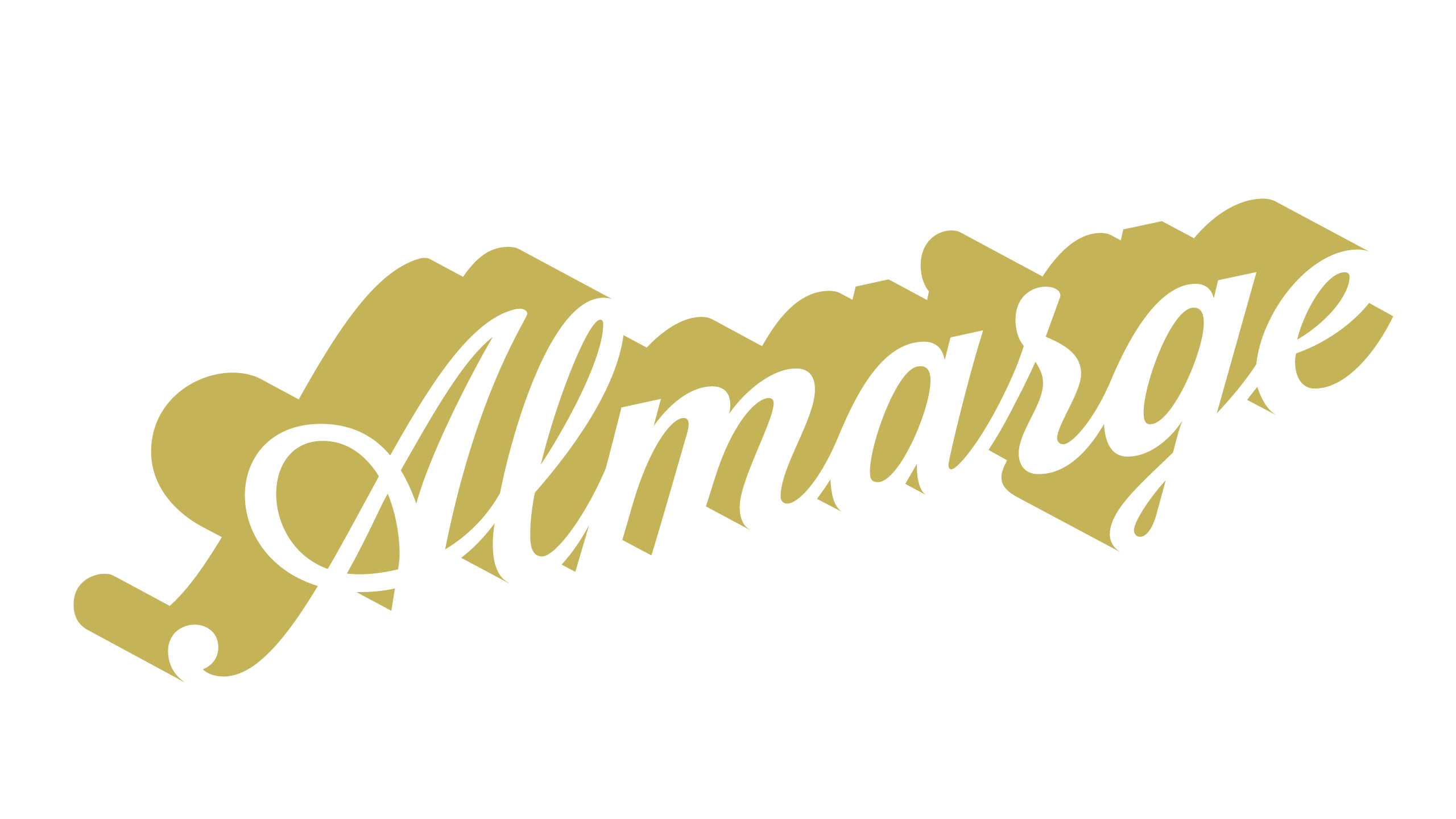
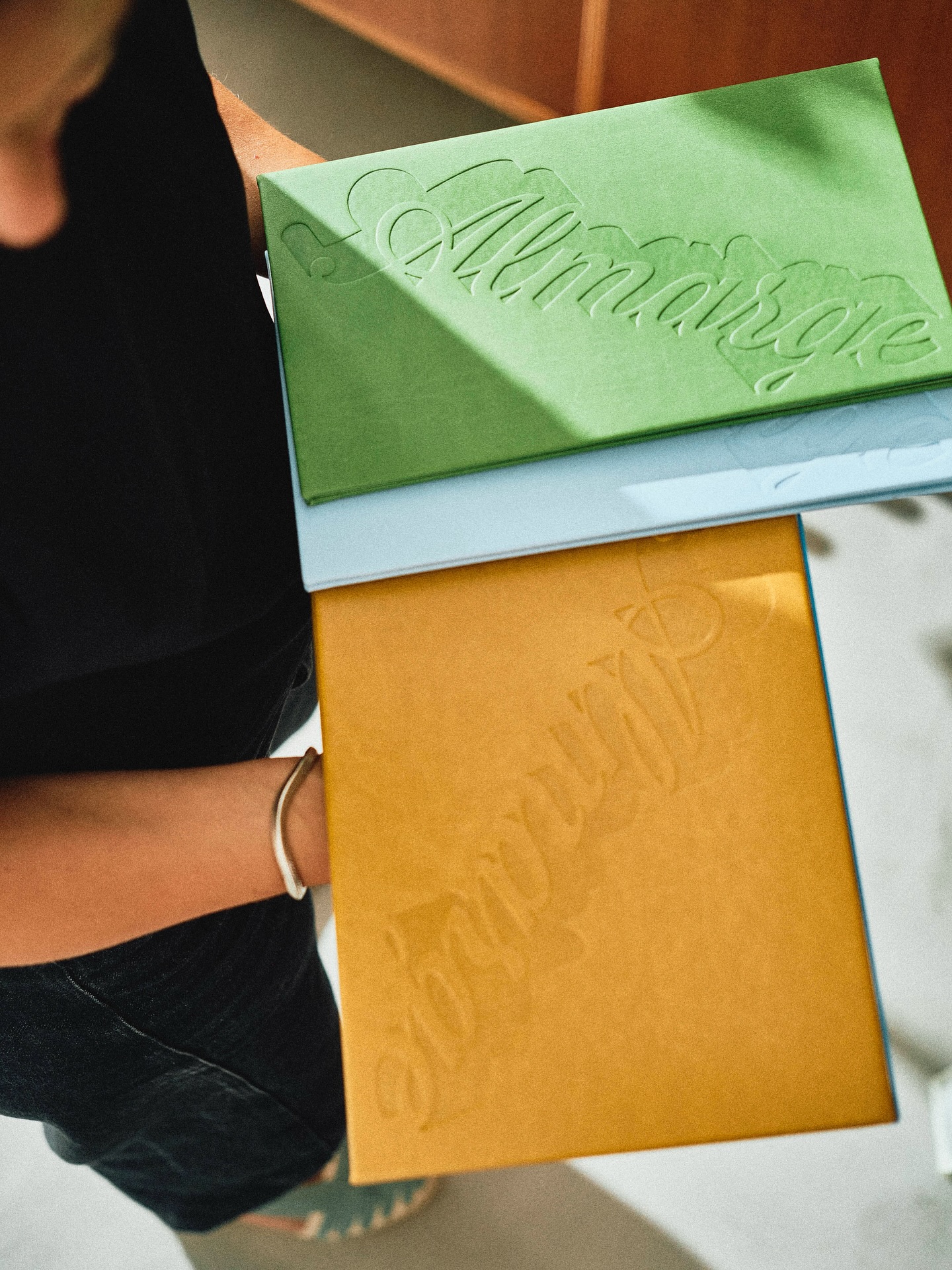
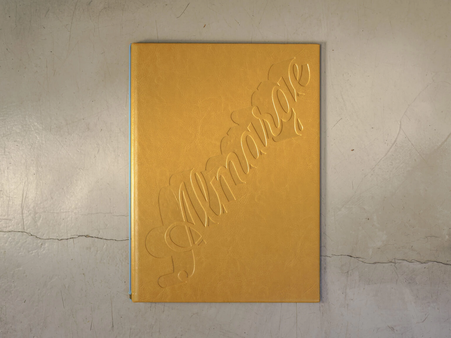
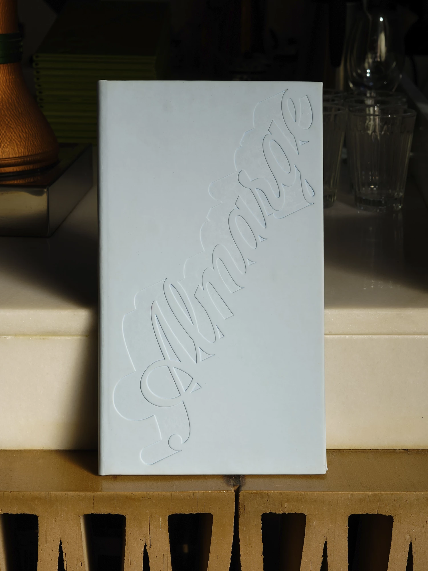
Custom wordmark design for Almarge’s visual identity.
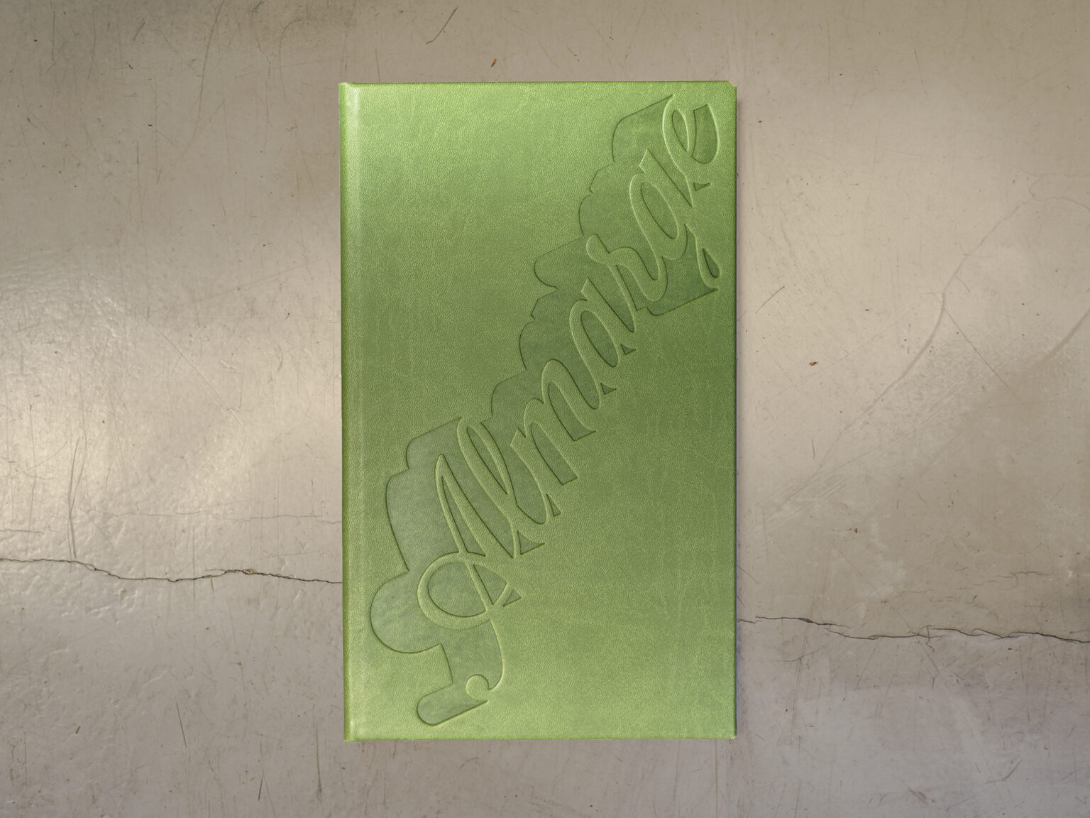
Laura collaborated with Ingrid Picanyol on the design of the custom wordmark for Almarge’s visual identity. Almarge is a highly-regarded, Michelin-recognized Mediterranean and Catalan restaurant in Badalona, Spain, widely recognized for its “friendly cuisine” (cuina amable), blending traditional Catalan roots with modern, market-fresh techniques. From Ingrid’s initial sketches and references Laura did the lettering.
“al marge” “on the edge ” Almarge is a made-up Catalan word meaning “on the edge” fused into a single term. The name Almarge itself is a clever synthesis: it pays homage to the couple’s professional origins at Alkimia and Alkostat, while also signifying their move to the “margins” (outside the main gastronomic hub of Barcelona).
In the words of Ingrid:
The visual identity for Almarge is built around a central idea: inhabiting the edge. The name — merging “al marge” (“at the margin”) into a single word — opens a conceptual field that speaks of limits, tension and deliberate positioning. A space that is neither neutral nor comfortable, yet precisely because of that, meaningful. From this premise, the project unfolds through two key exercises.
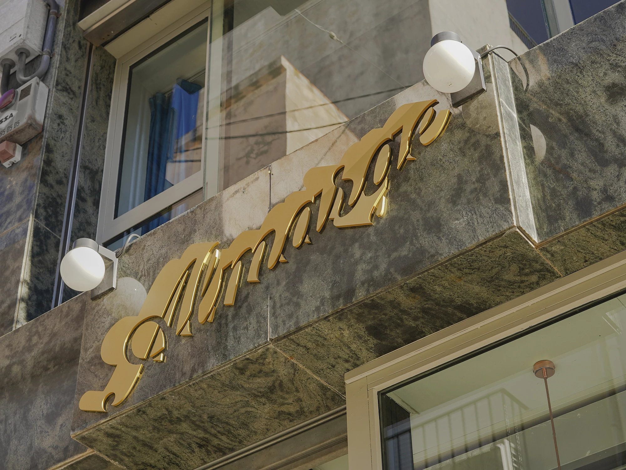
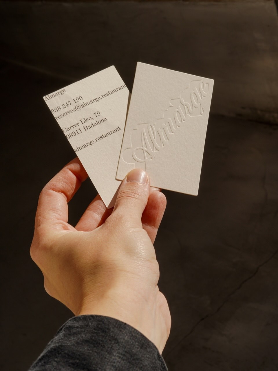
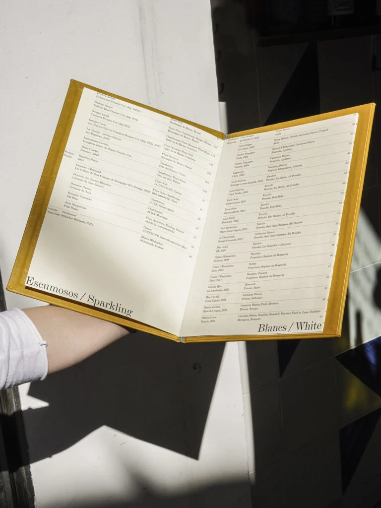
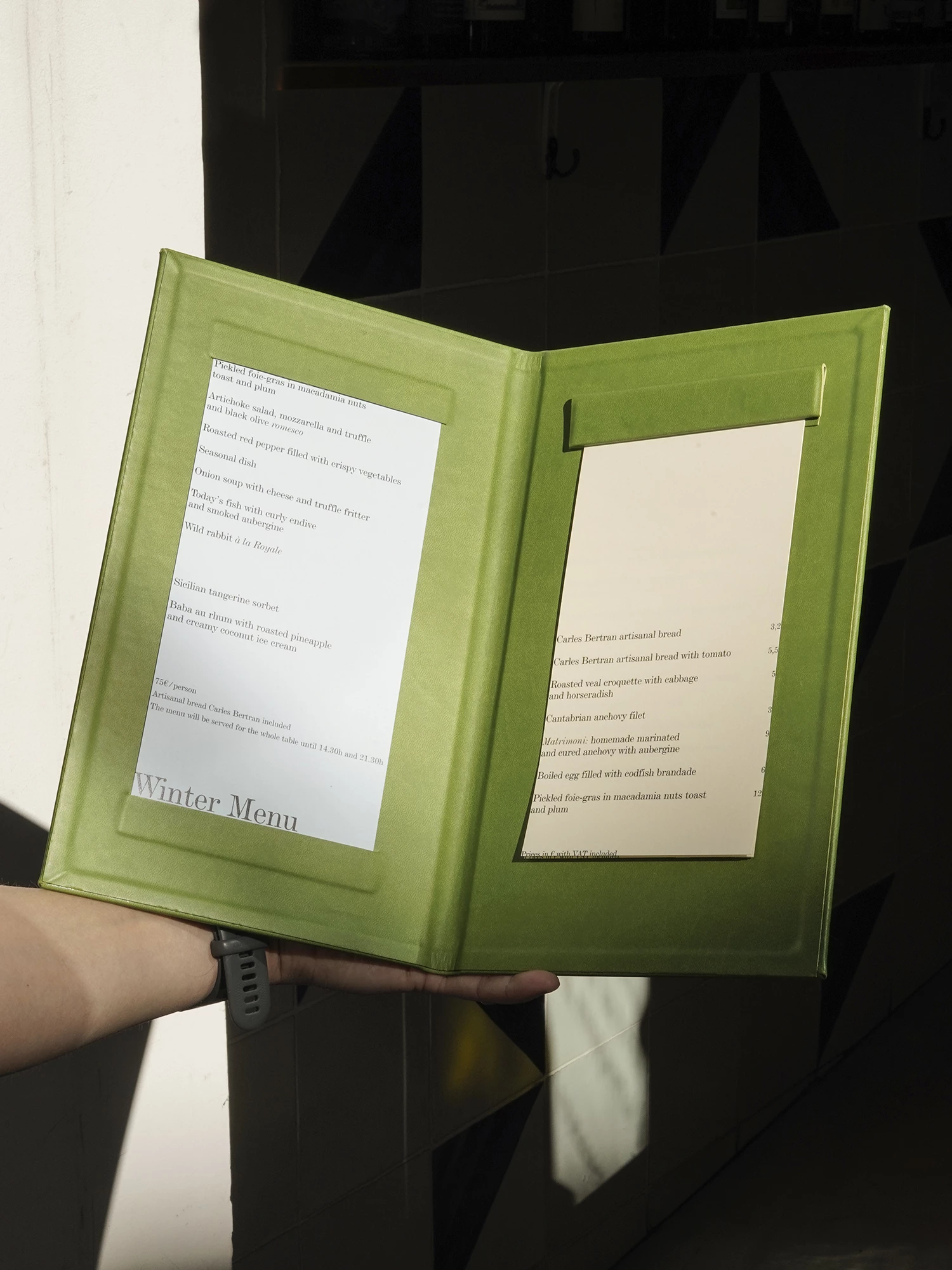
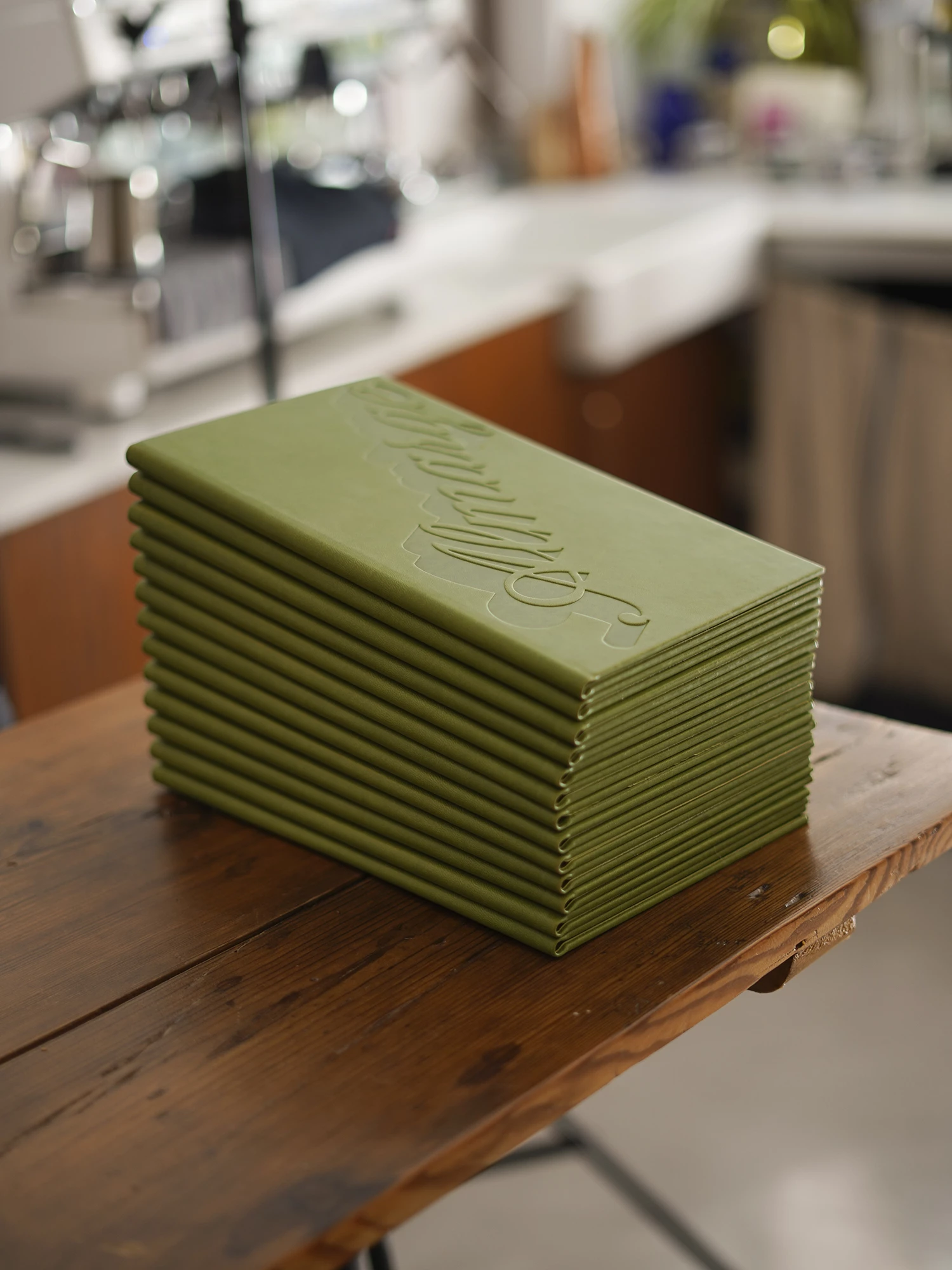
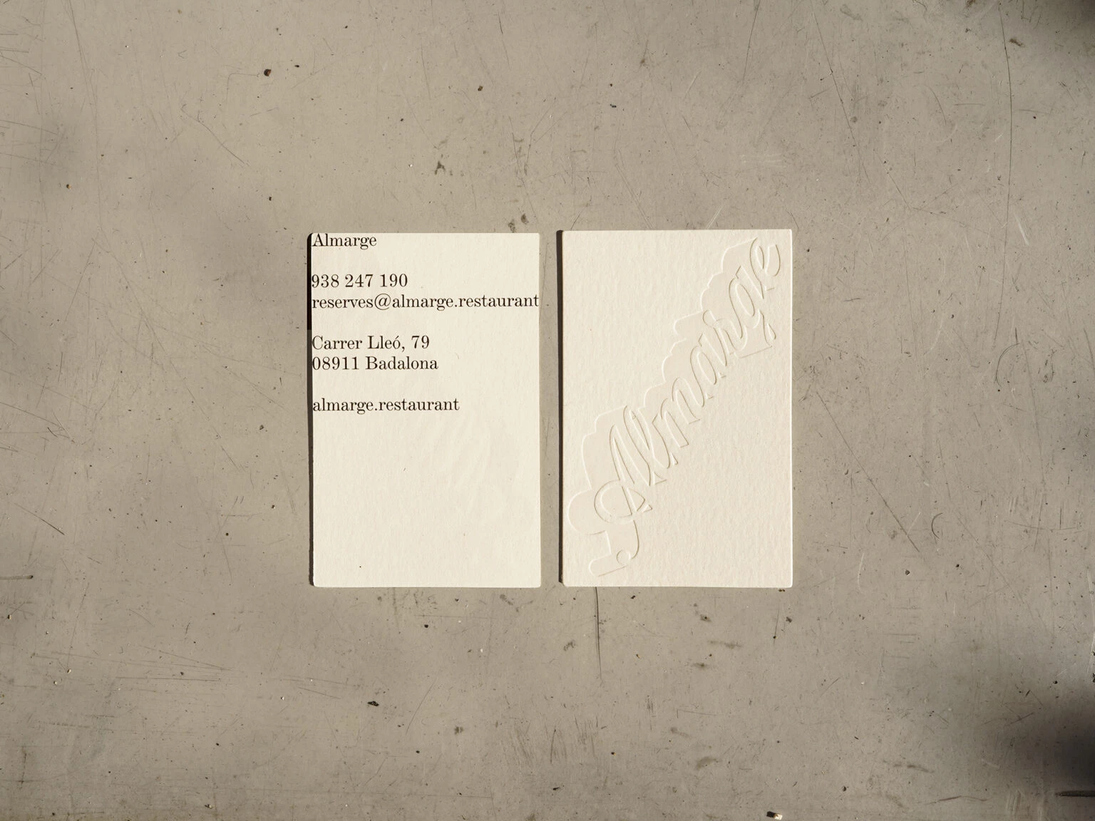
The first is the design of a custom lettering, developed specifically for the restaurant. The letterforms balance tradition and contemporaneity: they carry echoes of classical, almost artisanal script, while being resolved with a clear sense of present-day sharpness. The result is a mark with physical presence and character — capable of inhabiting architectural signage, print and material applications without falling into nostalgia or decorative excess. The second exercise focuses on the typographic composition of the texts, particularly within the menus. (…)
Typographic Identity
From the outset, the wordmark was designed to inhabit the “edge”—both semantically and physically. The lettering draws inspiration from the visual language of vintage hand-painted signs: a fluid, high-contrast cursive script, that evokes a sense of warmth, reflecting the core concept of “friendly cuisine.”
The shadow isn’t just a product of the physical sign, it is a core element of the brand’s storytelling and aesthetic experience. It functions as a deliberate typographic device—a second layer of meaning built into the mark itself. In the tradition of lettering, the drop shadow serves to anchor forms in space, granting flat characters a sense of weight and architectural presence. This reinforces the significance of the piece.
Client: Restaurant Almarge
Graphic Designer: Ingrid Picanyol Studio
Wordmark designer: Laura Meseguer
Photos: Joan Pujol Creus & Ingrid Picanyol Studio
——
Prizes: Laus Bronze 2026 in Redesign — Small business corporate identity