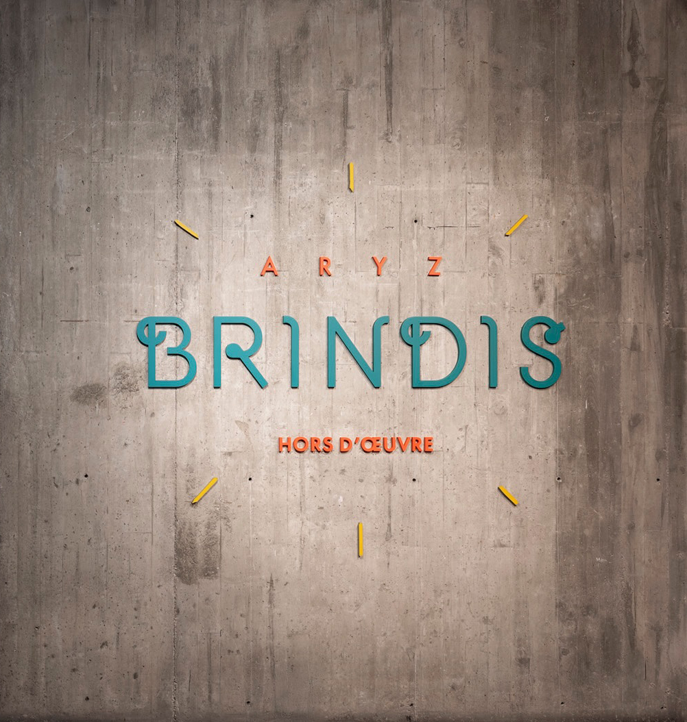
Custom lettering and title design for Brindis, an Exhibition by Aryz.
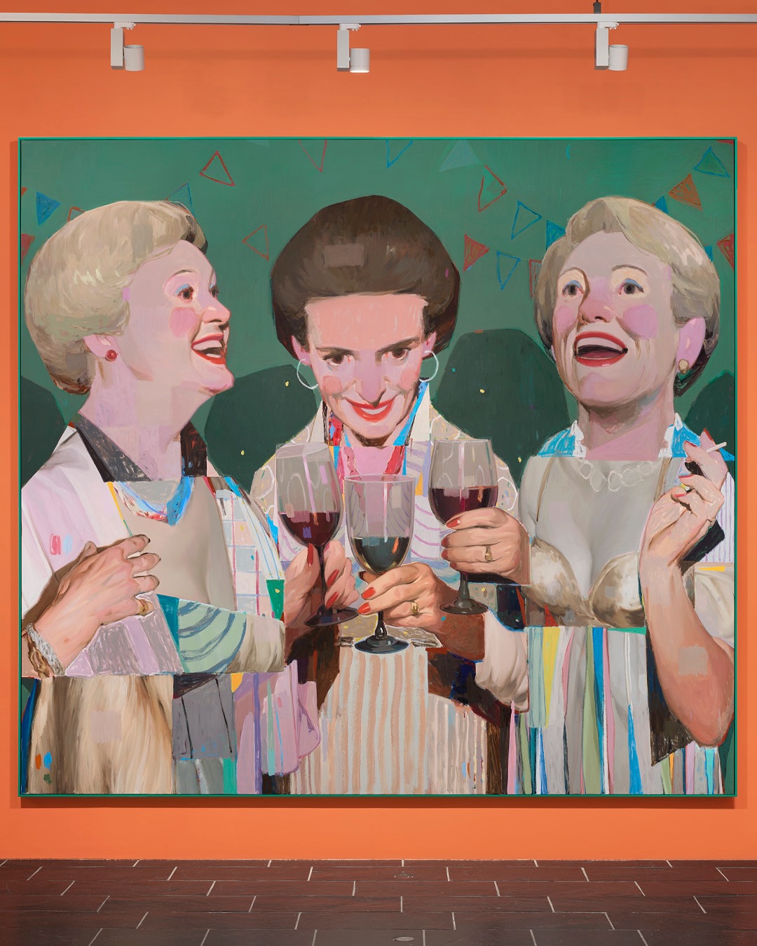
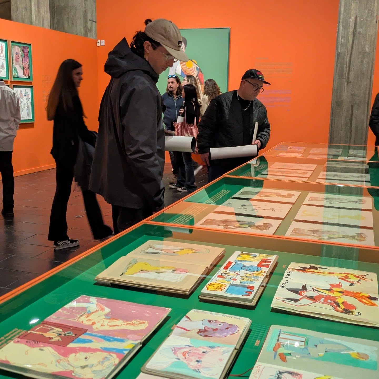
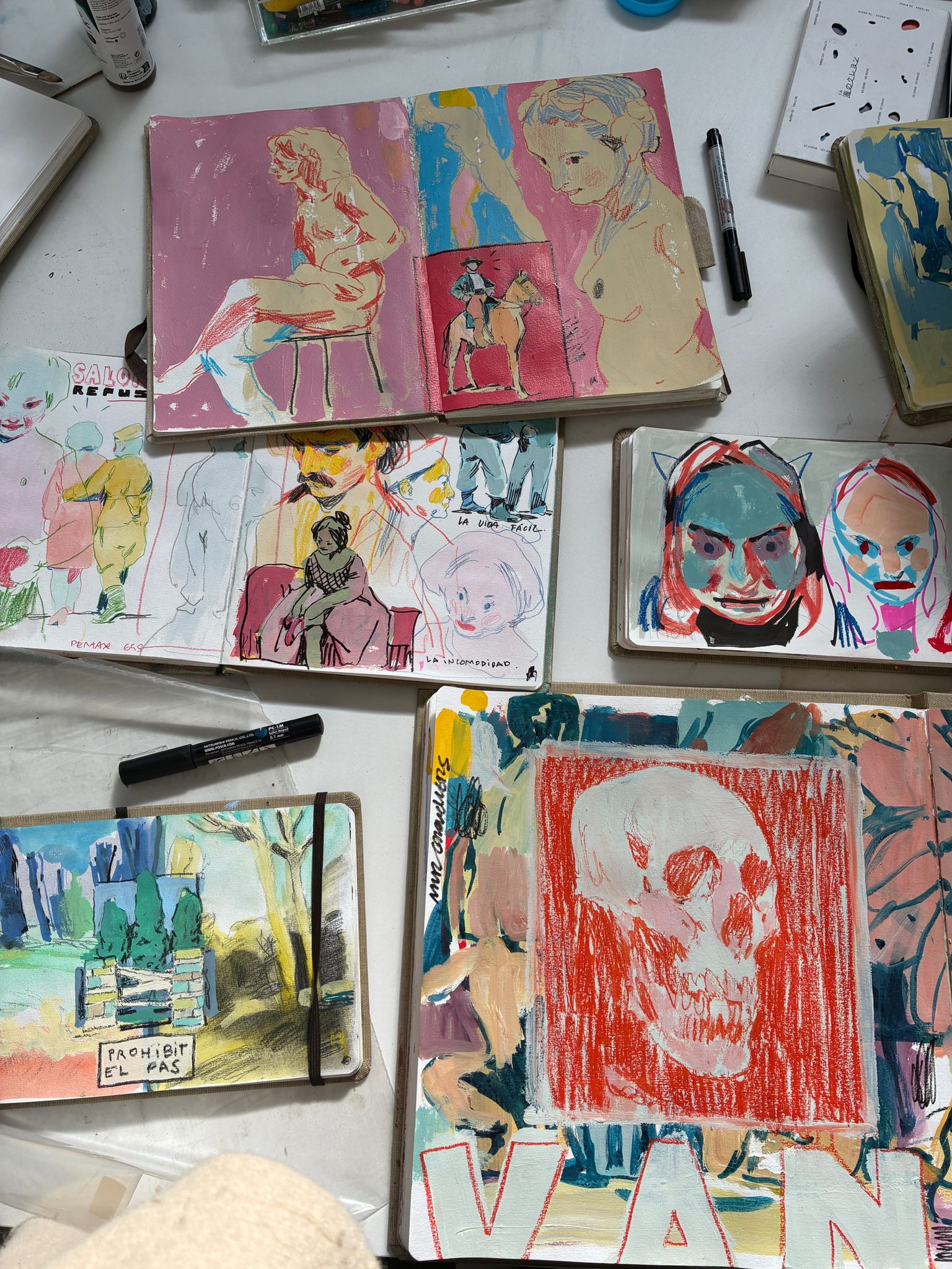
The Museu de Granollers presents Brindis, the latest solo exhibition by Aryz (Octavi Arrizabalaga, Palo Alto, 1988), a project that acts as a “hinge” between stages: an exercise in transition, exploration, and language. Brindis is conceived as a space for celebration and pause, where the artist displays fragments of his process and reveals how he approaches the search for his own visual language and the recurring themes of his studio work. As he did in his previous exhibition Preludio, the artist continues to pay homage to the craft, highlighting his interest in printing techniques—such as lithography and engraving—and, naturally, in painting itself. The title, Brindis (Toast), alludes both to the shared gesture and the suspended moment that precedes something new.
In Brindis, Aryz ironically revisits an open critique of the art system and unfolds a gesture of celebration: a toast to the creative process, to the craft, and to the millennial practice known as painting.
— Museu de Granollers
The typographical choice
The typographic design is deeply integrated with the conceptual framework of the show. Laura proposed the artist to design a rational sign, sober in form but with a more playful arrangement:
— The Title (BRINDIS): This is the focal point, featuring a customized geometric sans serif, based on Futura, with ornate swash details (notice the “B” and the “D”, and the loops at the “R” and the “S”).
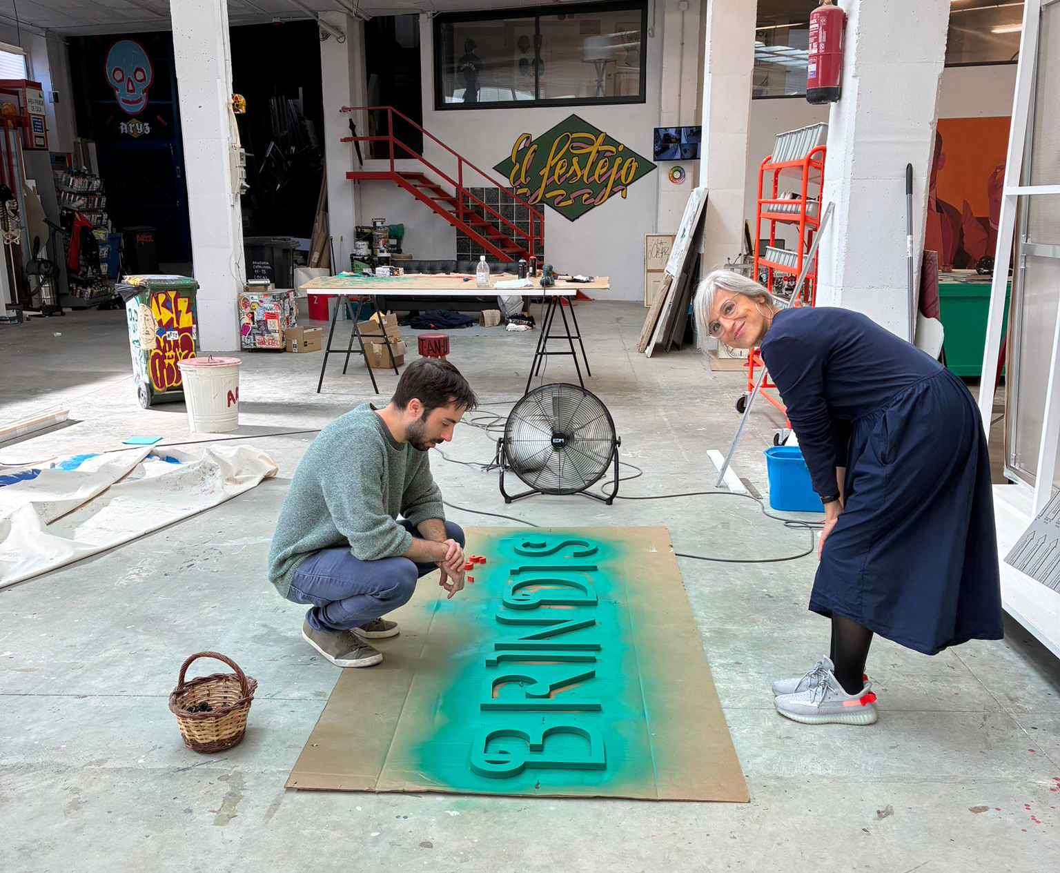
The lettering was cut in wood and painted in Aryz’s green feels both retro and artisanal, echoing the artist’s tribute to traditional “craft” and techniques like lithography and engraving; but also the more festive approach of BRINDIS. In a sense, it is an“appetizer-exhibition” an hors d’œuvre in the most literal and symbolic sense: a small preliminary tasting, a transition between reviewing the past and opening new paths.
— The Artist’s Name (ARYZ) and the Subtitle (HORS D’ŒUVRE): Set in a clean, spaced-out Futura that represents the modern, and contemporaneity of the artist’s studio work. By using Futura—a quintessentially modernist, geometric typeface—the design creates a direct conversation between the Museum of Granollers and the artist, as they use it for their own identity.
Do not miss this exhibition—it is a pure joy. It has been a privilege to collaborate with such an admired and illuminating artist. What began as a message, written in a moment of genuine admiration, led to a reply that brought us all the way here. 🙂
Client: Aryz
Exhibition: Brindis, Museu de Granollers, till 28th of June 2026.
Wordmark designer: Laura Meseguer
Photos: Museu de Granollers, Aryz & Jenny Méndez