By Laura Meseguer – Originally published in April 2013 for I Love Typography
Introduction: A Typeface Inspired by Fluid Handwriting
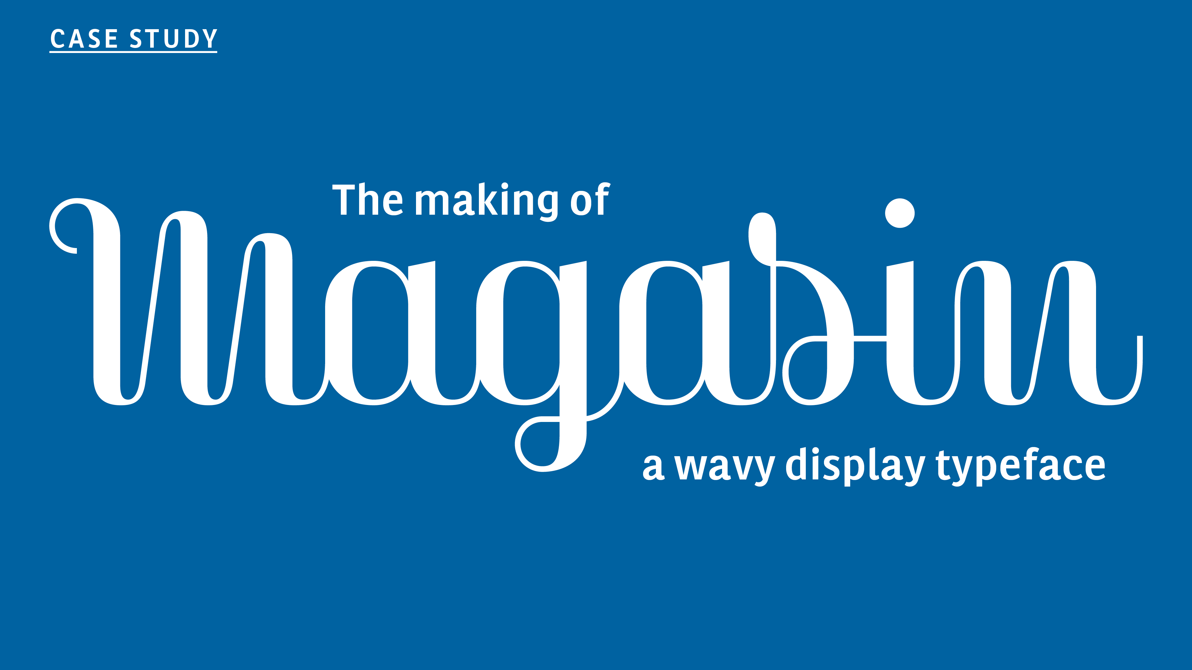
Magasin is a high-contrast, wavy display typeface influenced by fluid handwriting and calligraphy. As an amateur calligrapher of Copperplate, I have always been fascinated by the expressive movement of script-based typefaces. This led me to design Magasin, a typeface that blends script-like qualities with geometric structure while adding a retro-chic touch.
Origins and background
My first approach to this project began with the lettering I designed for BoMo, a graphic design studio, in spring 2011. It’s based on a brief: feminine, professional and sensibility. The solution came as a well-crafted series of ‘calligraphic letters’ with high contrast, the B, the M and the o, combined as two connected syllabes. During the design process I discovered the significant potential that this idea could have if it were developed as a typeface. Thus, almost one year later, I began to sketch it, and two years after I released it!. It evolved from the initial three letters of the logo but with differences: slightly less condensed proportions, different designs for the two upper case letters and a new construction of the connecting strokes.
It combines a sense of script with geometric and slightly condensed structure resulting in idiosyncratic curves, yet with a retro-chic twist. These might probably be the most attractive features, because all together they give a very strong identity to words.
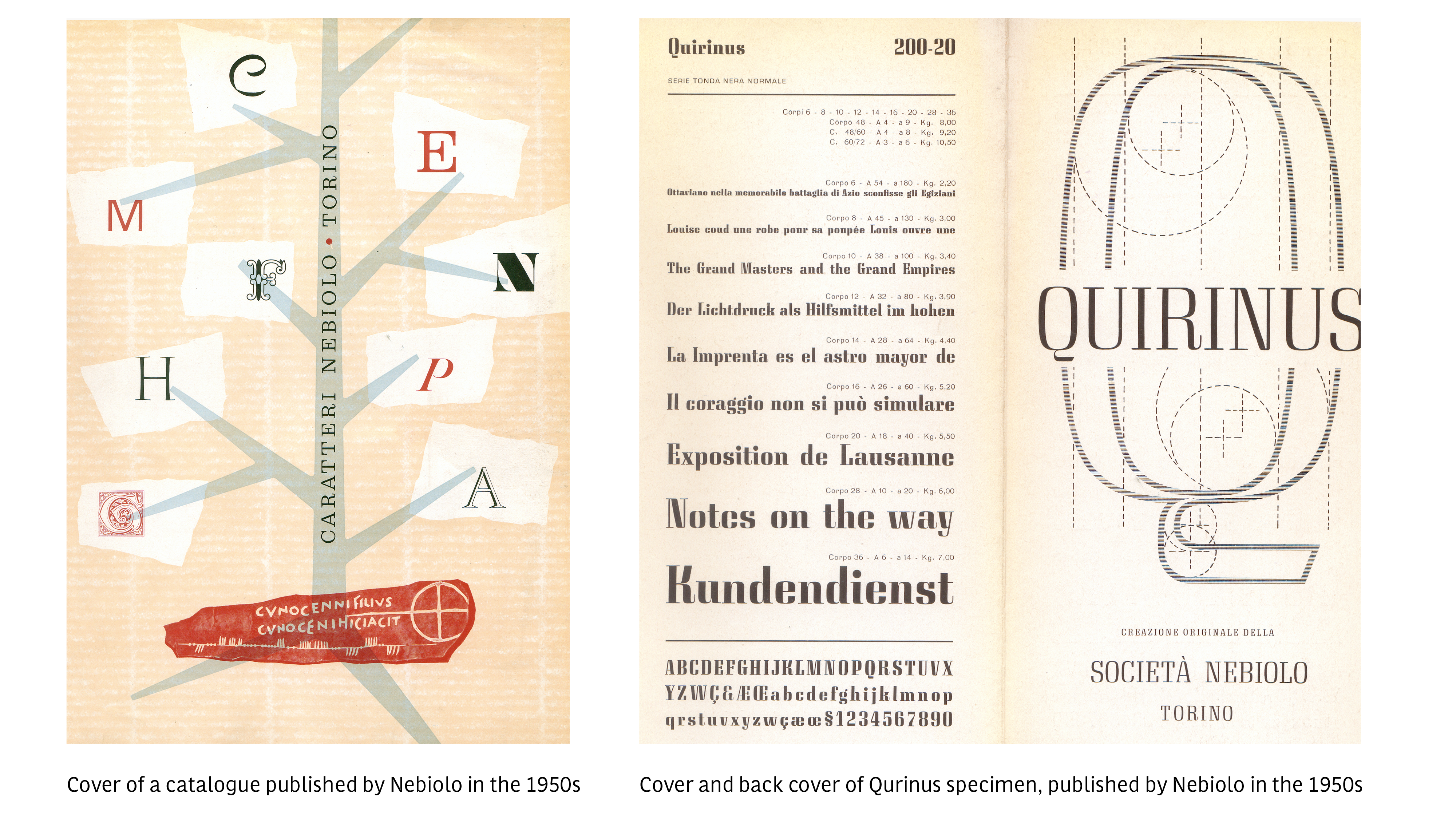
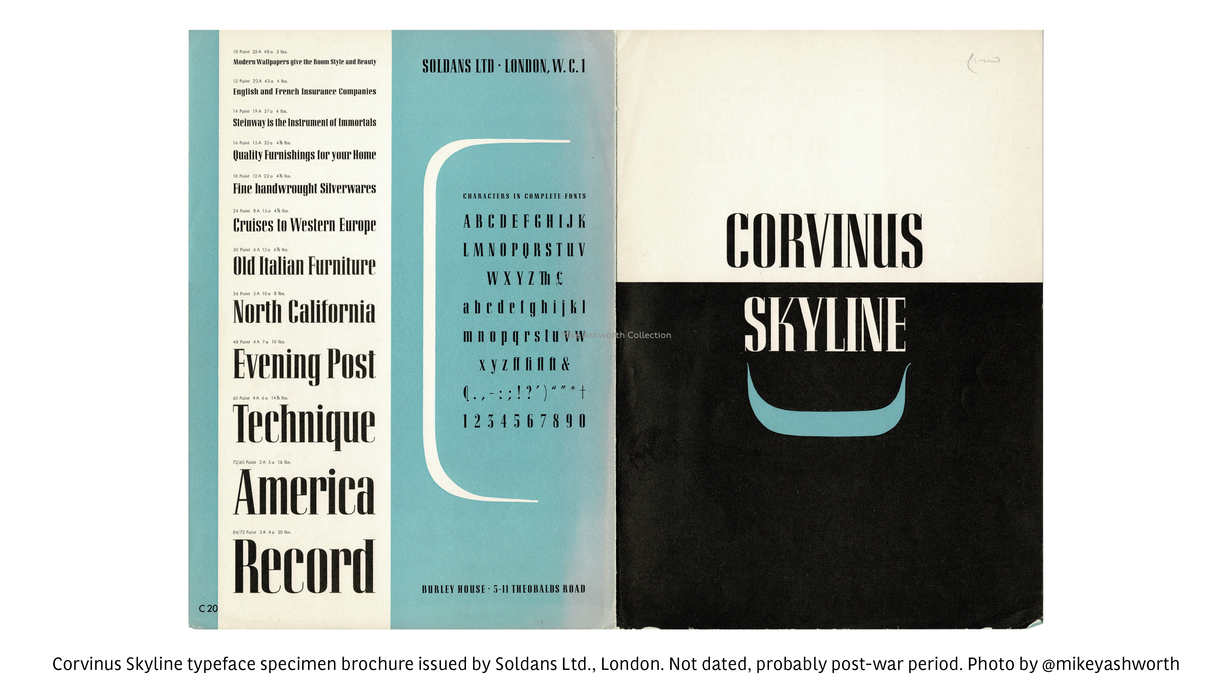
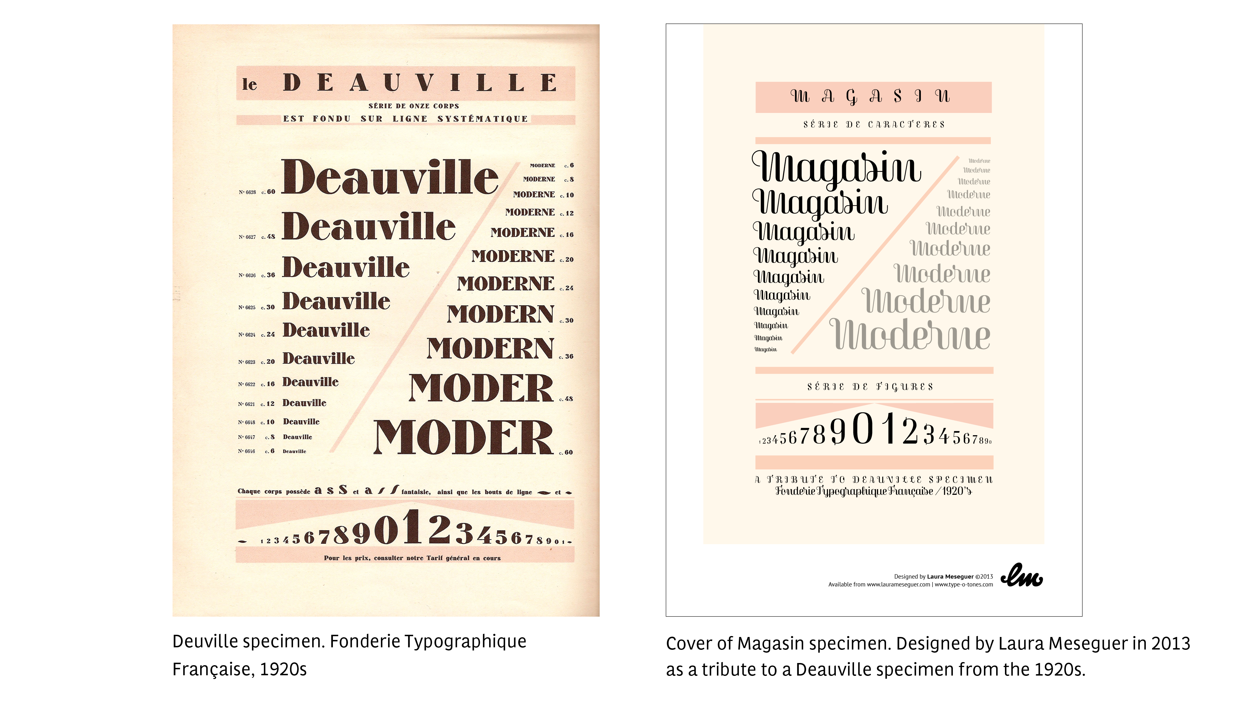
During my research I review a lot of previous & excellent typefaces sharing a similar idea, but any of them had this sense of a connected and upright script. Somehow, Magasin explores and pays tribute to the charm and playness of typefaces that were designed during the 1930s. Some inspiring references are Corvinus, released by Bauer in 1935 (designed by Imre Reiner in 1934), Quirinus (Alessandro Butti,1939) and Fluidum (1951), a kind of non-connected script version of Quirinus, also designed by Butti for the Nebiolo foundry.
The design principle
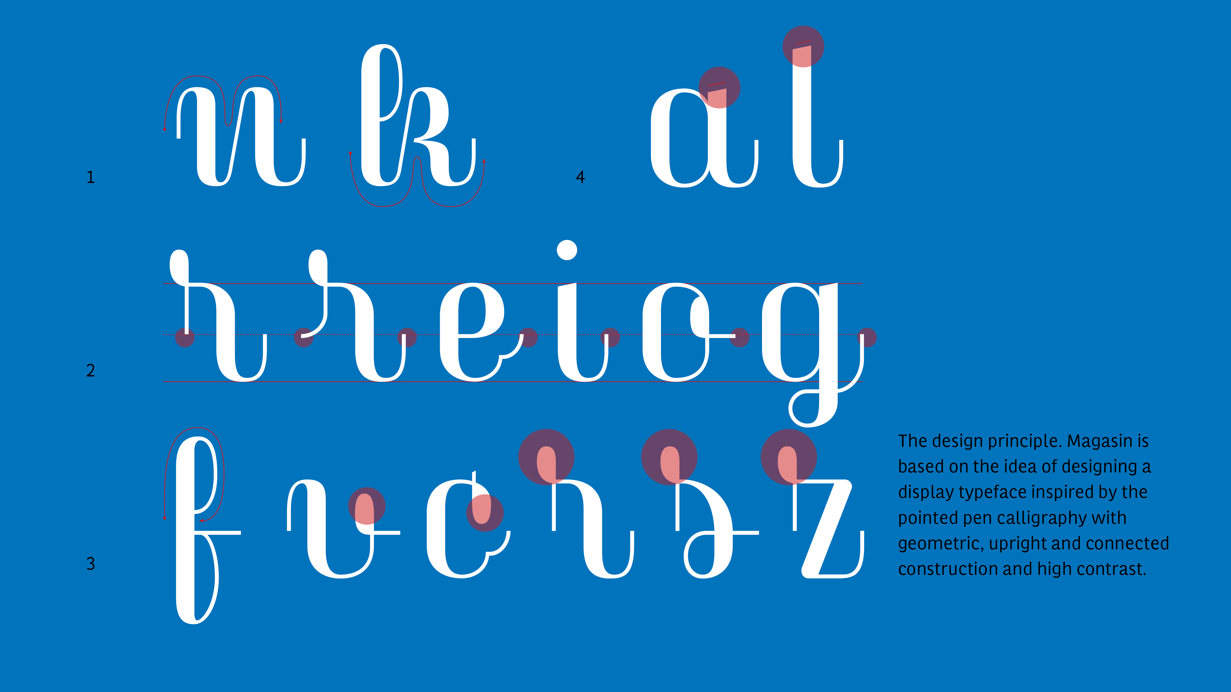
Magasin is based on the idea of designing a display typeface inspired by
the pointed pen calligraphy with geometric, upright and connected construction and high contrast. What I wanted to show is the obvious accuracy that can be seen in any calligraphic work, but with a close attention to the creative combination of linked letters when creating words, bringing a lettering flavour.
The construction principles are:
1/the wavy shapes to emphasize the ryhmth
2/the four different way of links, always merging in the half of the x-height
3/the loops and drops evocating the pointed pen calligraphy letters
4/ the angled ending stroke
The process
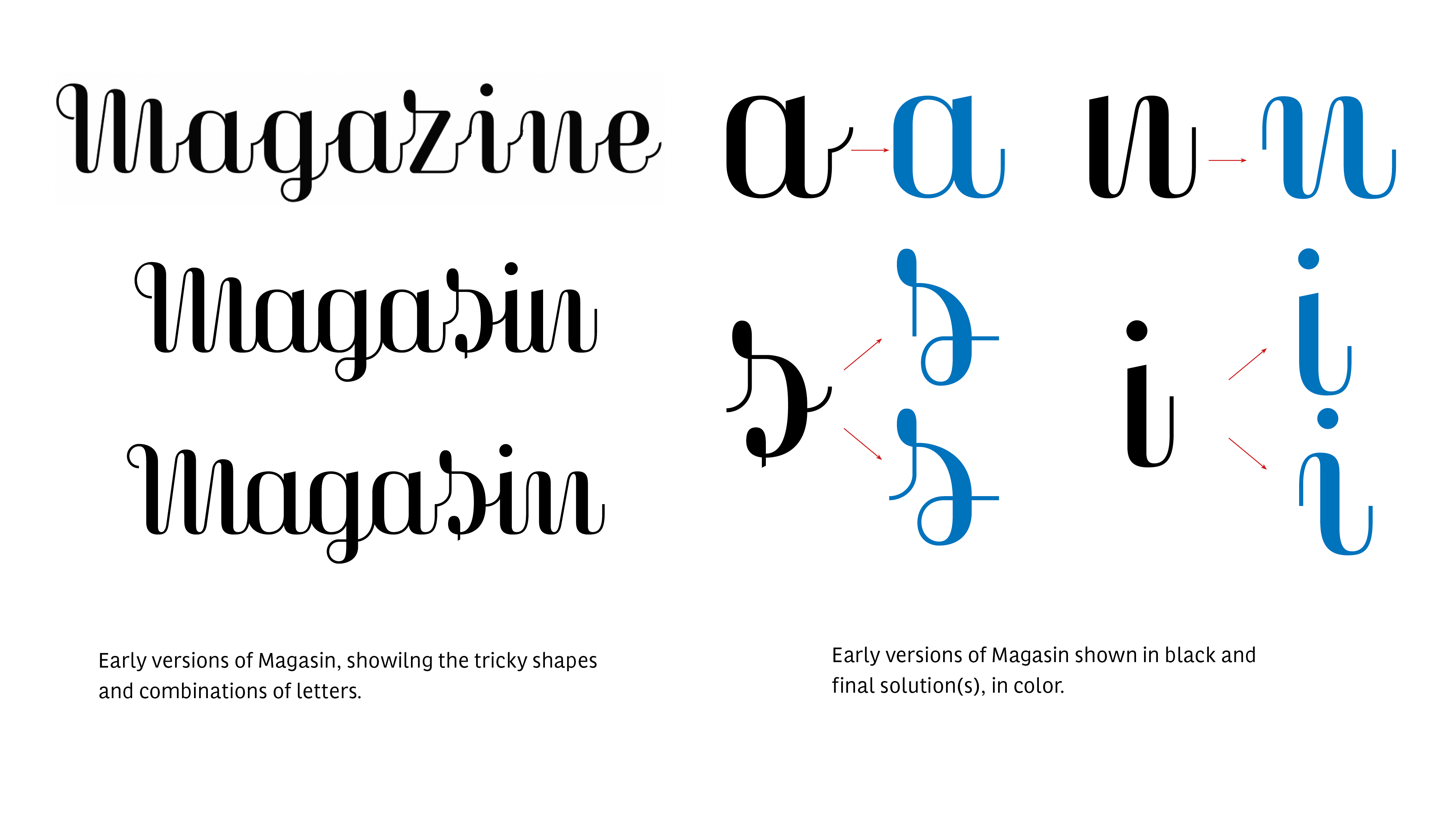
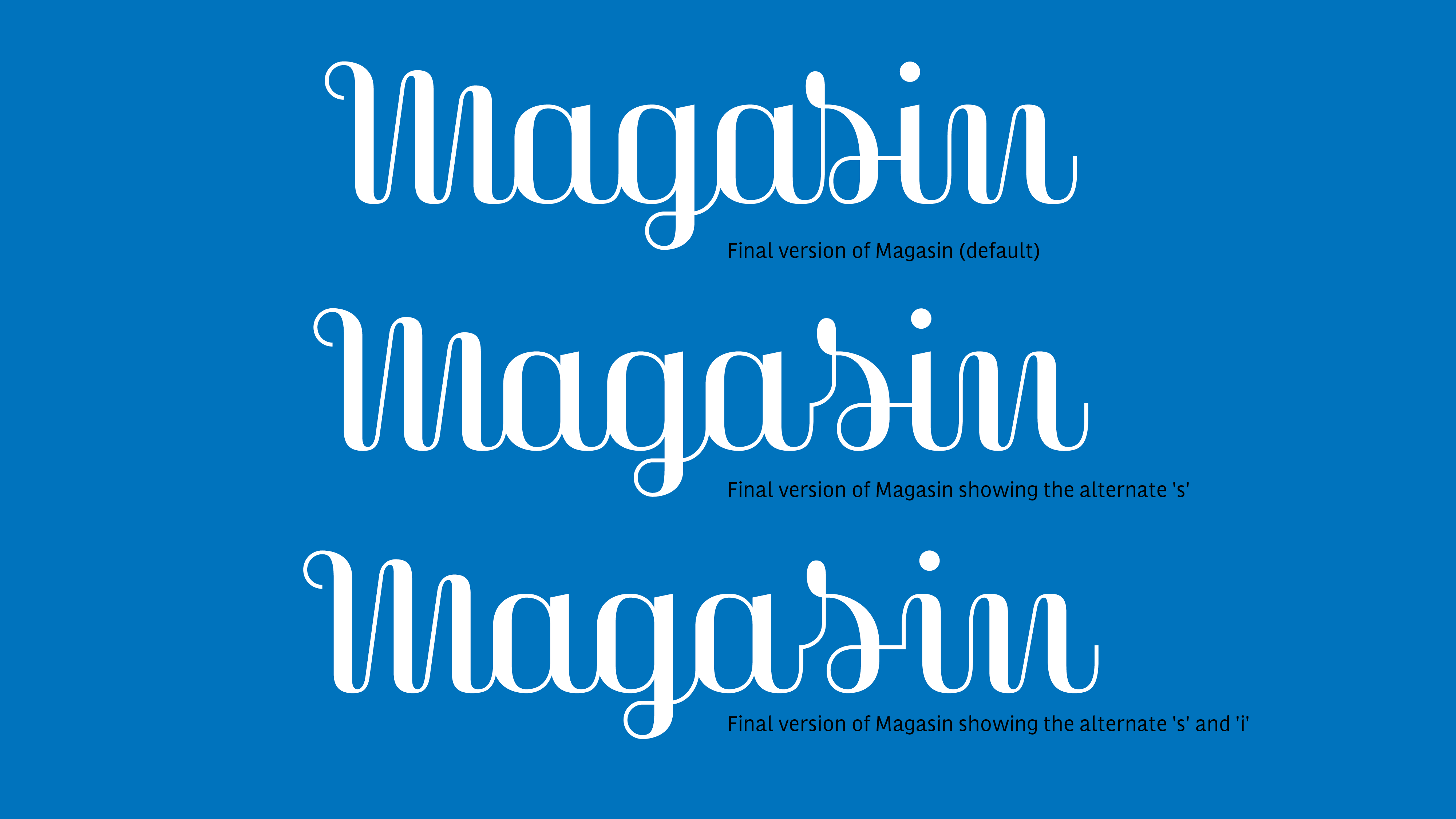
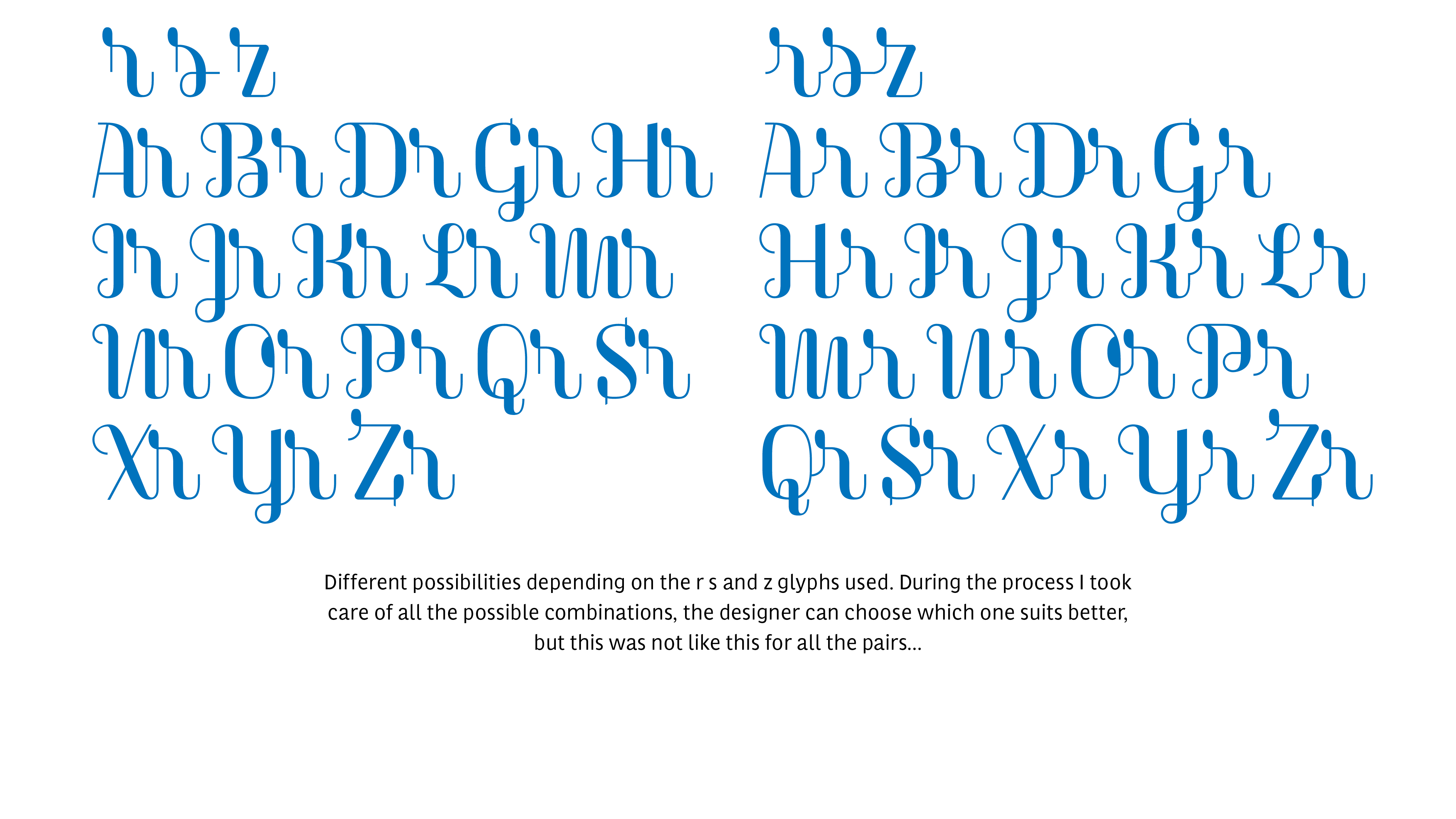
The first versions of Magasin were more experimental; I gave an extraordinary leadership to the connexion strokes, and characters as ‘m’ and ‘n’, had a different starting stroke, but soon I found it problematic.The following versions were based on the exploration and refinement of some characters and the different connexion possibilities, with the goal of balancing the spacing, a process that also led to the design of alternative glyphs.
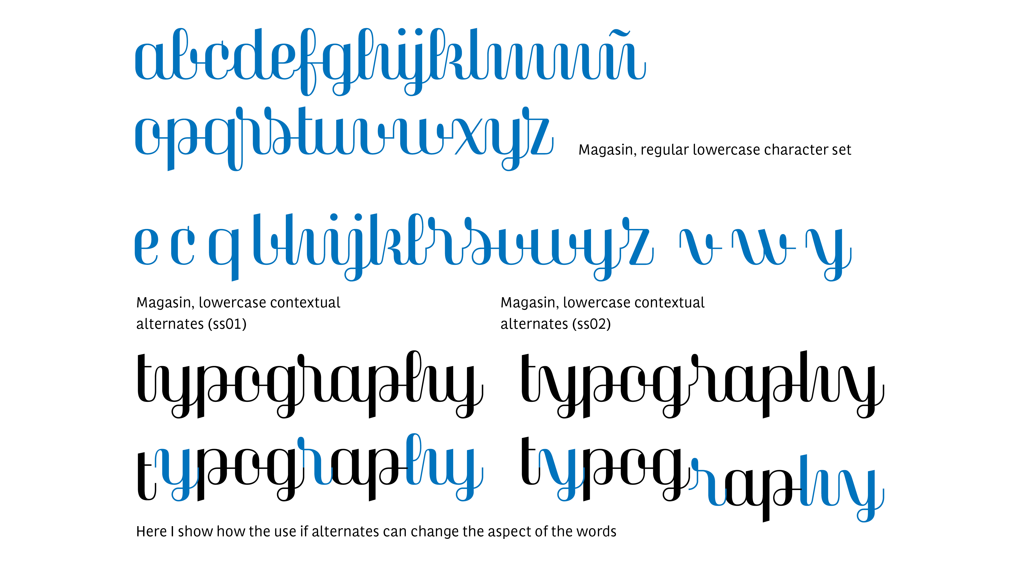
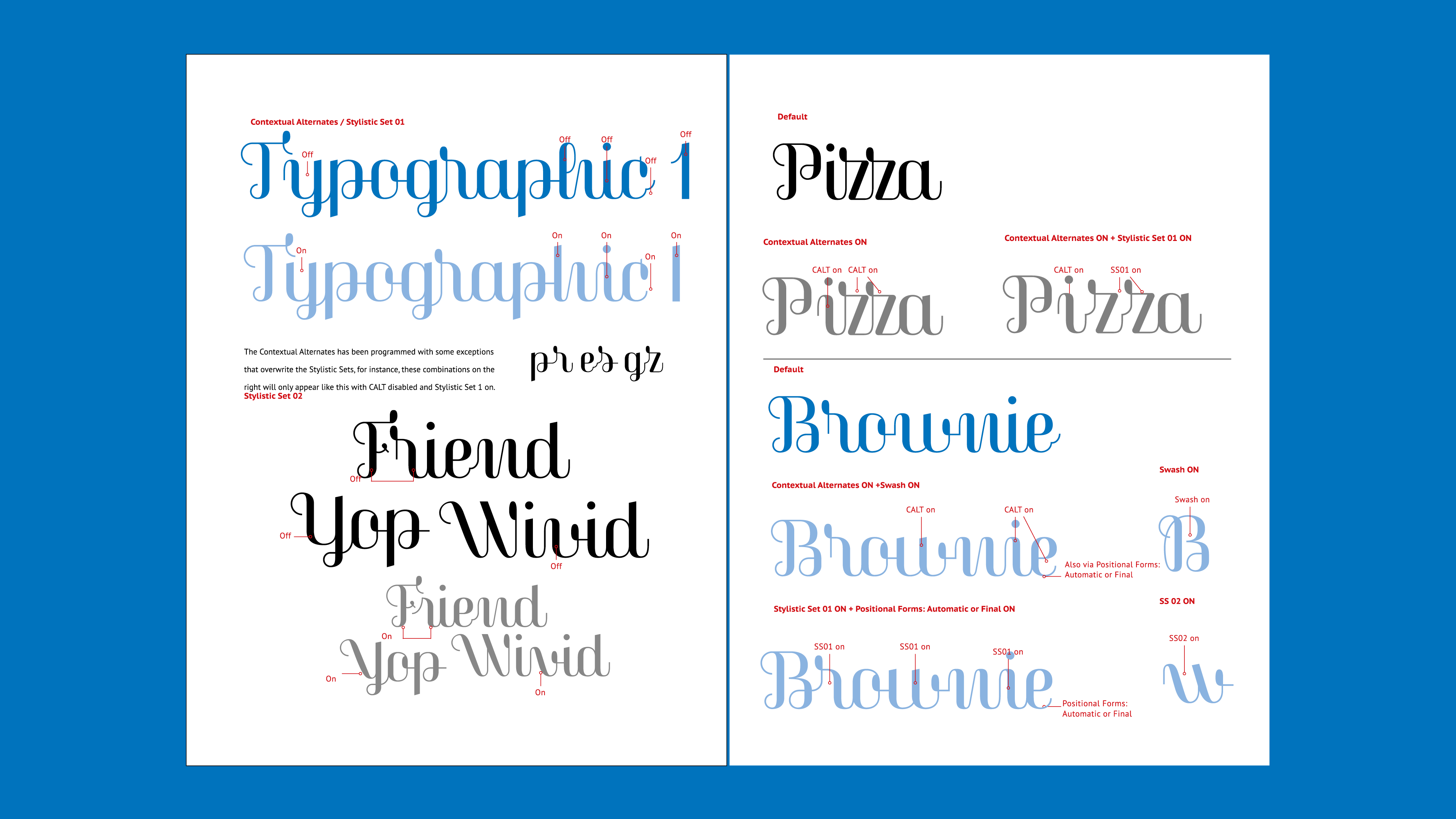
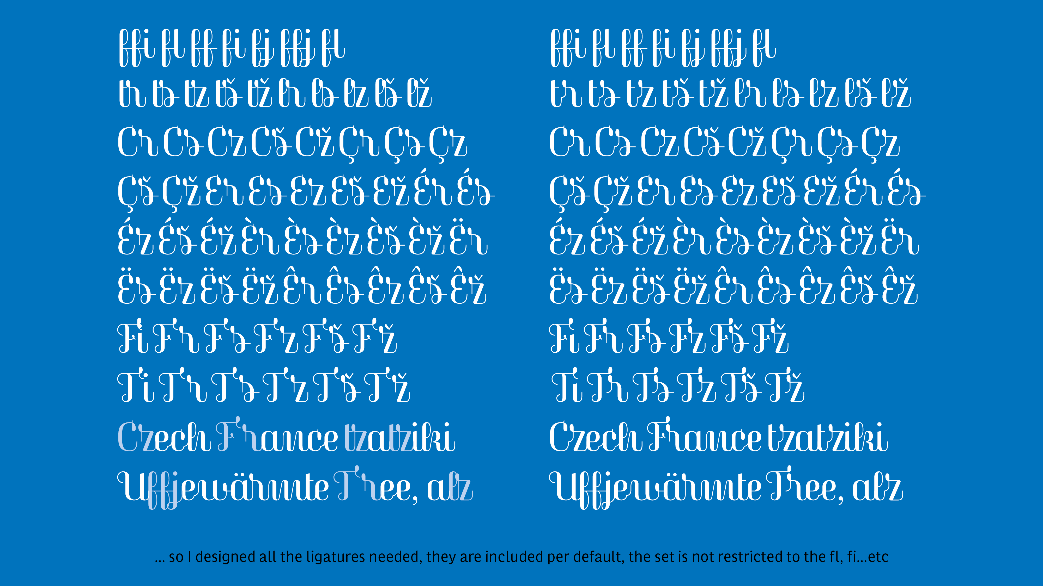
At a certain point, I was not sure if it could become something usable or just a personal amusement; some connexions were looking really weird but others just came automatically and in a very beautiful way. So I wrote a list of necessary ligatures to balance the text flow, and another of the non-convenient combinations that later became ‘exceptions’ in the programming. I also designed a reduced set of secondary alternates (ss02) and an out-strokes version of the ‘c’, ‘ç’, ‘e’ and ‘q’, to gave a better ending to sentences or words. Therefore, it implied a bunch of OT programming for a correct use and performance. In the specimen I designed, that’s thoroughly explained, and downloadable at Type-Ø-Tones.
The Capital and Swashes
The capital letters appeared much later, they are a bit experimental and very much inspired by the Copperplate Calligraphy mixed with some ‘Cancelleresca’ features.
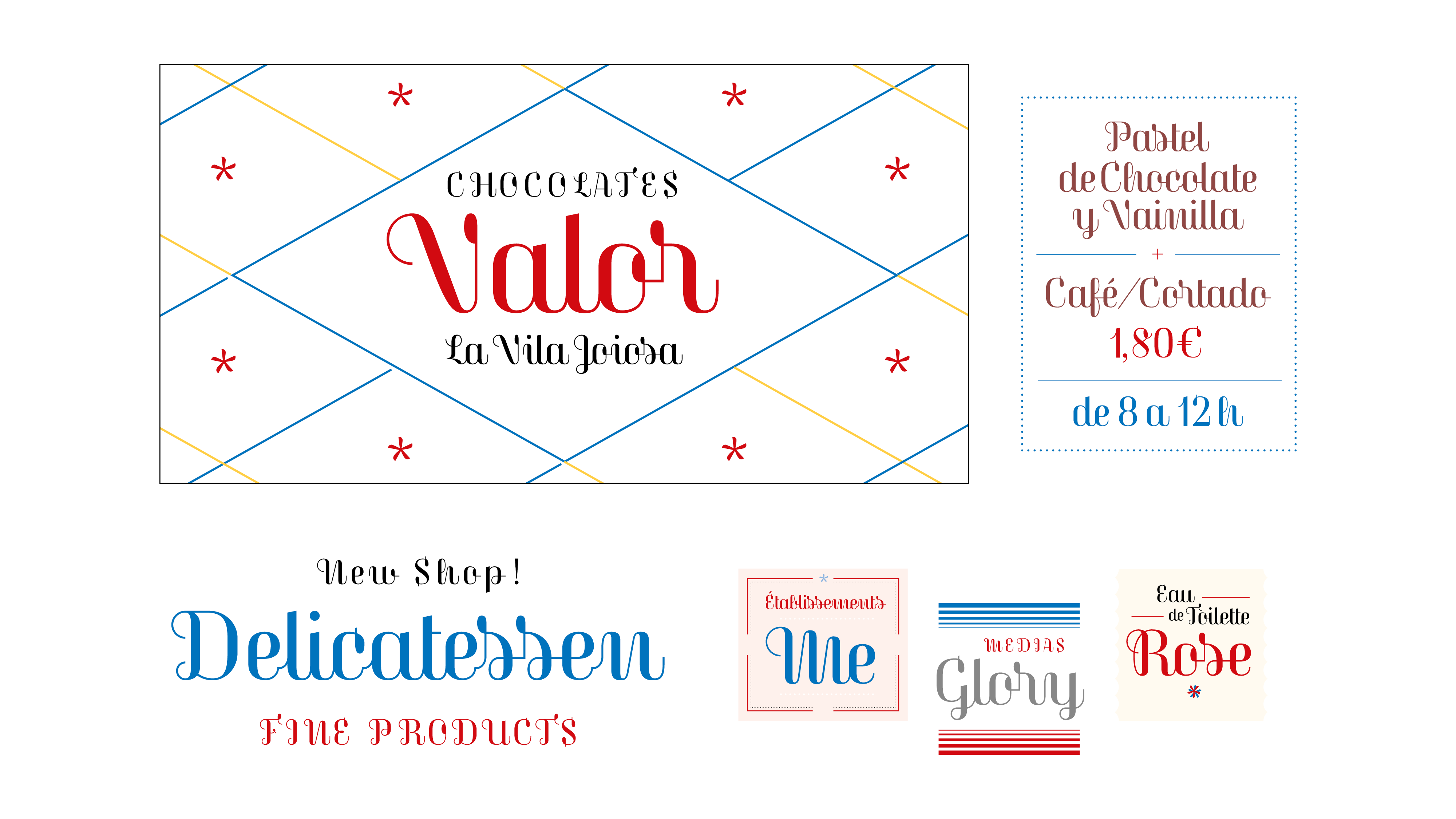
While testing it, I realized that Magasin could be very useful in a lot of applications, and for many various moods; moreover, the swash capitals were intentionally designed to ‘pimp’ words and provide many possibilities, but normal capitals can also perform better in certain situations.
Notes
See more specimen images on the flickr collections by Indra Kupferschmid, or see also the special Corvinus set from the Herb Lubalin Study Center, and the ‘caratteri nebiolo’ set by :nike
Author: Laura Meseguer
Creation: 2013
Character Sets: Basic Latin, Latin-1 Supplement
License Types: Desktop, Webfont, ePub, App, Server, for any other modality please ask.