
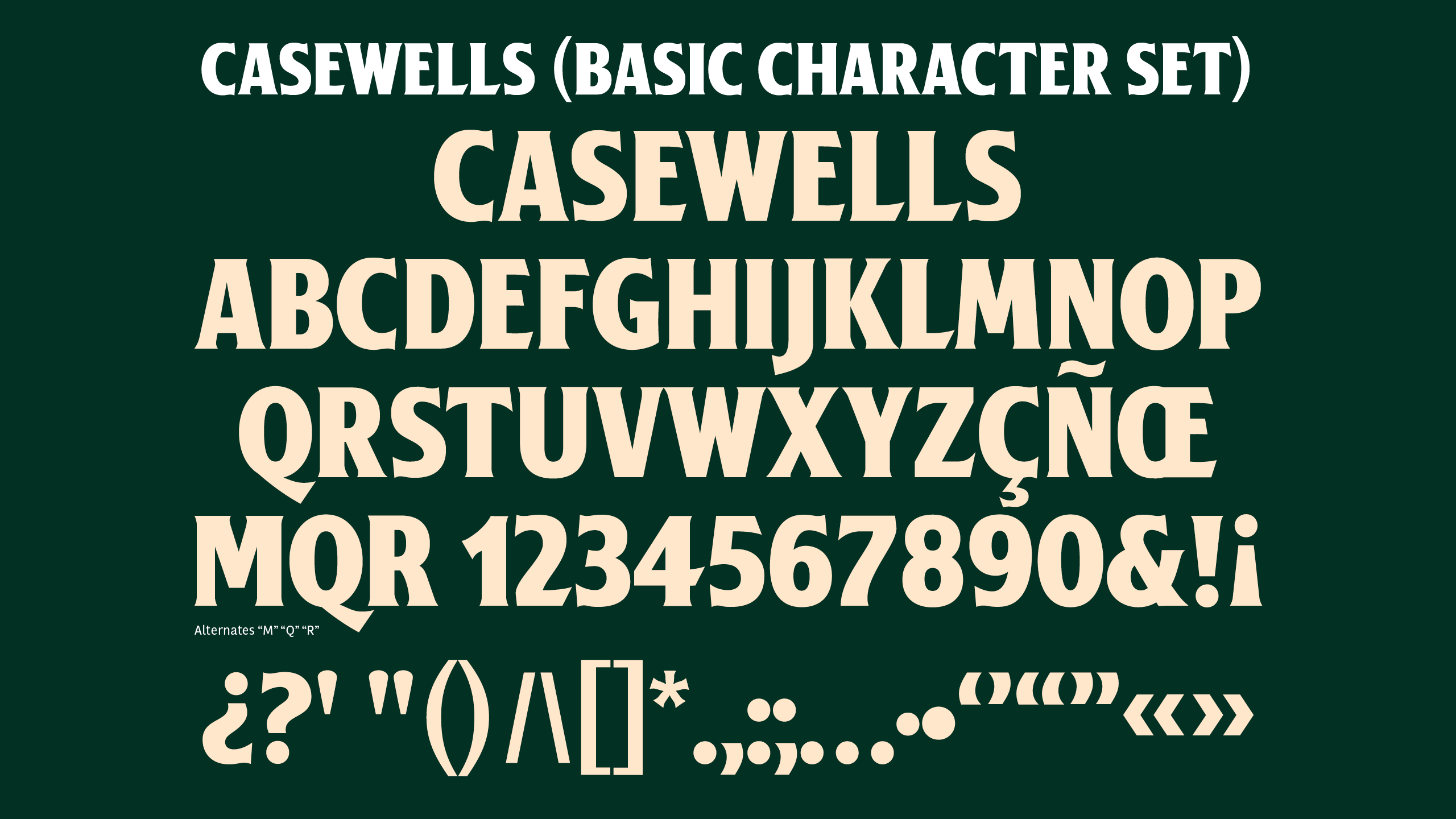
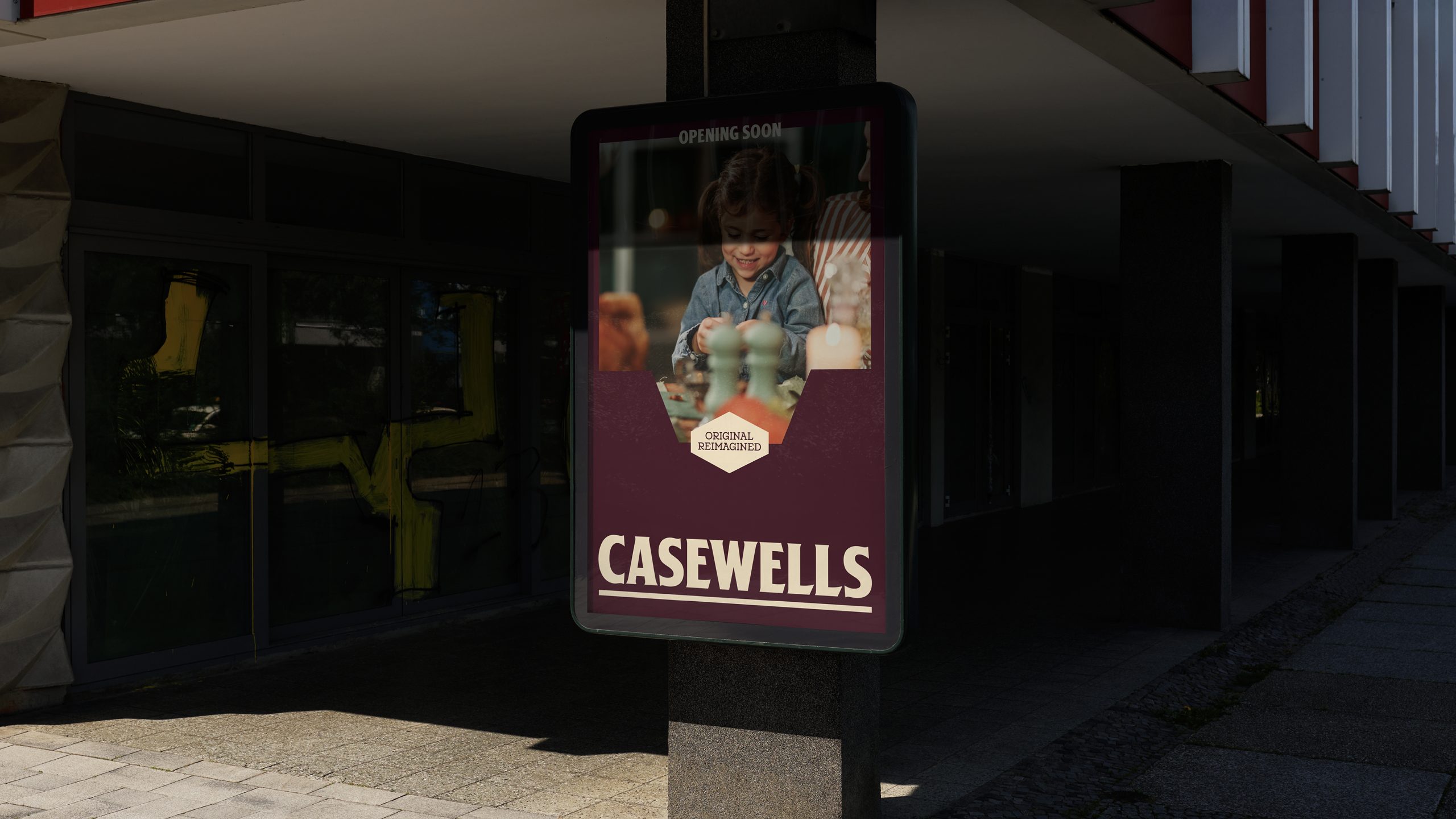
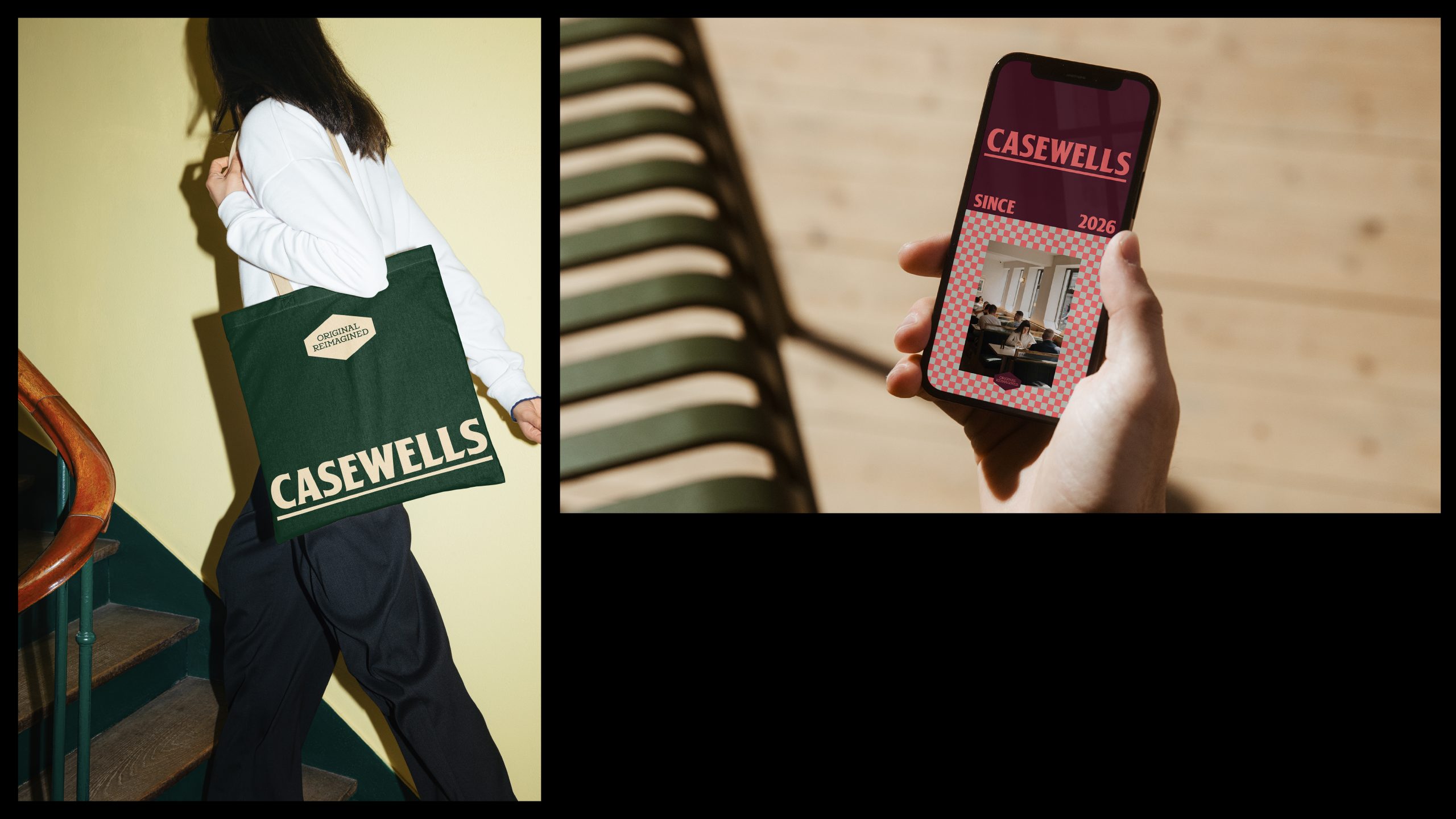
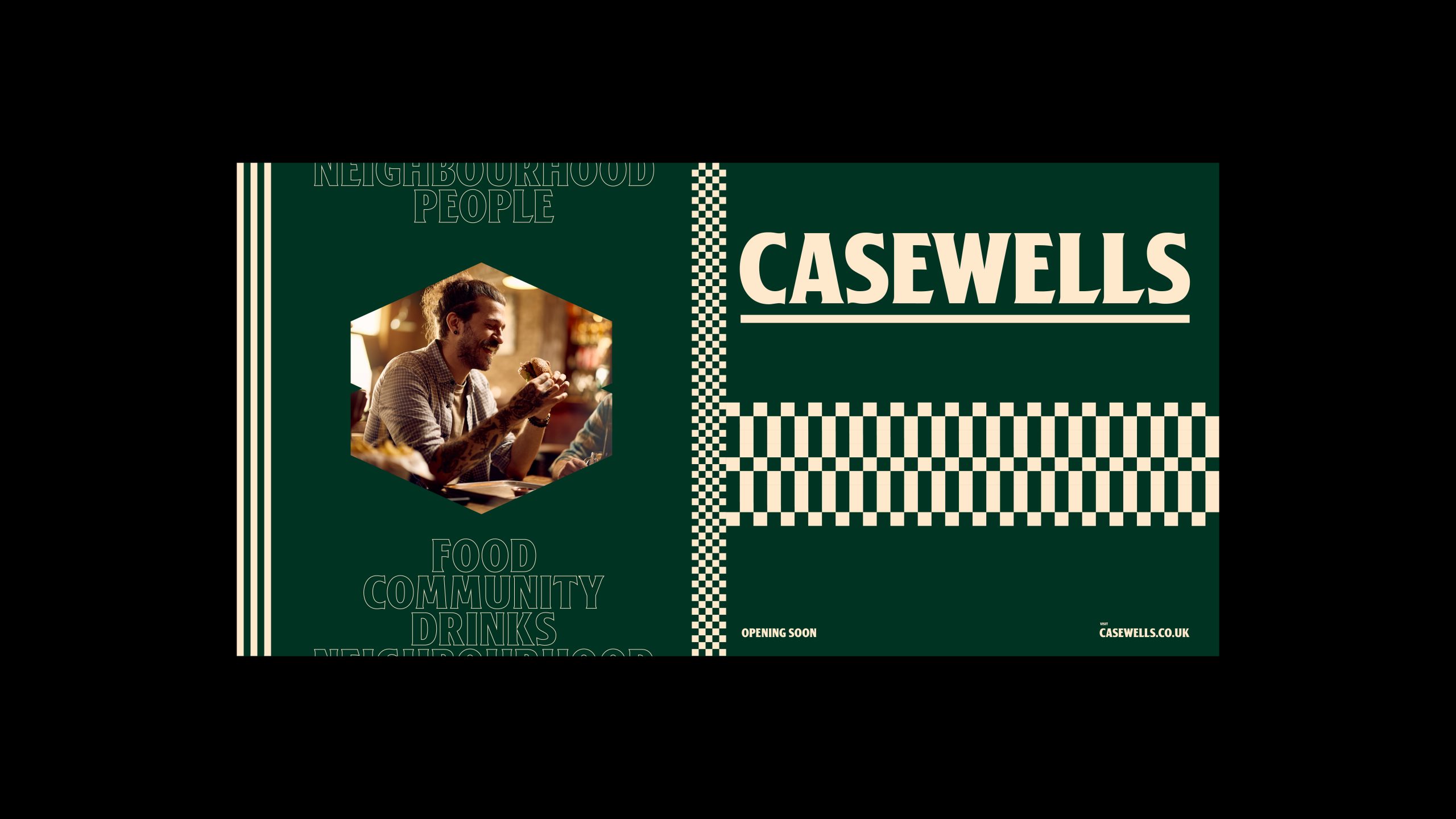
CASEWELLS is a custom typeface designed for the brand identity of a new food hall being built in the heart of Bury town centre. The creative director of the brand identity is Dave Sedgwick from StudioDBB, located in Manchester.
The typeface
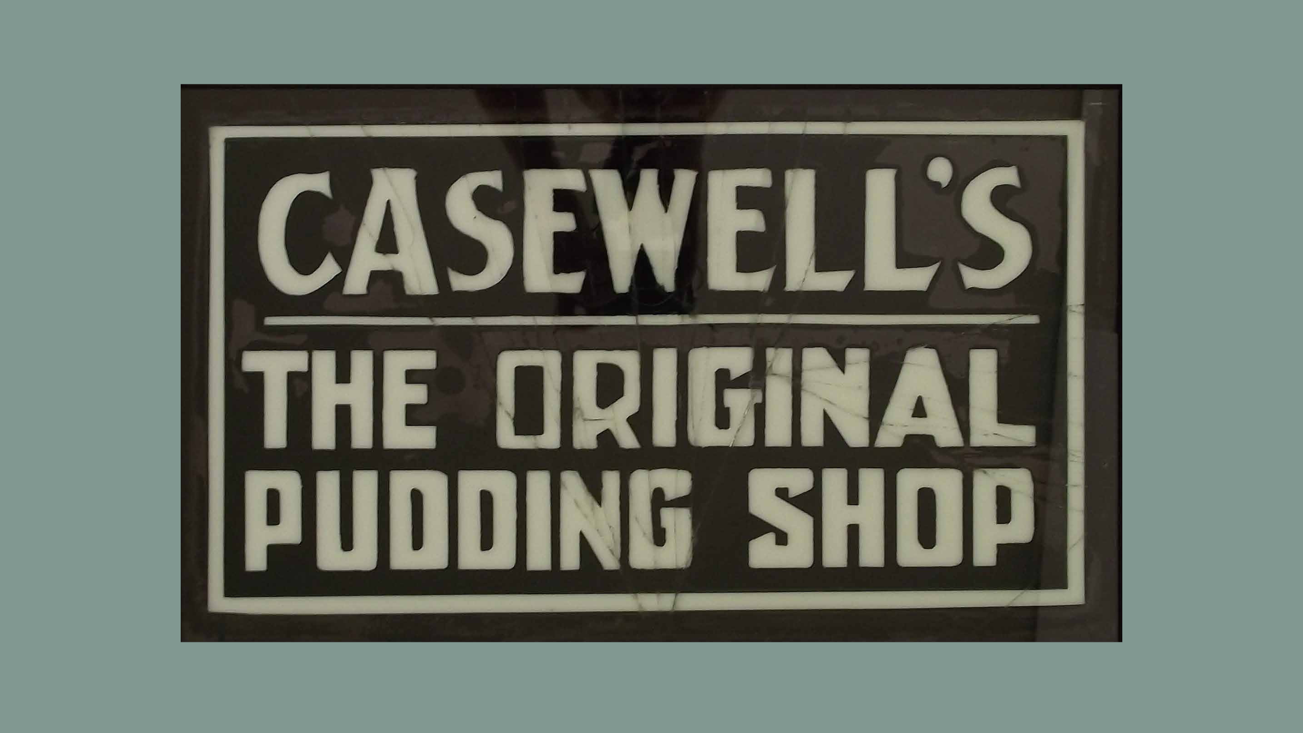
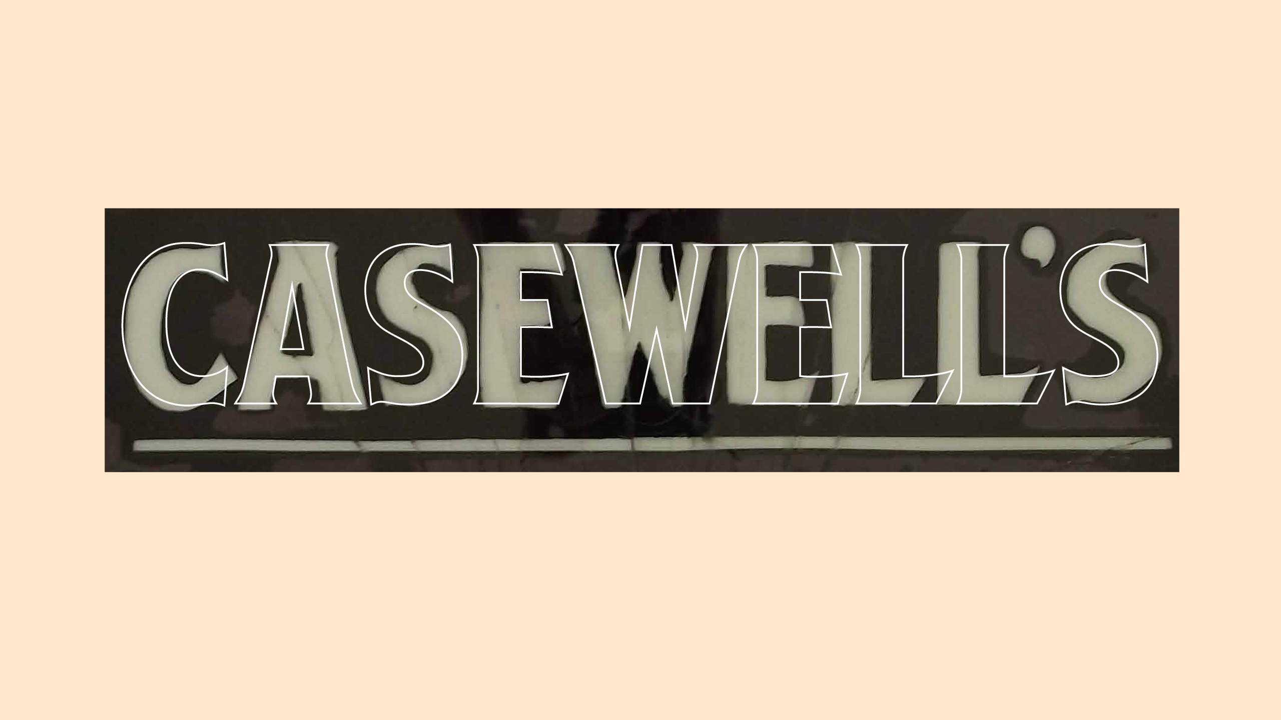
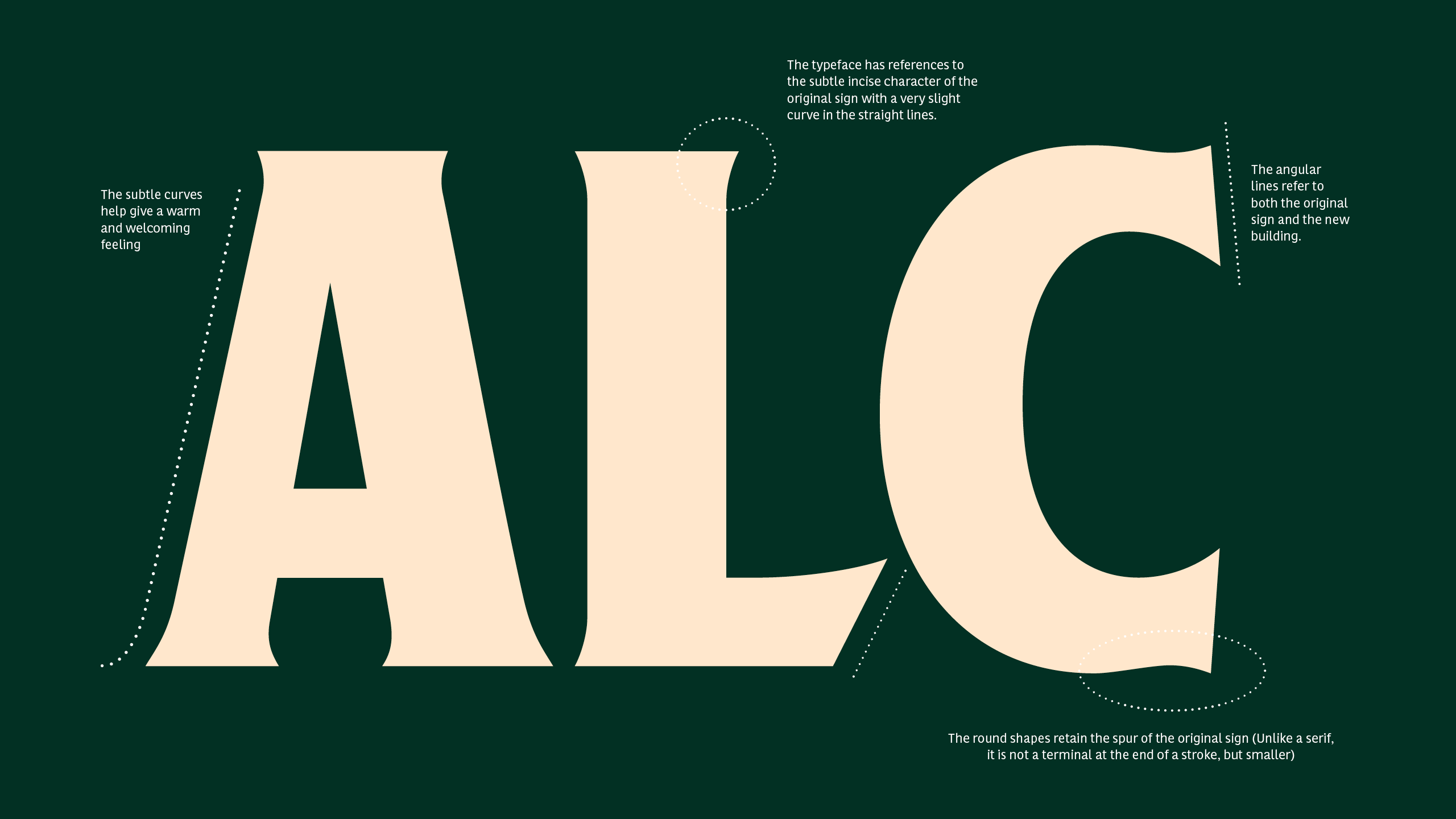
It has references to the subtle hand painted element of the original sign with ever so slight curves in the straight lines. The subtle curves help give a warm and welcoming feeling. The design draws inspiration from the original sign while incorporating elements that echo the architecture of the new building. The bespoke typeface feels modern yet rooted, reflecting a space that is flexible, welcoming and also full of character.
The design approach in David Sedgwick’s words
“CASEWELLS takes its name from a piece of Bury’s culinary history. The original Casewells was the home of the town’s first black puddings, made right in the heart of the town. The name carries the legacy of local craft, flavour and tradition, while the rediscovered sign and bespoke typeface bring it boldly into the present. Today, CASEWELLS isn’t just a nod to the past, it’s a place where history, community and modern life can all come together. Original in spirit, reimagined for now.
— Every element of the brand has been carefully crafted to celebrate Bury’s rich history while looking confidently to the future. The name and logo are inspired by an original sign. During my research into the town’s food history, I discovered CASEWELL’S, the very place where Bury’s first black puddings were made. I even tracked down some old photographs showing the original sign above the door and Mr Casewell himself.The sign has since been lovingly restored and returned to Bury, creating a meaningful connection between past and present. While I explored a number of naming options, it quickly became clear that Bury will always be synonymous with black pudding. Casewells allows the town’s heritage to shape its future.
— The colour palette is drawn from the textures of Bury itself: soft creams, olive stone and rich greens, evoking the warmth and materials of the town’s markets and mills.
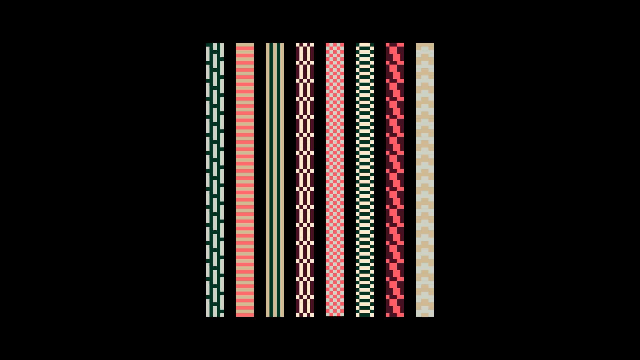
— A series of eight textile-inspired patterned lines runs throughout the brand, referencing the warp and weft and the way the community’s stories and experiences are interwoven.These lines also mirror the eight pillars forming the entrance to the new space. A subtle nod to the architectural and social fabric of the town.
The food hall is due to open later this year and this initial work represents just a small part of a project I’m thrilled to be part of. Much more will come as the building progresses.”
Casewells – Originally Unique.