
Artistic Residence and Exhibition at AGA-LAB, Amsterdam
In Spring 2018 Laura did a graphic artist residence at the AGA LAB in Amsterdam. There, she had access to different printing techniques being silkscreen and risography the ones she used the most. This stay led to the conception of a (typo)graphic exhibition and its content. The result, all together, got the name of Expanding the Craft.
The concept and the ideas and process behind Expanding the Craft
The exhibition and its title represent what Laura started at the AGA LAB, where she used the context as a point of departure. As a type designer working in custom assignments, she defined a briefing and started sketching by hand or using calligraphy, for working later on with a computer to create the full alphabet or digitize the letterforms, whithout being the designer who will use them, but the “translator” of what the designer needs. By being a designer, he or she can also be in charge of the content, become the editor, and create a project that combines both the content and the translation, working in the full process. This is the expansion of the craft. Her residence at the AGA LAB allowed her to work on a new project that goes from the idea to the print, a place where the available techniques had also influenced this “translation”.
Type in Art
One of Laura’s main concerns, was how to create contents in such an artistic environment (the workshop and the city).
It was a challenge! and I started the process with a close look at the work of some artist who used type and letterforms, as is the case of David Hockney, Hendrik Nicolaas Werkman, Robert Indiana, Depero or Sister Corita Kent, from pictorial to more conceptual approaches. I realized that, in many cases, they content was poetry essays or related to activism. I took pictures of lettering in Amsterdam as inspiration, and I had endless conversations with the other artists in residence, about their approach to art, type, techniques, etc. All those helped me to see my work from another dimension.
The process
Laura was fascinated by the fact that more designers are becoming producers —authors, publishers, instigators, and entrepreneurs— actively employing their creative skills as makers of content and shapers of experiences. She thought it was perfect for that moment and she did it through printing, as it was the most familiar way of production to her. She modestly started to reflect all those inputs in her sketchbook and used some of those and photos to learn and test the techniques. Later came the idea of creating an alphabet, it seemed natural as type design is her expertise, but in a quite different way.
The artistic printing experience
She used risography combined with silkscreen for the posters and riso for the letrazine. The photographic chapter of the letrazine allowed her to get more experimental. Though she had to work with the restrictions in size and number of colors, she loved riso’s freshness and simplicity. Later she mixed it with silkscreen to expand my knowledge, the color palette and the “texture”. She did many test printings, resulting in beautiful posters and maculae that put together textures and bright colors. Finally, for the big format pieces, she mixed collage with the etching technique for the pressure. All together gave a tactile experience to my work, another dimension, much different to the one you can get with only digital techniques, and for sure of the one she expected at the beginning.
The Exhibition had 3 different parts:
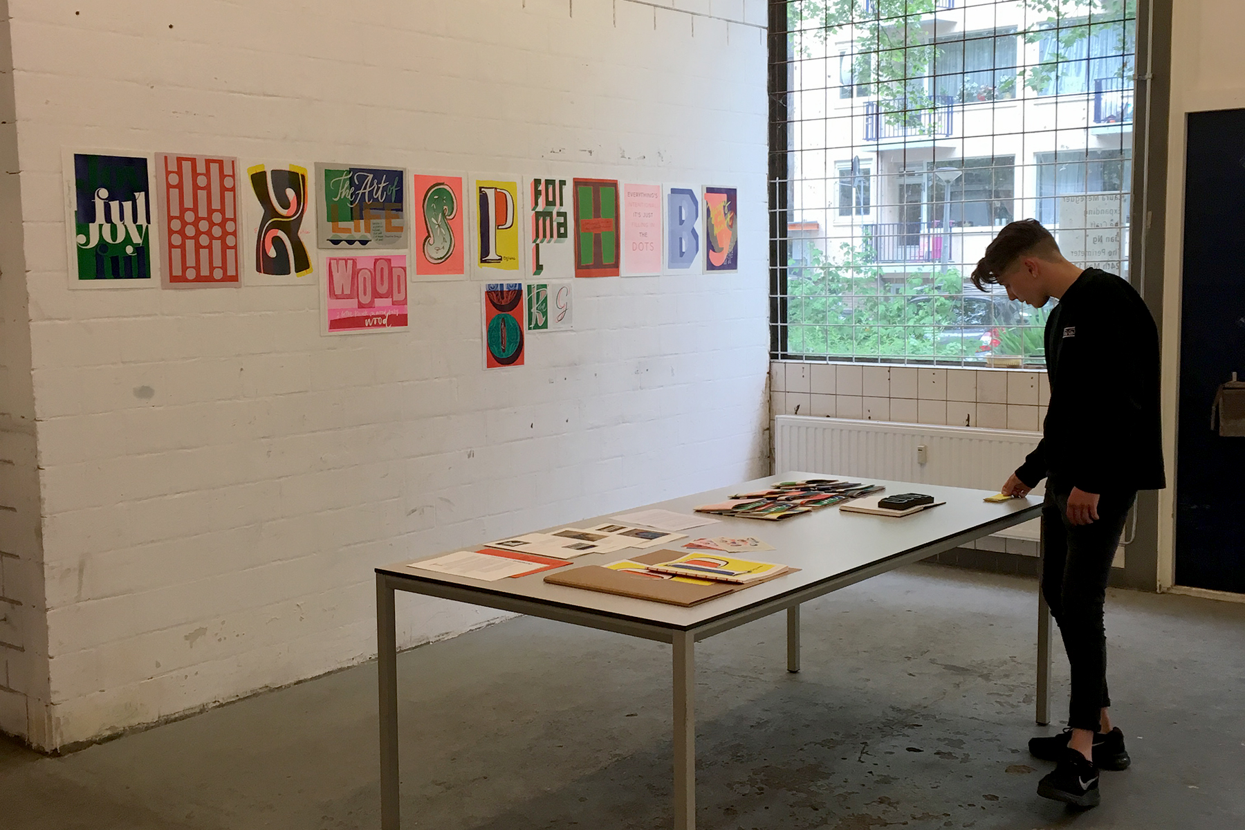
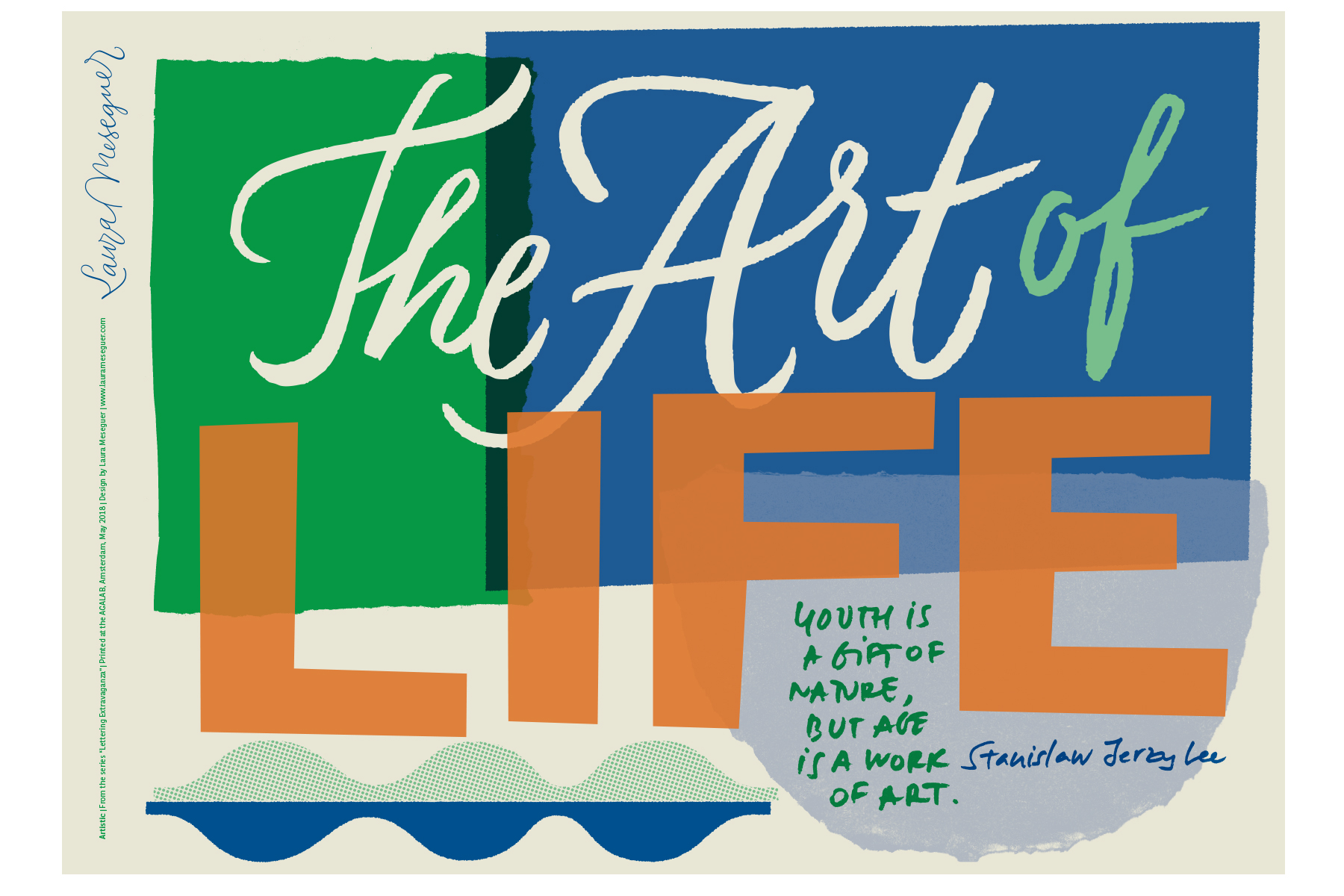
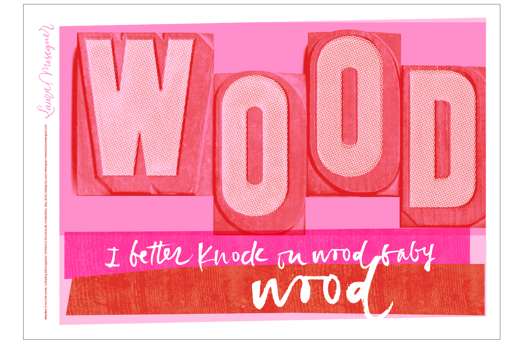
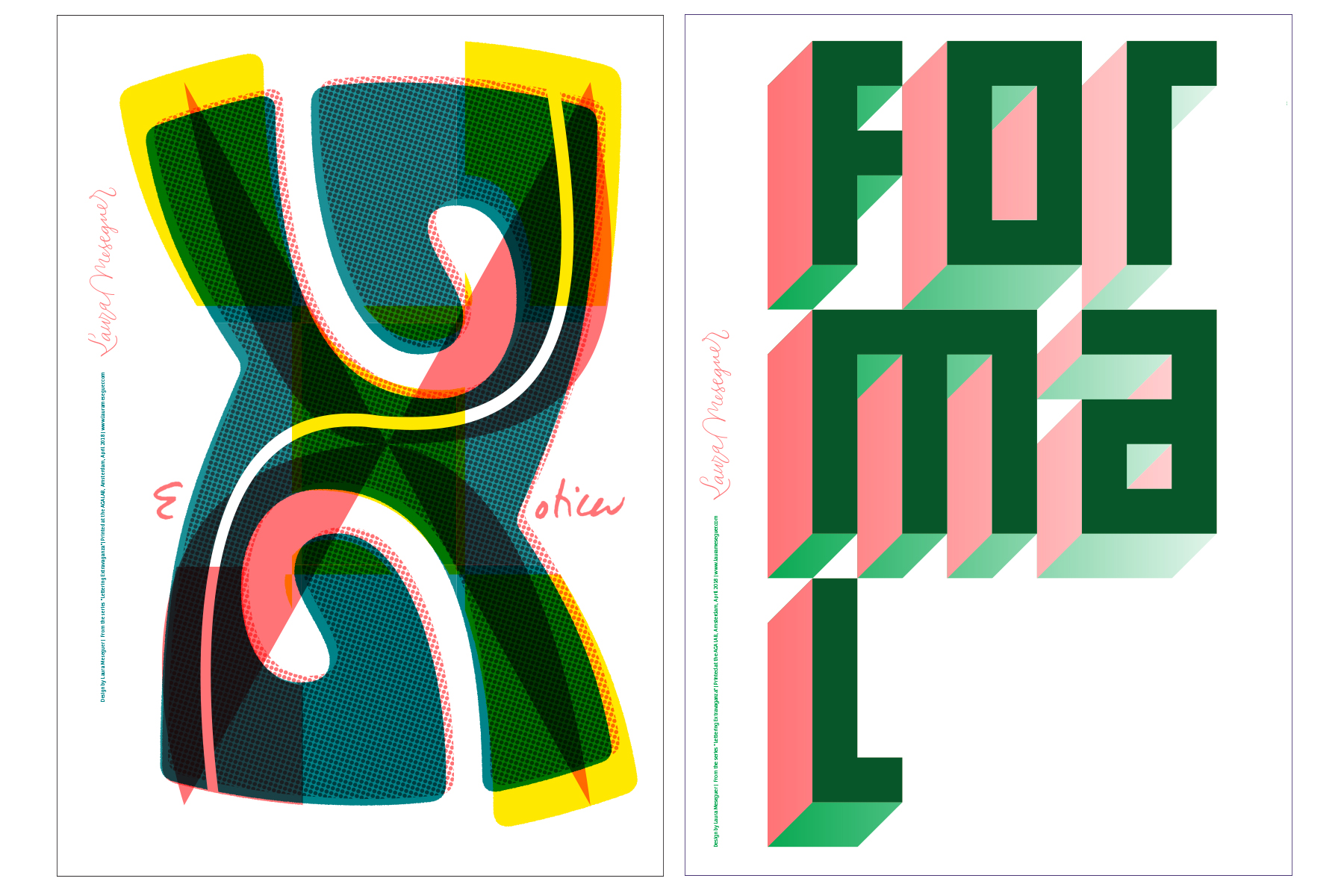
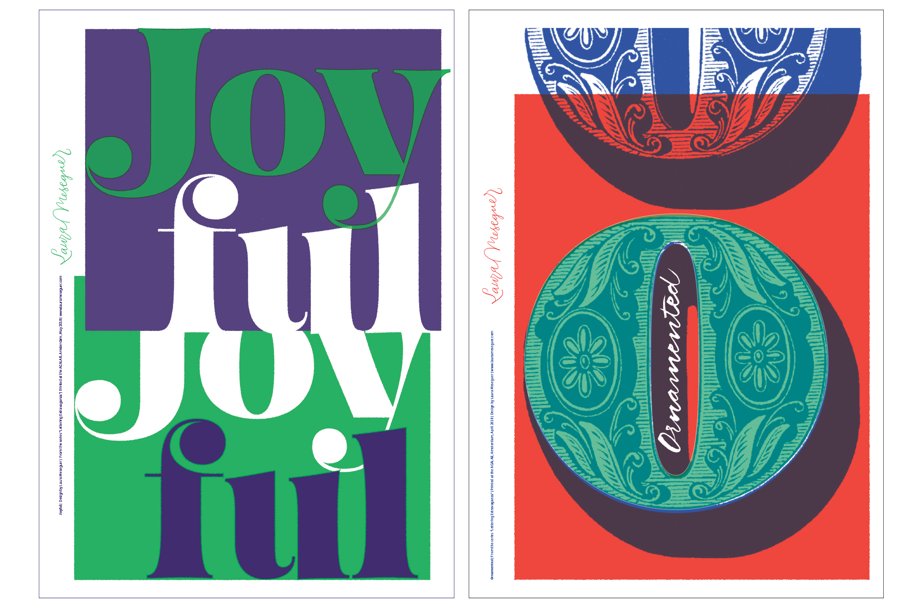
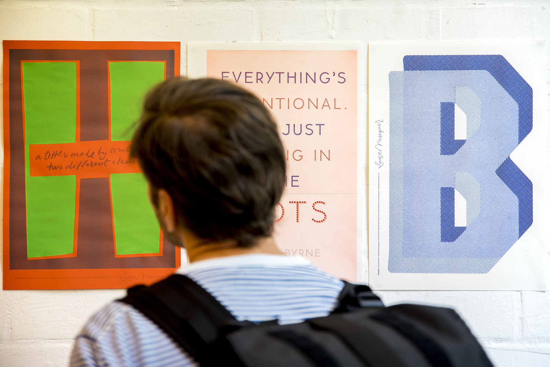
“Lettering Extravaganza” is an ongoing project, consisting of a set of posters showing the ‘letters’ of a conceptual or imaginary alphabet, where every letter was designed to represent a concept or attribute applicable to letterforms, lettering, and type design. Sometimes are resolved with a letter, sometimes a word, or even a quote or a sentence from a song. Is a sort of exercise of visual poetry, where the letters and words mixture is open to associations and interpretations. All the letters are drawn by me except the O for the ‘ornamented’ one.
Description
—Size: A3+
—Printed at AGA LAB in 2 or 3 riso colors, in some posters in combination with a color printed in silkscreen
—Paper IGEPA Eos 2.0 Blauw-wit 120 g
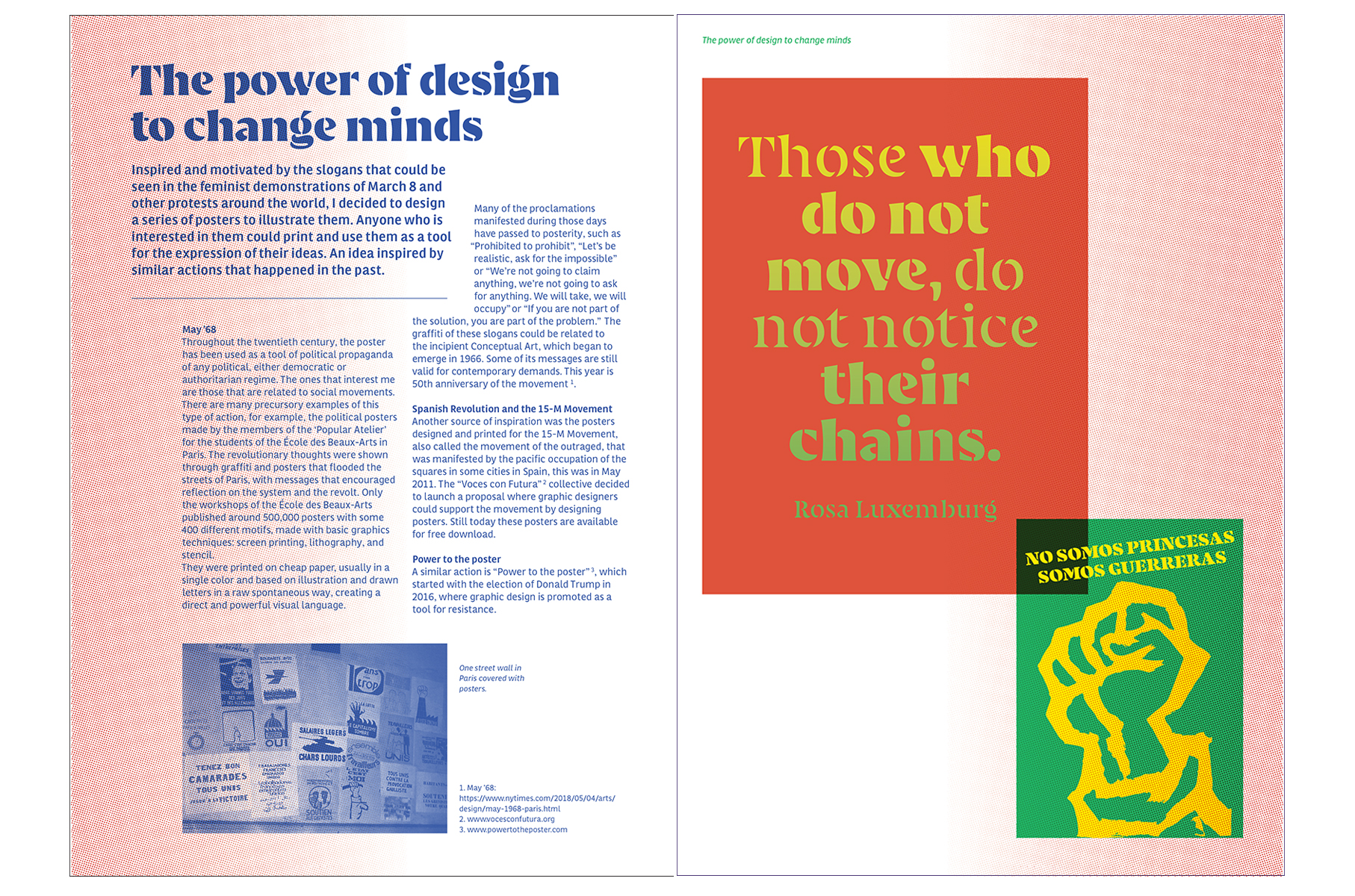
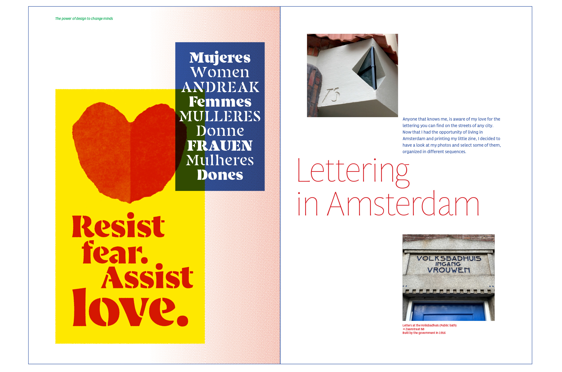
“Personal”, the letrazine, is a sort of magazine that presents 3 different connected chapters for which I designed and wrote the content except for the presentation that was written by Elena Veguillas.
The first chapter (The power of design to change minds) is related to posters designed for protest that reflect the actual political and social moment, the second (Lettering in Amsterdam) shows photographies of the lettering of Amsterdam; and the last one features some of my Lettering Extravaganza posters, a way of showing something about myself.
Description
—Size: 22×29 cm (closed)
—22 pages, plus cover and back cover.
—Japanese binding done by hand.
—Printed in Riso at Knust Press in 9 colors: Yellow, Pink Fluo, Orange Fluo, Red, Bright Red, Green, Blue, Medium Blue and Purple
—Paper IGEPA Eos 2.0 Blauw-wit 100 g and Forever IR Orange 120 g
—Typefaces in use: Custom lettering / Memimas Dots, Multi Display & Multi Text, Navy (work in progress) and Vibra (work in progress).
—24 copies were printed
The letrazine is presented in a folder together with the poster of the P, what is also the cover, as a sort of artistic object.
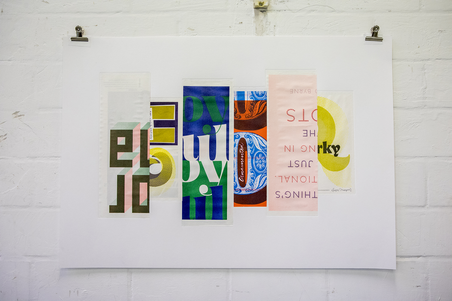
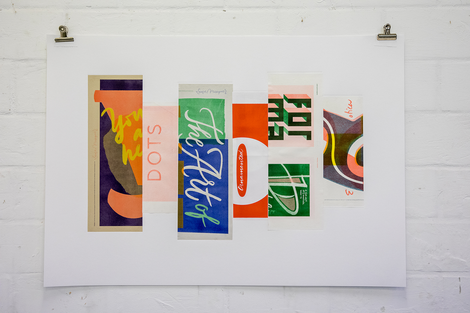
The Collages (Collage 1 and Collage 2) are two big format pieces that came as a result of all the process, they are composed of different stripes coming from cropped posters put together, and placed on an embossed area on a canvas done with relief print that gives a tactile dimension to the artwork. These 2 collages felt like the real art pieces to Laura, only possible after this creative process.
Description
—Size: 100 x 70 cm
—Riso print, silkscreen and relief print
—Paper: Hahnemuhle Etching
—Unique pieces
At the AGA LAB, Laura had the chance of learning the riso tecnique from Wasco, a Dutch comic artist; and silkscreen from the artist Christina Hallström. Also, the other artists in residence, Stella Murphy, Olga Karyakina and Lian Ng, were a huge inspiration for her. Thanks!