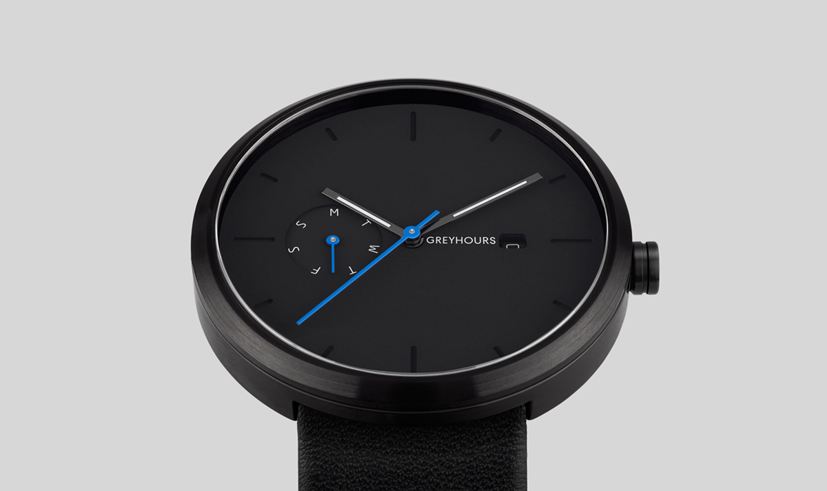

Custom type and wordmark design for GREYHOURS
GREYHOURS was a European luxury watch brand. In their own words: “It’s the result of a meeting of young entrepreneurs with a dream: the perfect watch, financially accessible to all and not just to a chosen few. The creative director asked Laura to design a custom logo that would match the attributes of the brand but also meet the functional requirements. Her first approach was to learn more about the product and the technical limitations, and offer solutions based on this briefing: Combining sober elegance with modern solidity, masculine strength and feminine grace. By expressing all its design characteristics through black or white. By daring to innovate and surprise.
Attributes
Hype, moderate, modern, classy, mature (neutral & mysterious)
Functionality
—The logo will be UVI printed on the front and engraved on the watch back.
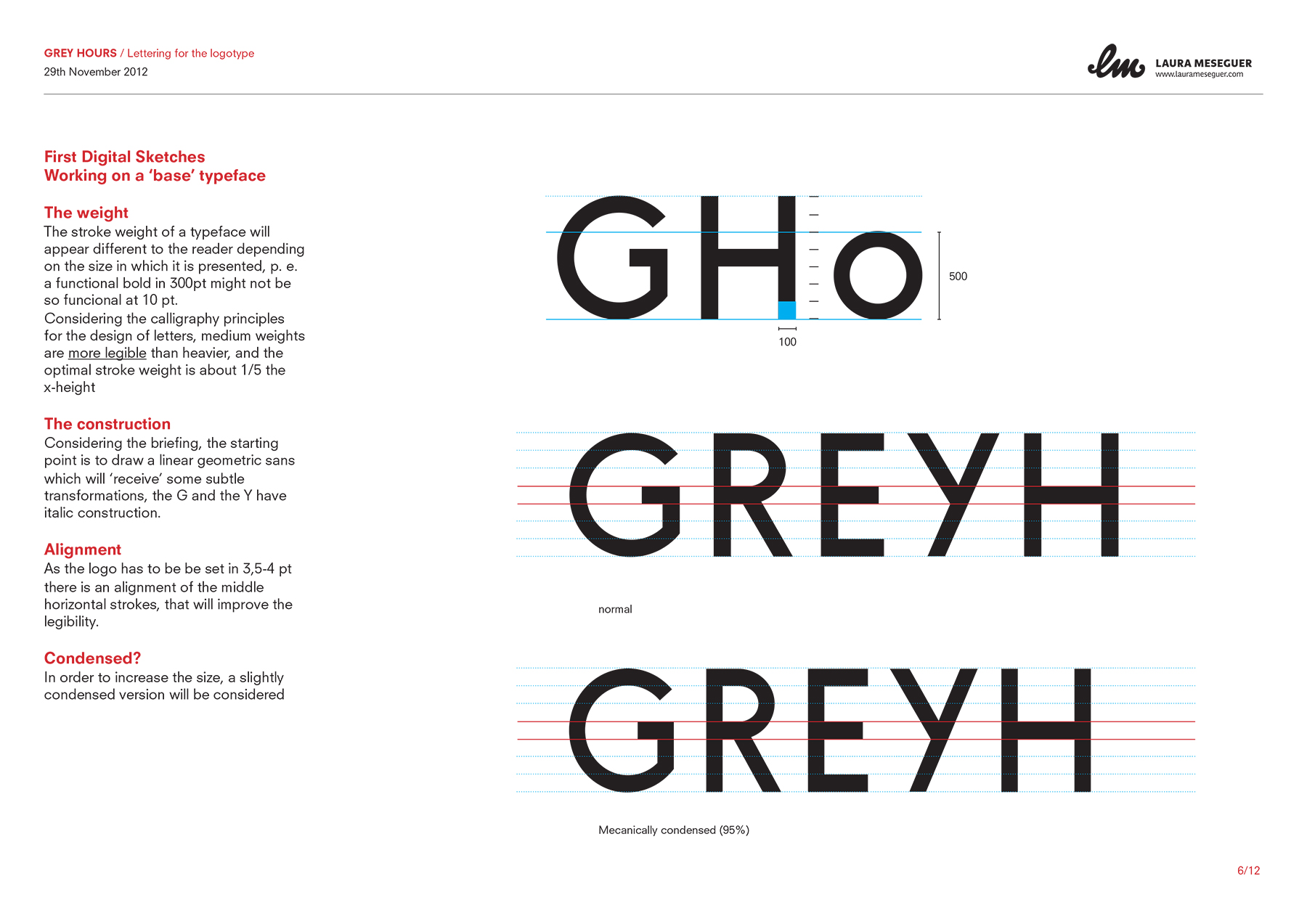
—Uppercase letters to work letter-spaced and generous in proportions, to give a contemporary approach.
—Readable on small sizes: Open counters, slightly condensed to enlarge the body size as much as possible.
—It will work along with the customization done by illustrators and artists with uncluttered illustrations that will also match the watch design.
Dimensions
Maximum width: 25 mm in the watch back and 7,5 -8 mm in the front. My proposal consisted of a geometric sans serif distinctive typeface, a little bit uncommon, simple, but very well designed, very readable, modern and sophisticated. Here you can see part of the process.
Client: GREYHOURS
Art Director and Co-Founder: Olivier Kraff
Type designer: Laura Meseguer