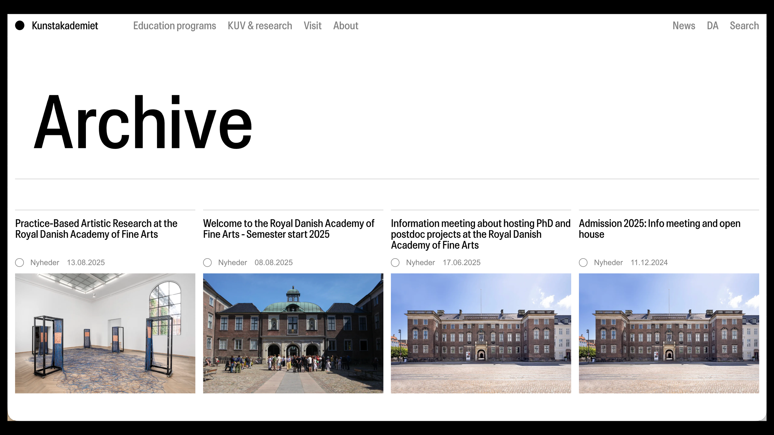
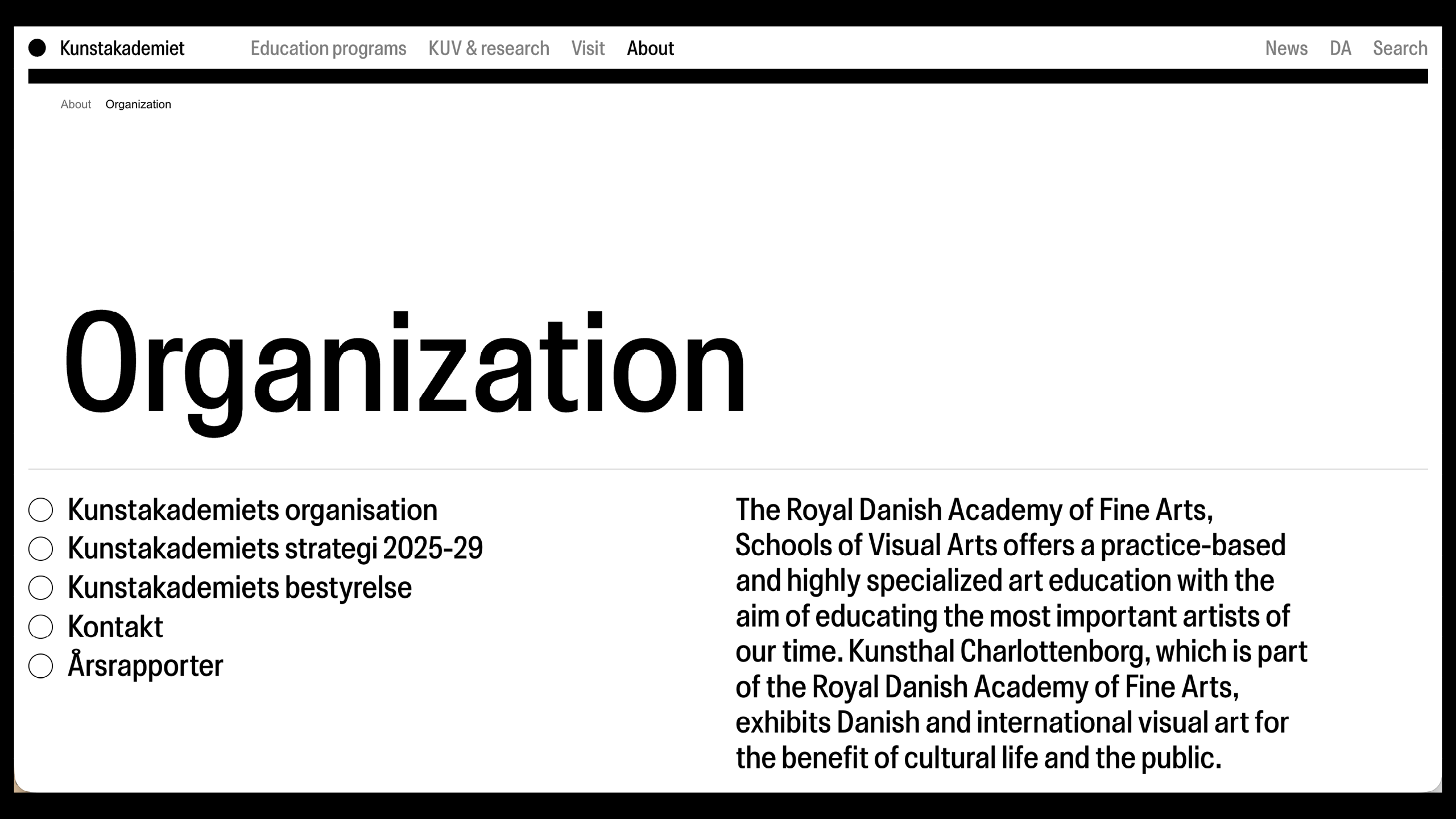
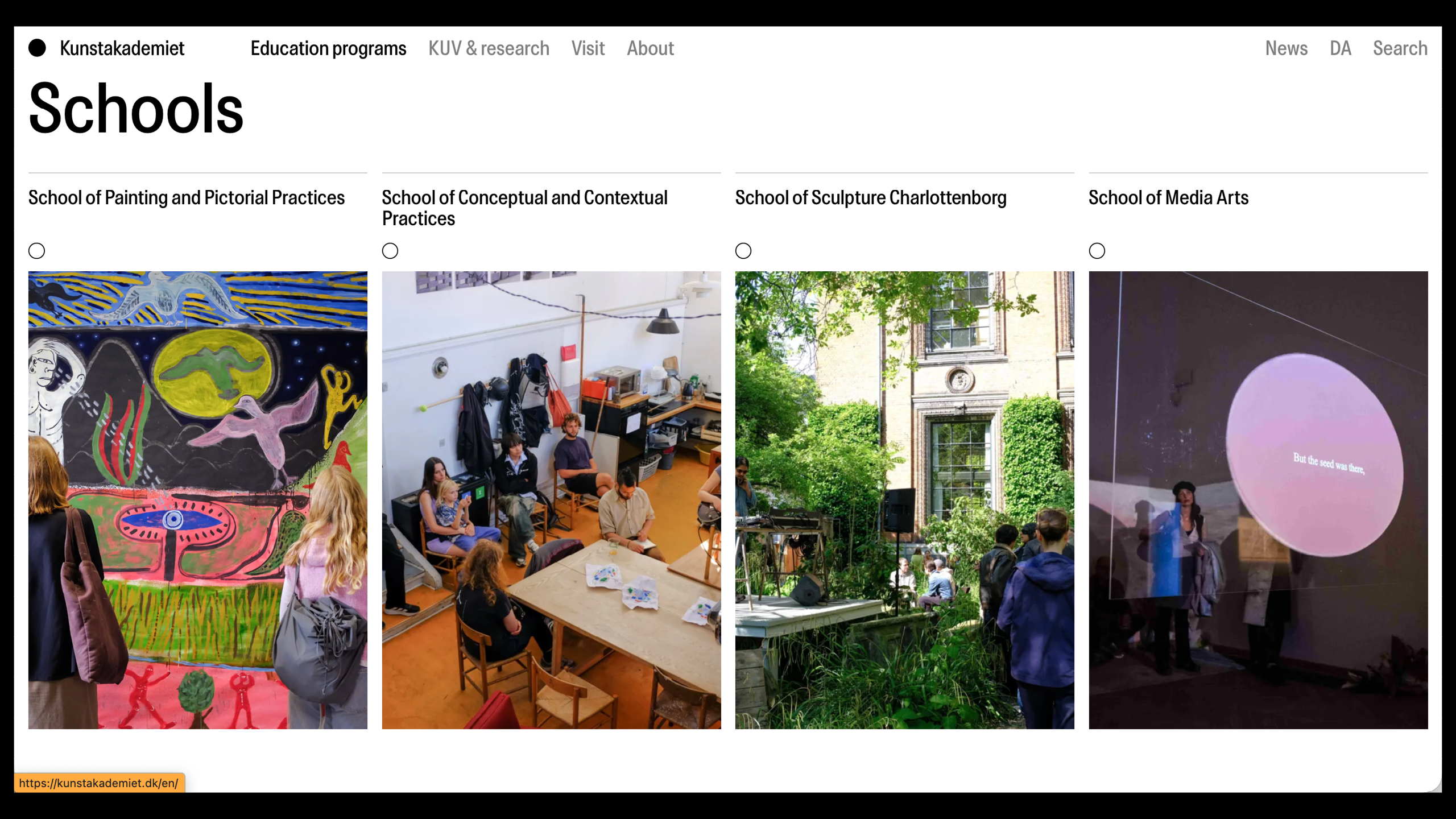
Custom Typeface for the Kunstakademiet (the Royal Danish Academy of Fine Arts)
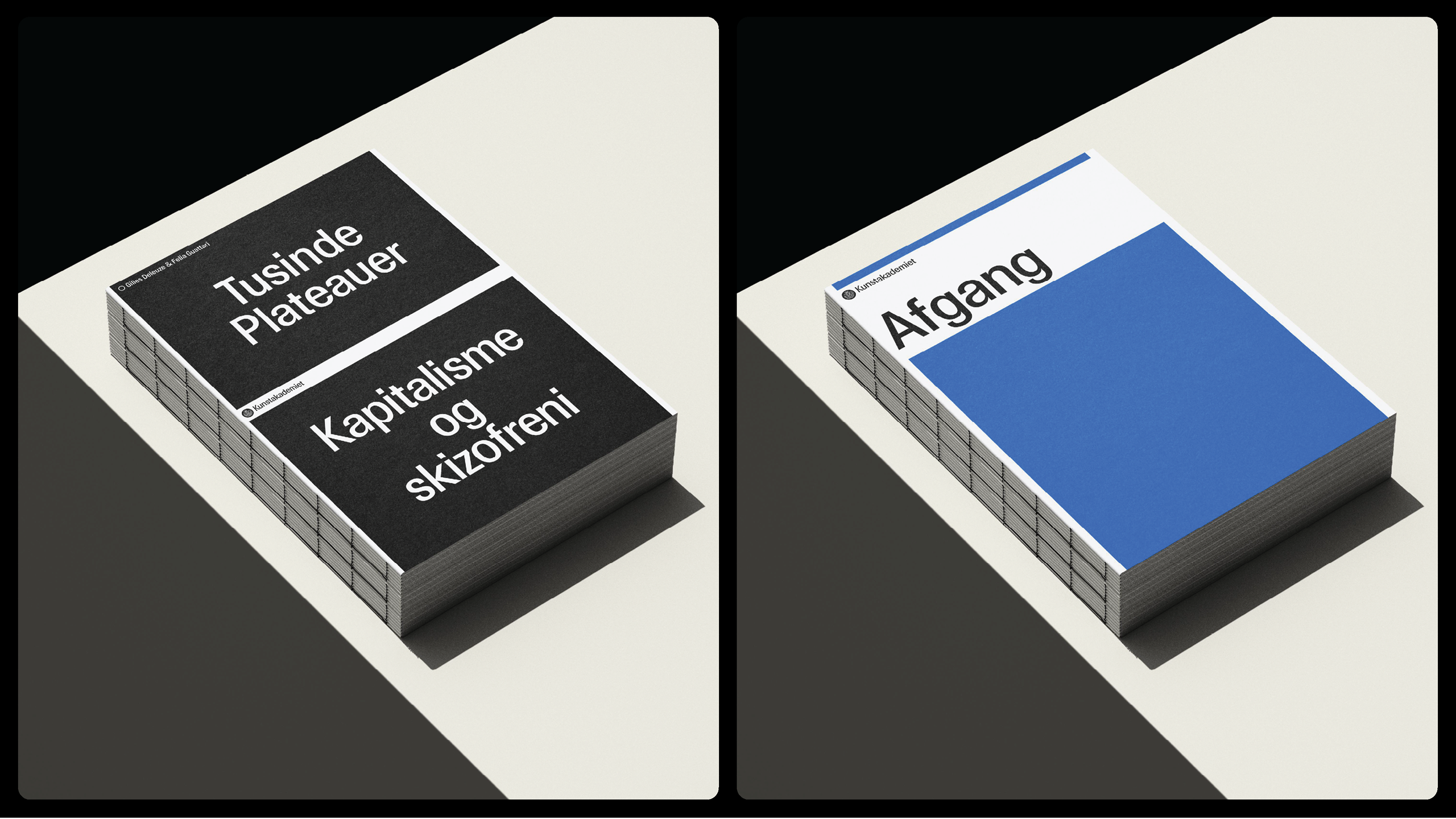
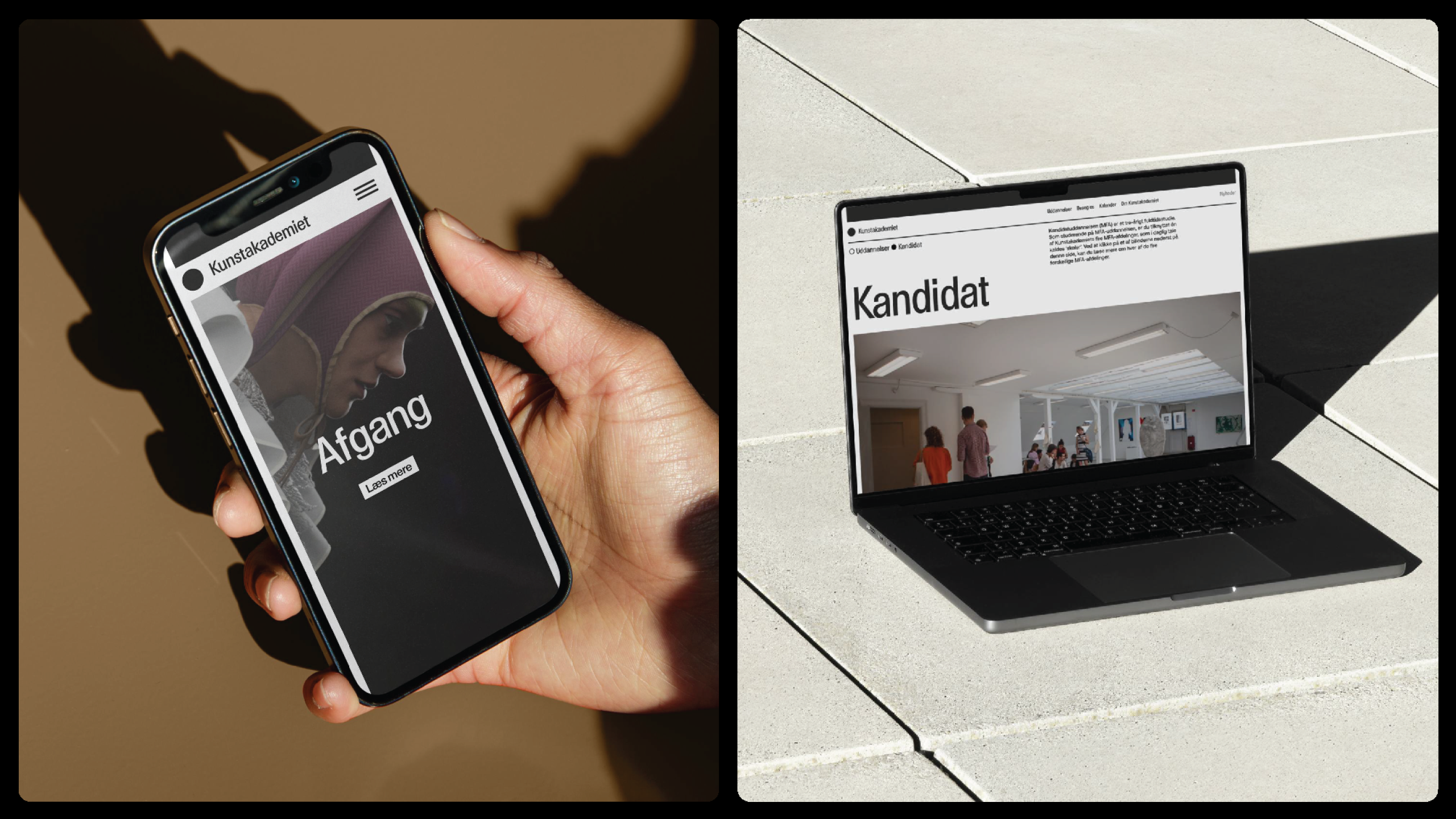
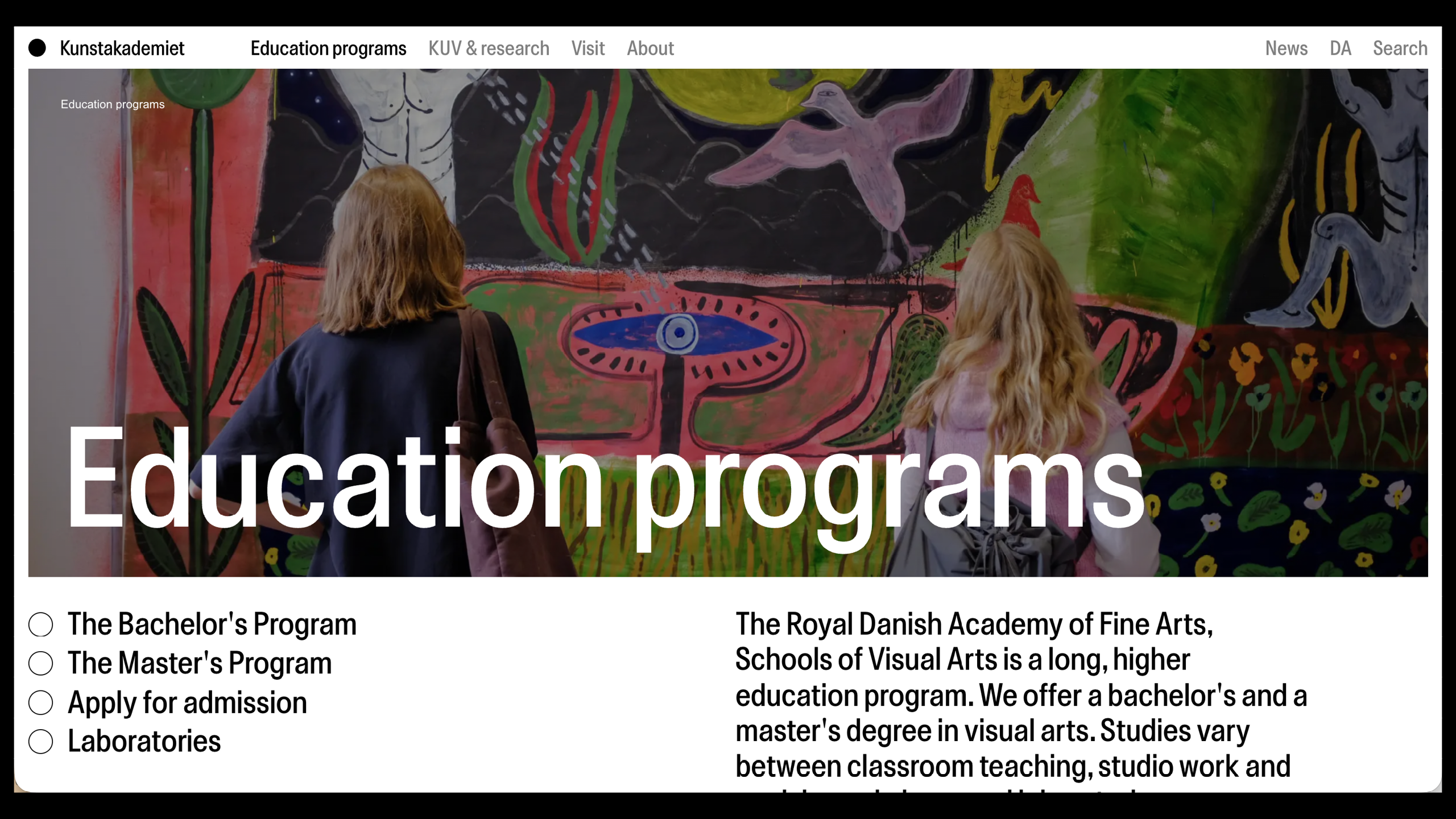
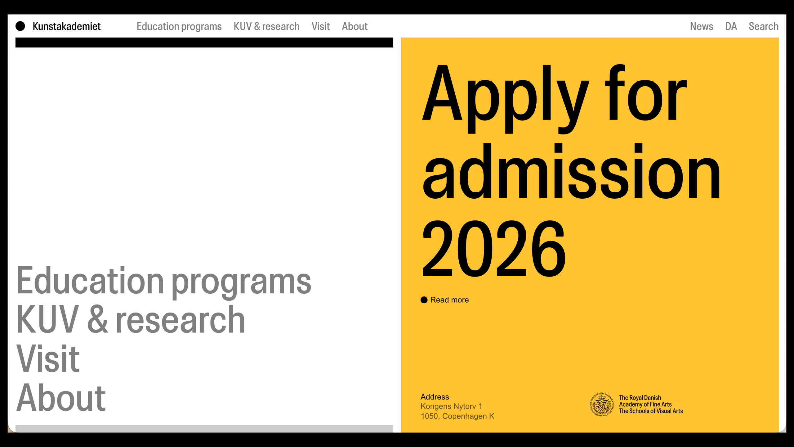
Kunstakademiet Display is a custom typeface created by Urgent.Agency for the design of visual identity of the Kunstakademiet (the Royal Danish Academy of Fine Arts) in Cophenhaguen, Denmark.
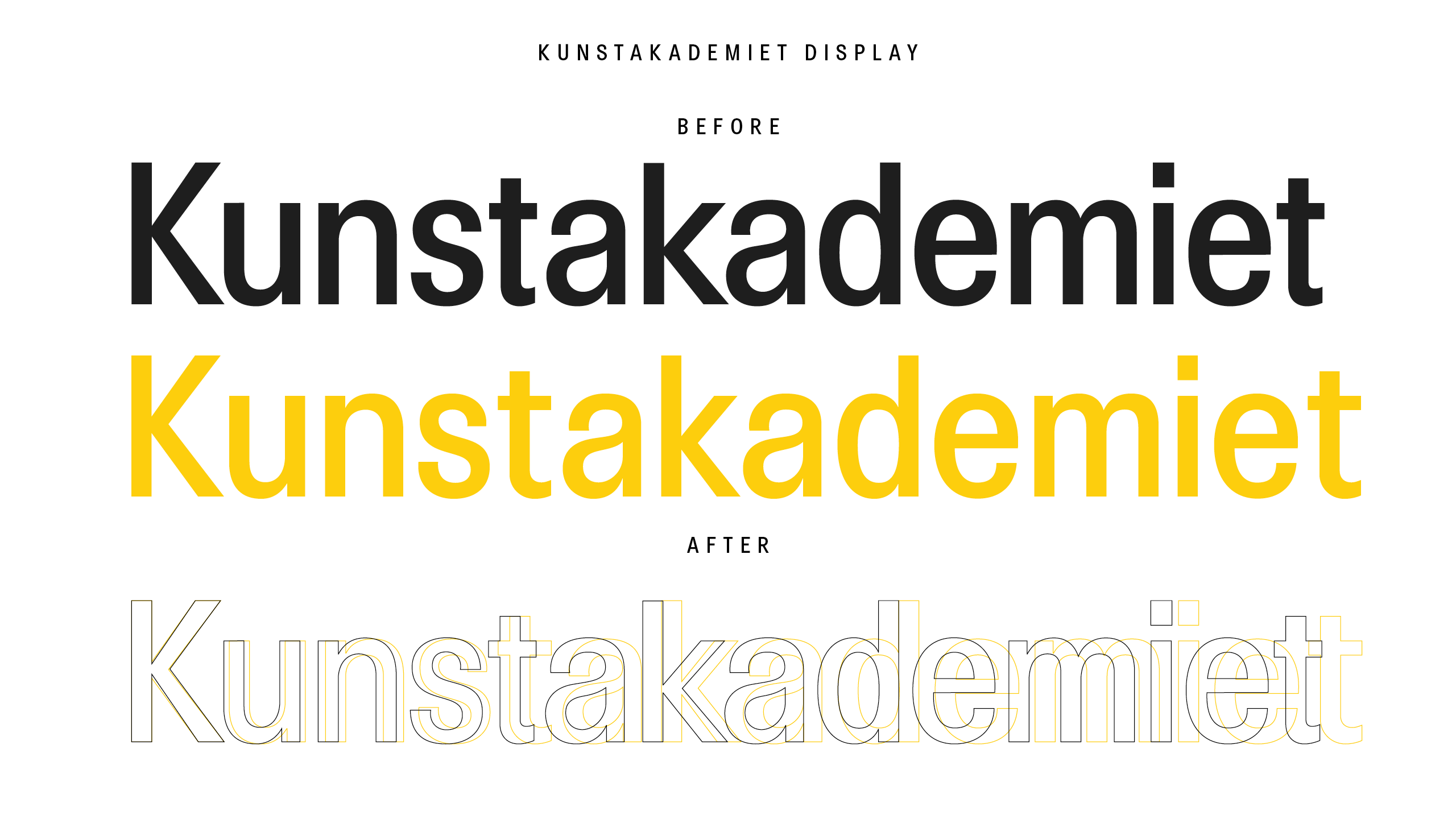
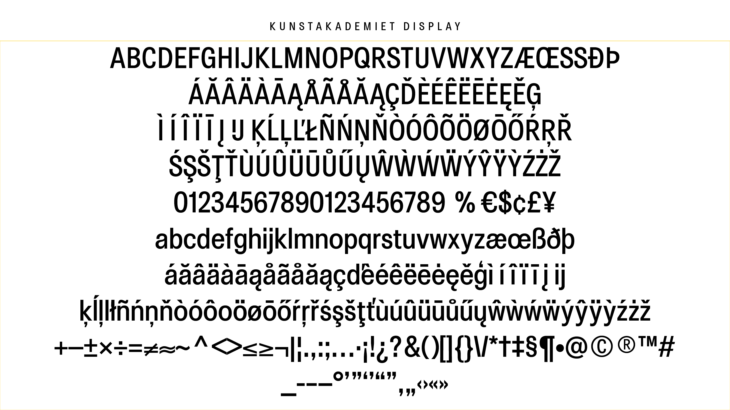
This typeface was developed to strengthen and unify the festival graphic identity and communication strategy. Laura’s role on this project was to refine the original characters, complete the alphabet with some missing characters and expand it with the accented characters.
The Inspiration (Why)
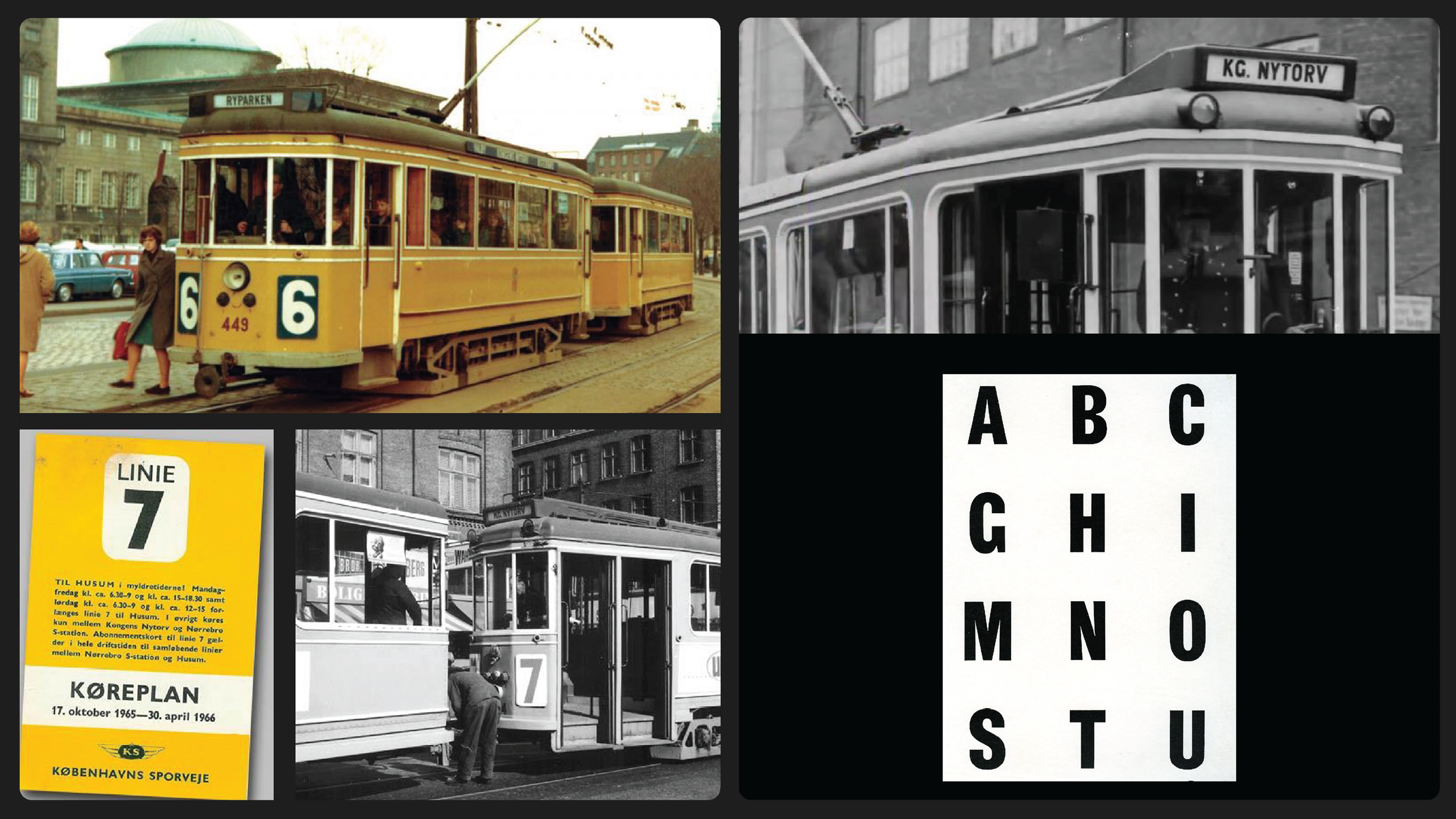
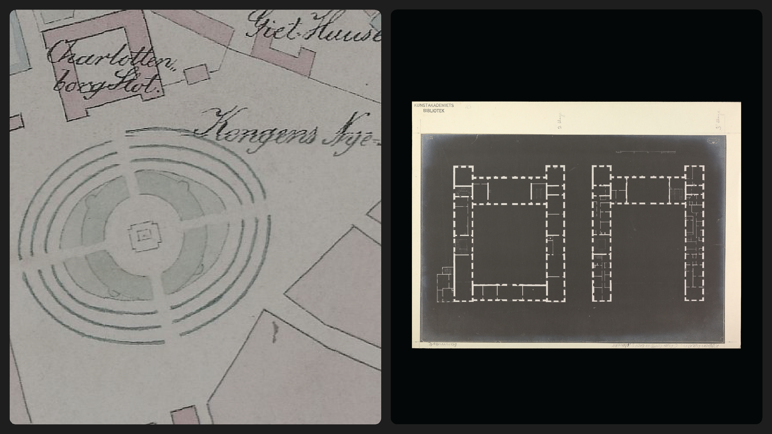
It began with the Academy’s core identity: a premier hub for contemporary art that is public, open, and in a state of constant flux. The design doesn’t just sit on a page; it moves with the institution. The inspiration stems from the cycles of creation. Art is never static—it repeats, it evolves, and it breaks its own rules. We wanted to build a visual language that felt like the building itself: a structural foundation that exists only to be filled with new, unpredictable ideas.
The Typeface (The Core Tool)
The custom typeface serves as the project’s backbone. It is a Living Framework designed to balance architectural weight with airy openness.
-
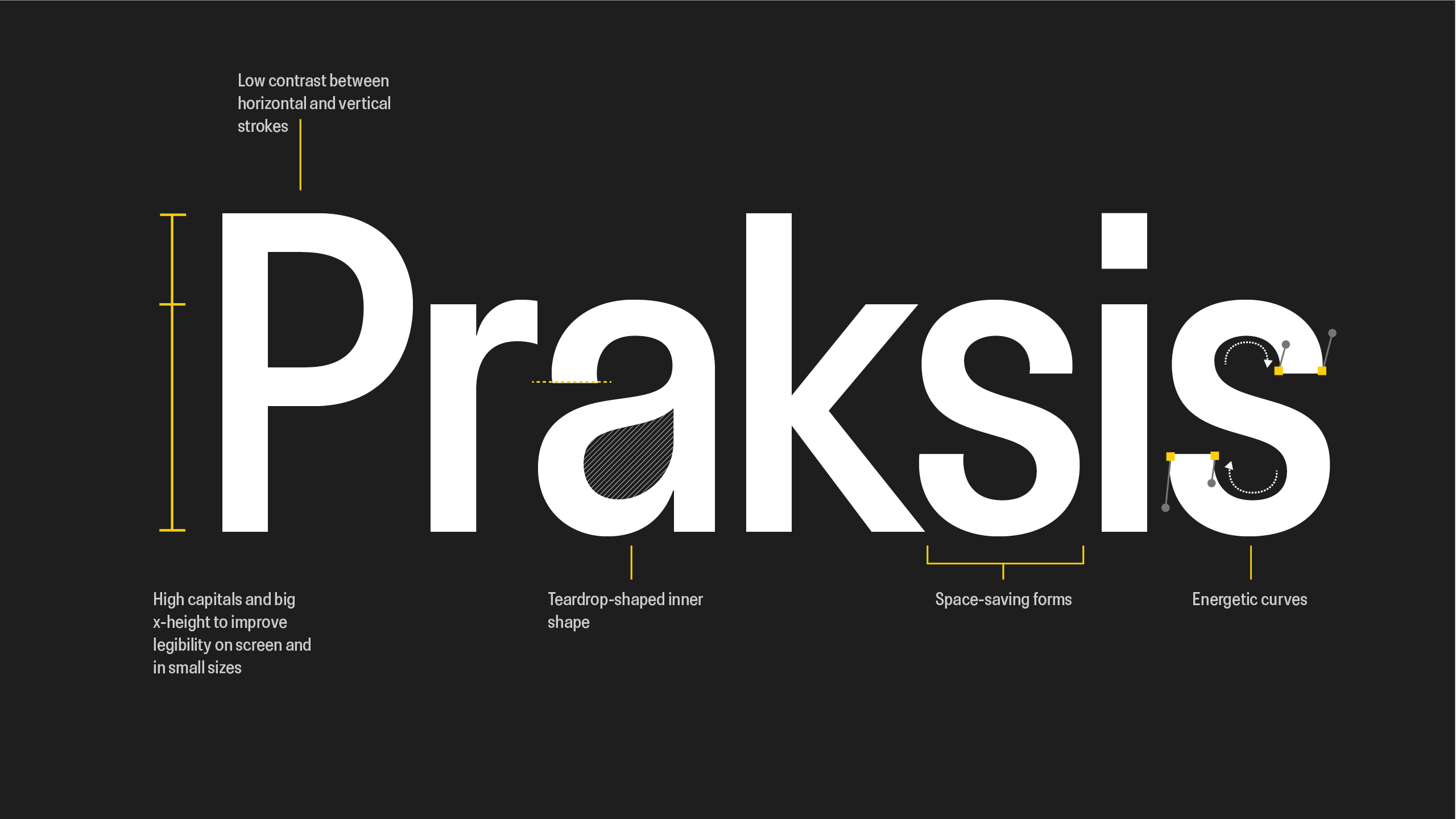
Display but also for text: Kunstakadsemiet is grotesque typeface with a medium weight. The letterforms are rooted in the geometry of the Academy’s history but feature wide, inviting apertures that feel contemporary and breathable.
-
High Legibility: The typeface maintains its legibility while becoming a graphic texture. Its perfomance on screen and in small sizes is really good, and for titles the user only has to use negative tracking.
Type Engineering: Laura Meseguer