
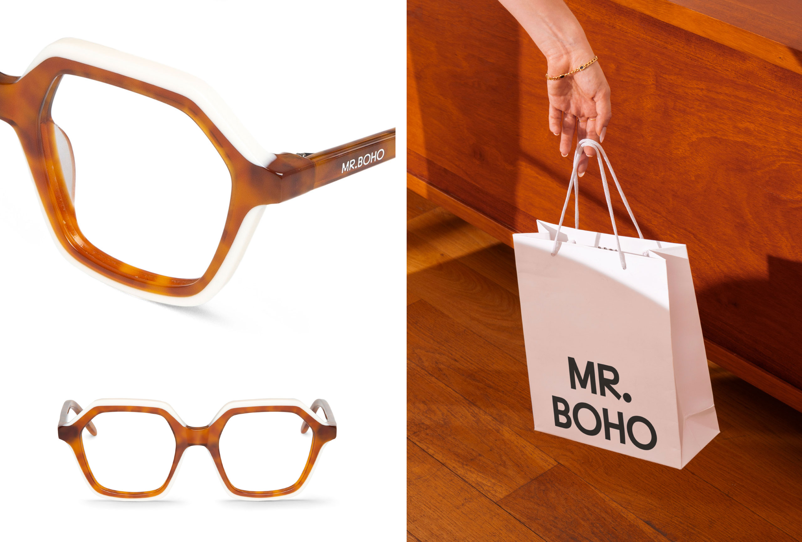
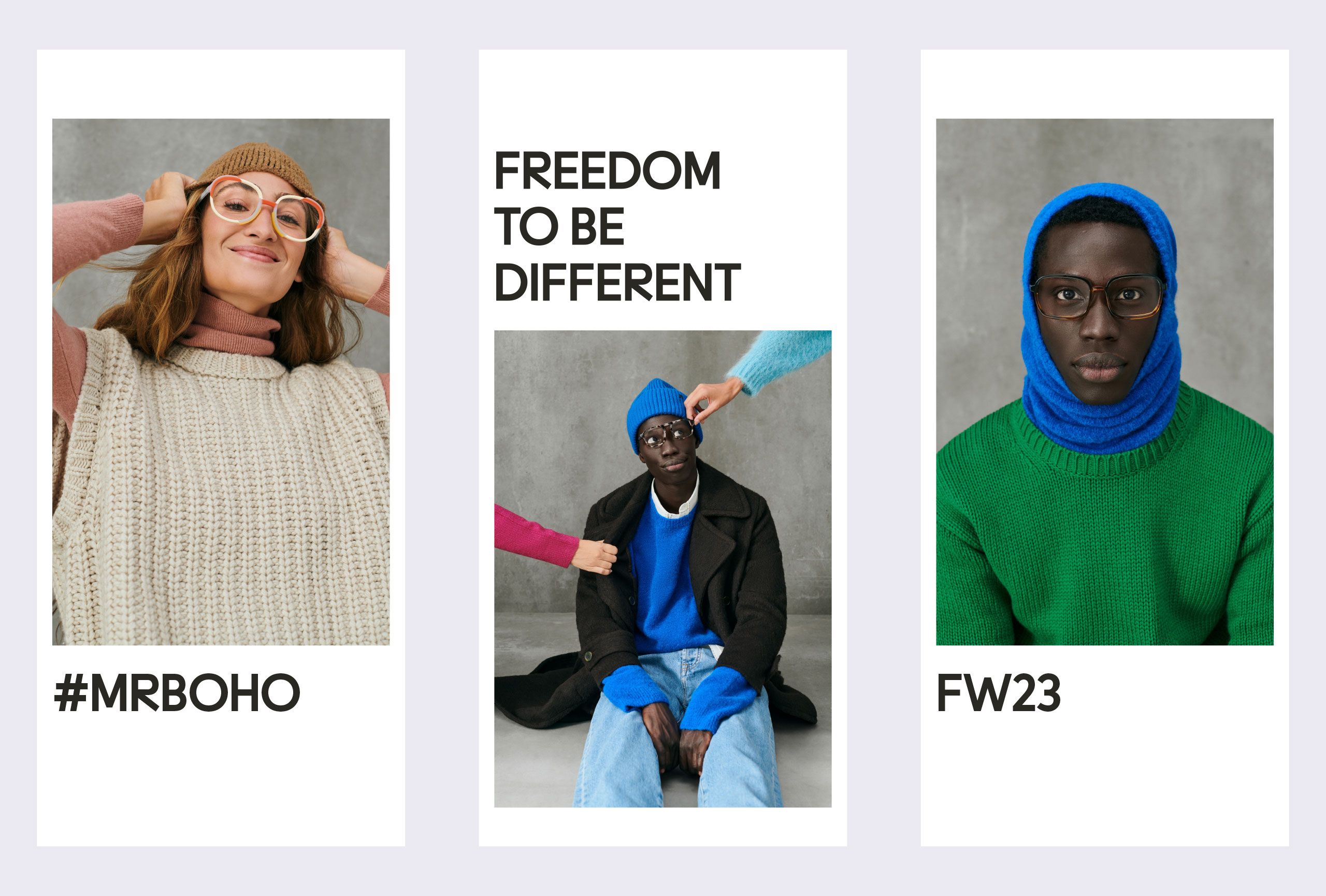
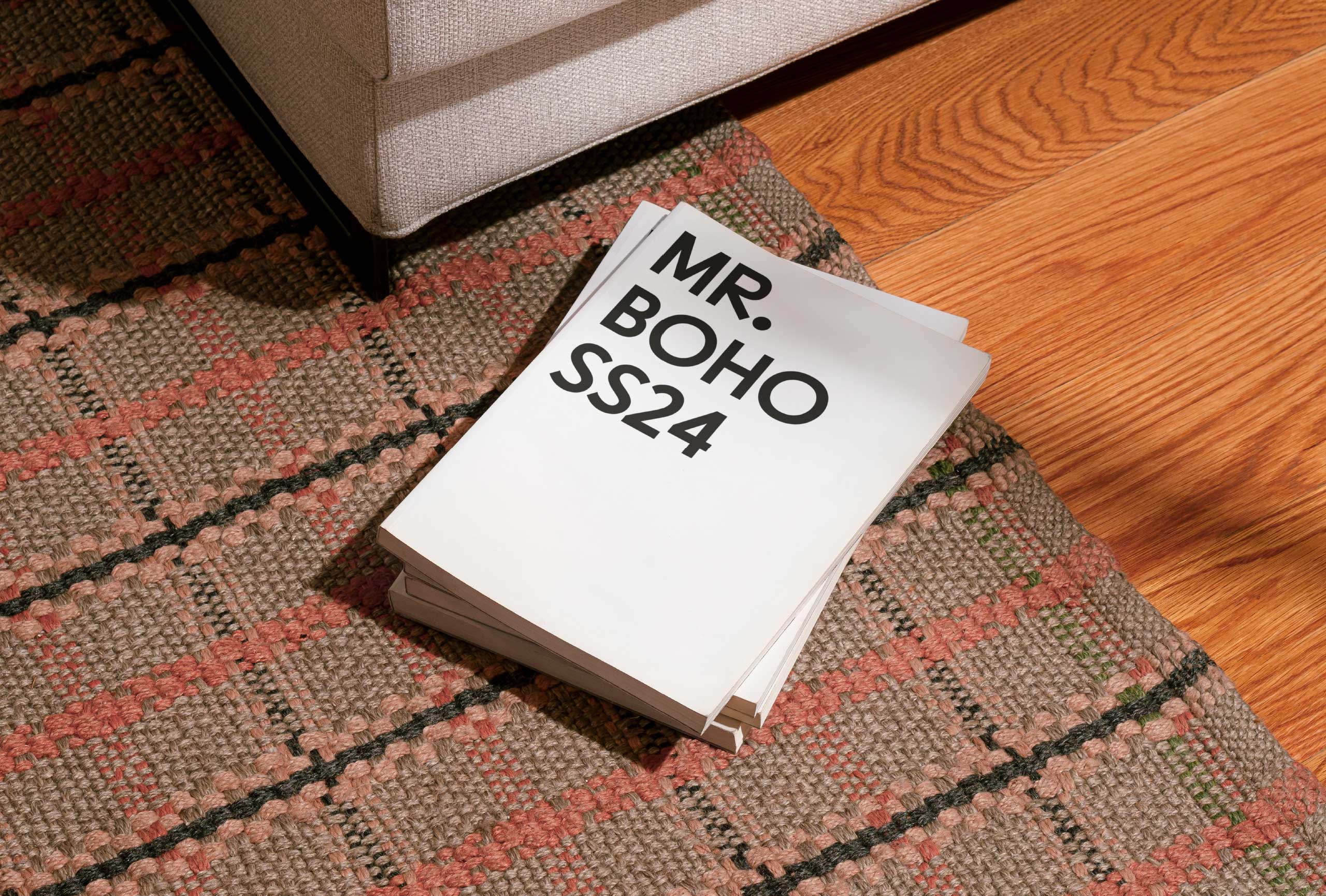
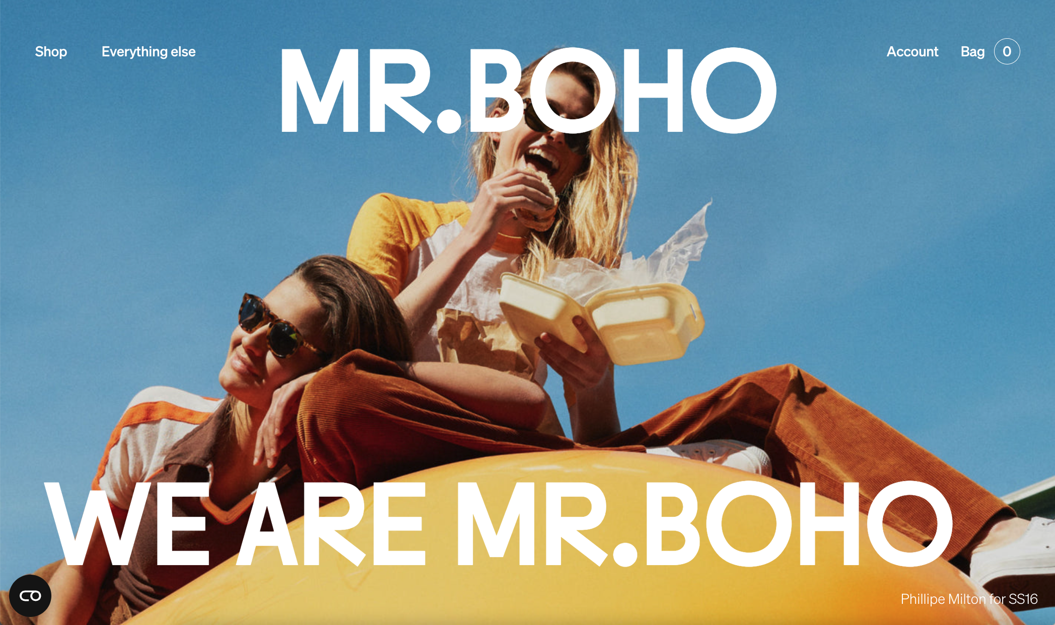
Custom typeface for the rebranding of MR.BOHO
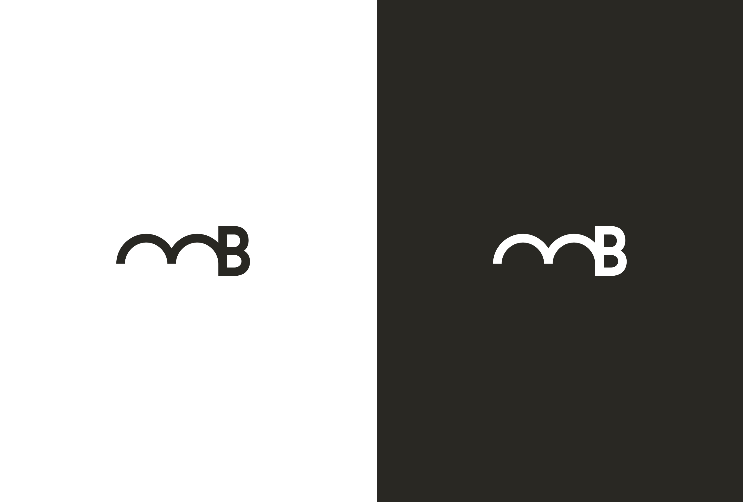
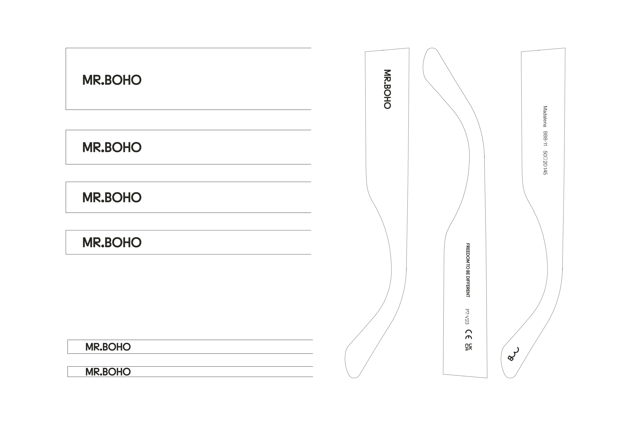
The design studio Buenaventura, from Granada, and Laura Meseguer worked together to redesign MR. BOHO, a new identity with an inuit spirit.
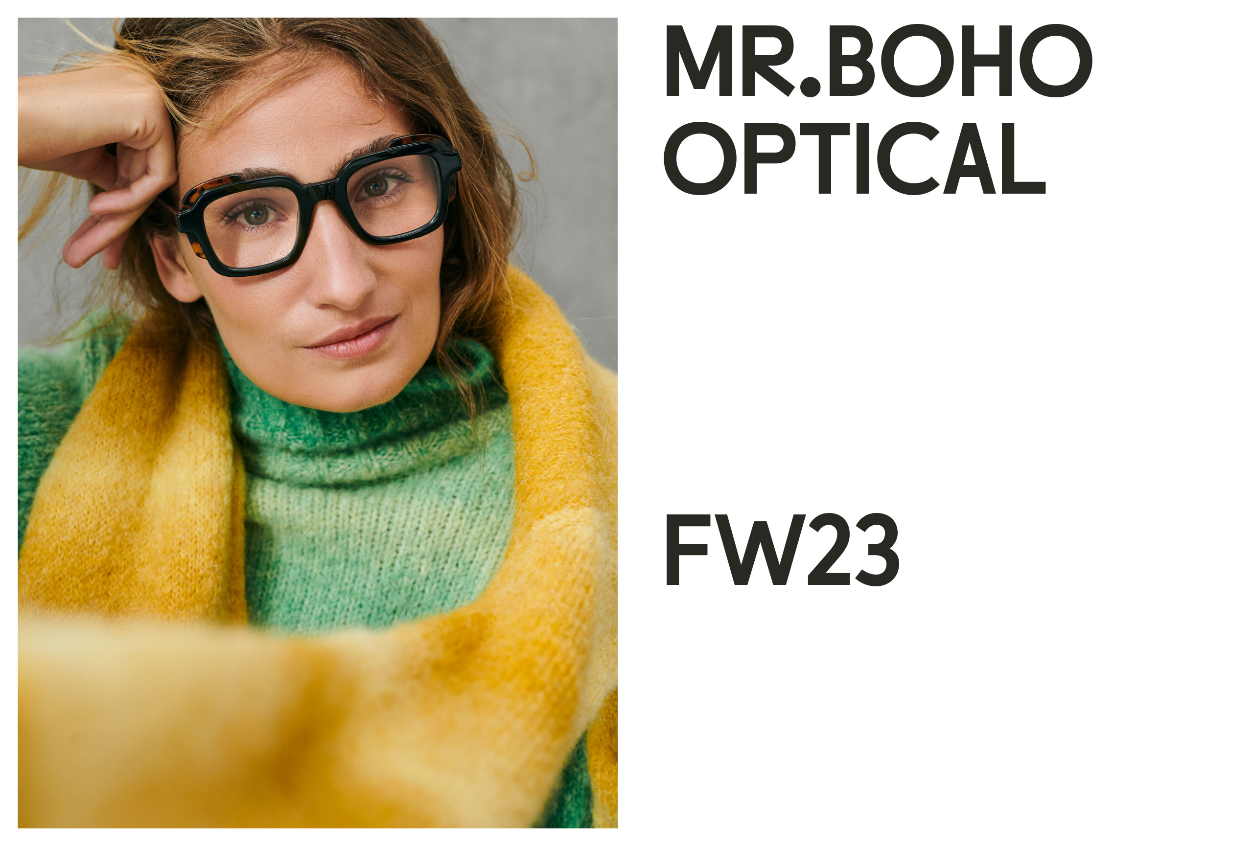
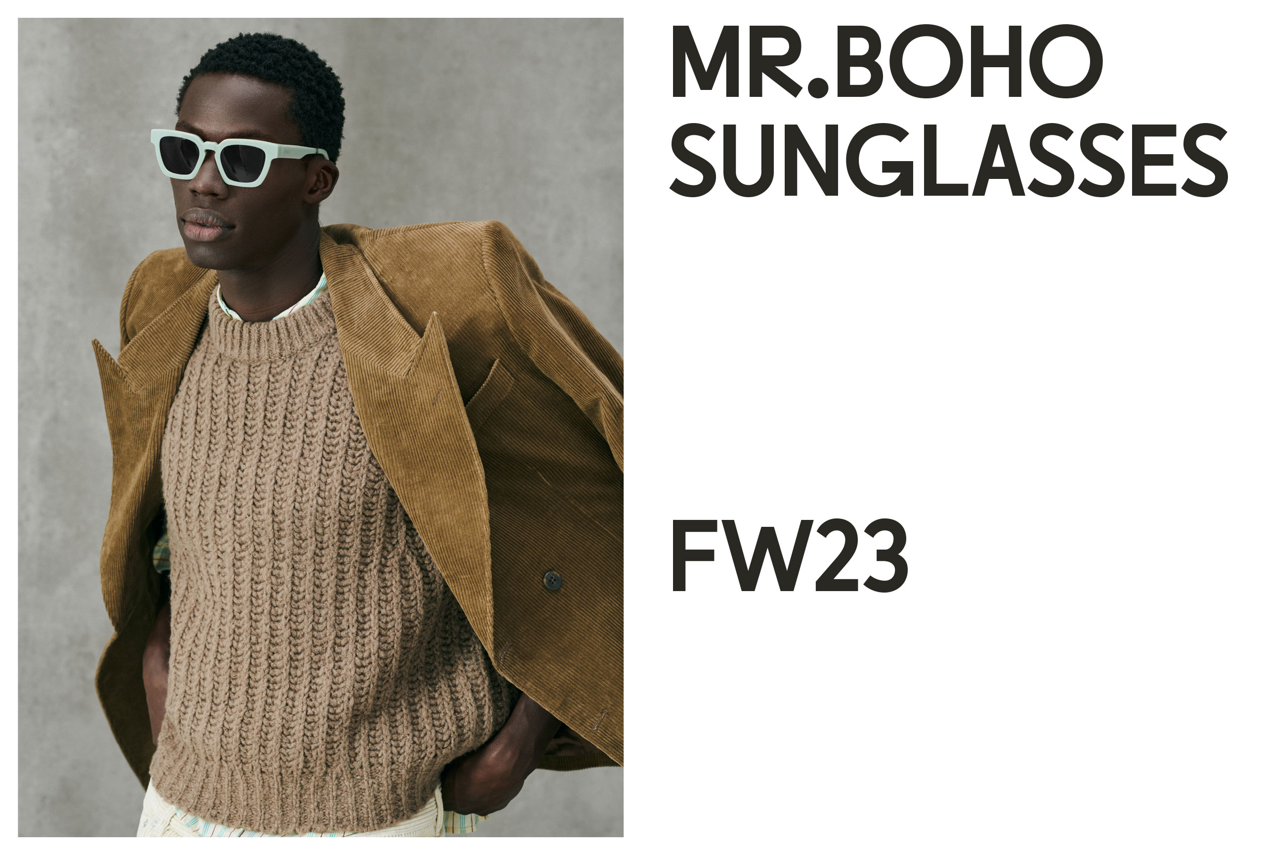
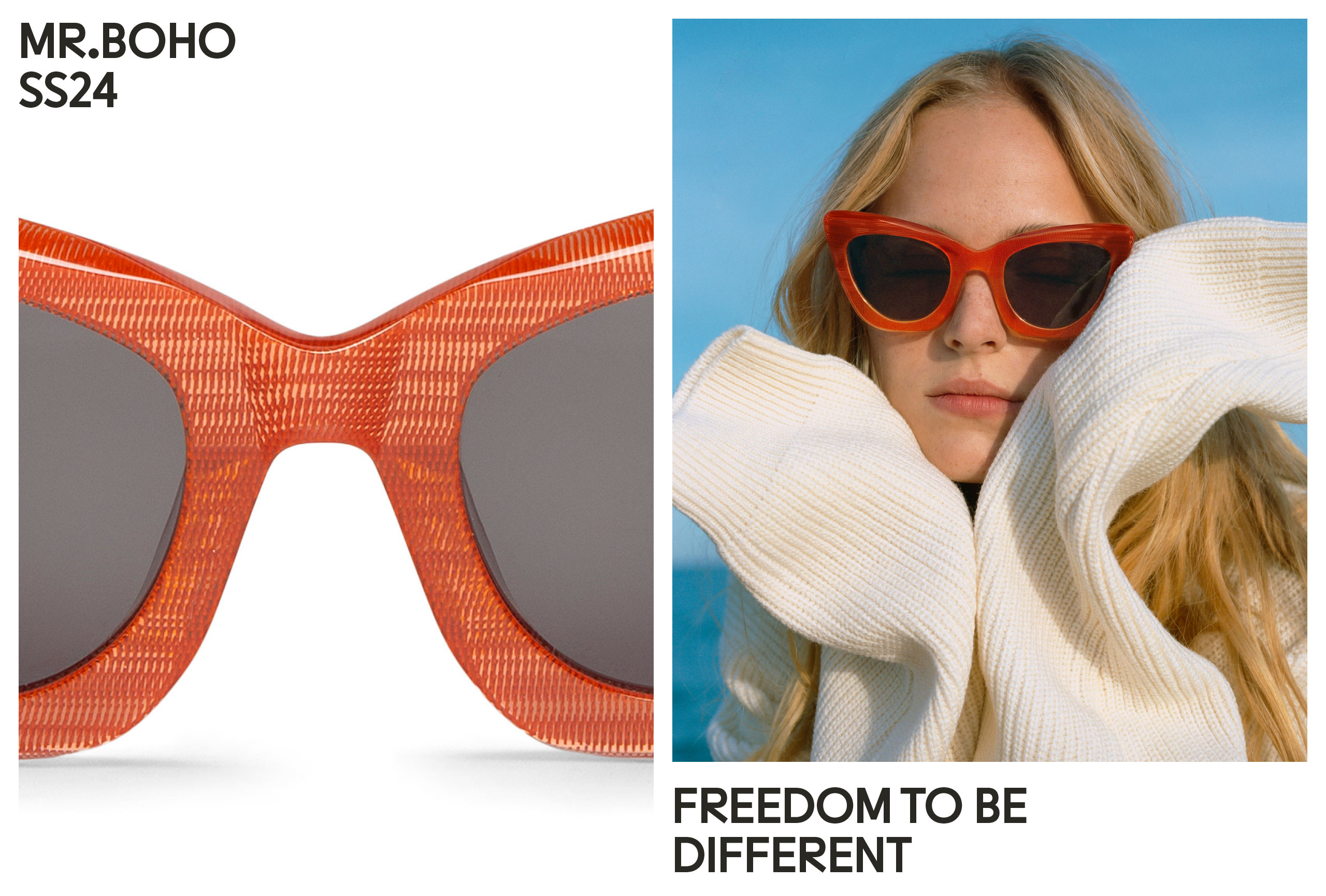
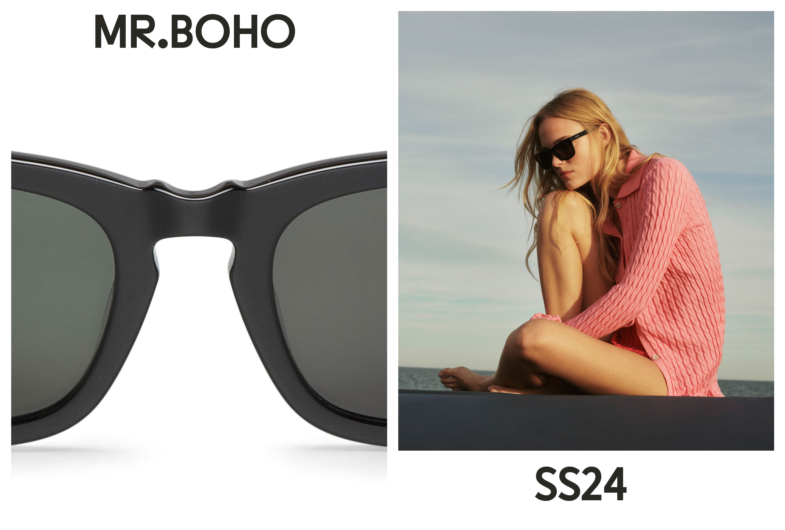
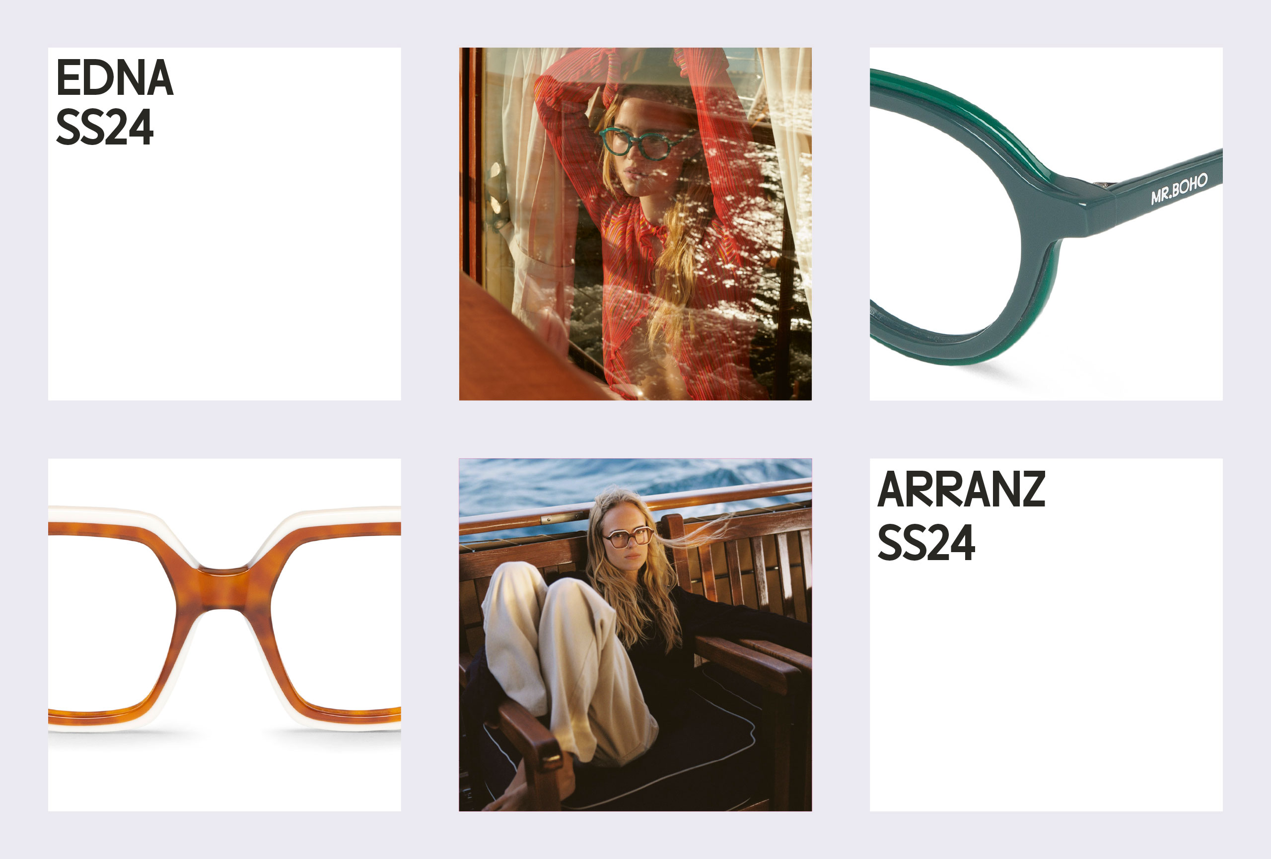
Founded in 2013, MR. BOHO is now a renowned eyewear brand known for its cosmopolitan, adventurous, and natural character. With a presence in over 40 countries, the brand focuses on providing quality Spanish design at an affordable price through its two collections of sunglasses and optical glasses. They needed a redesign to update their visual narrative to the current moment of the company.
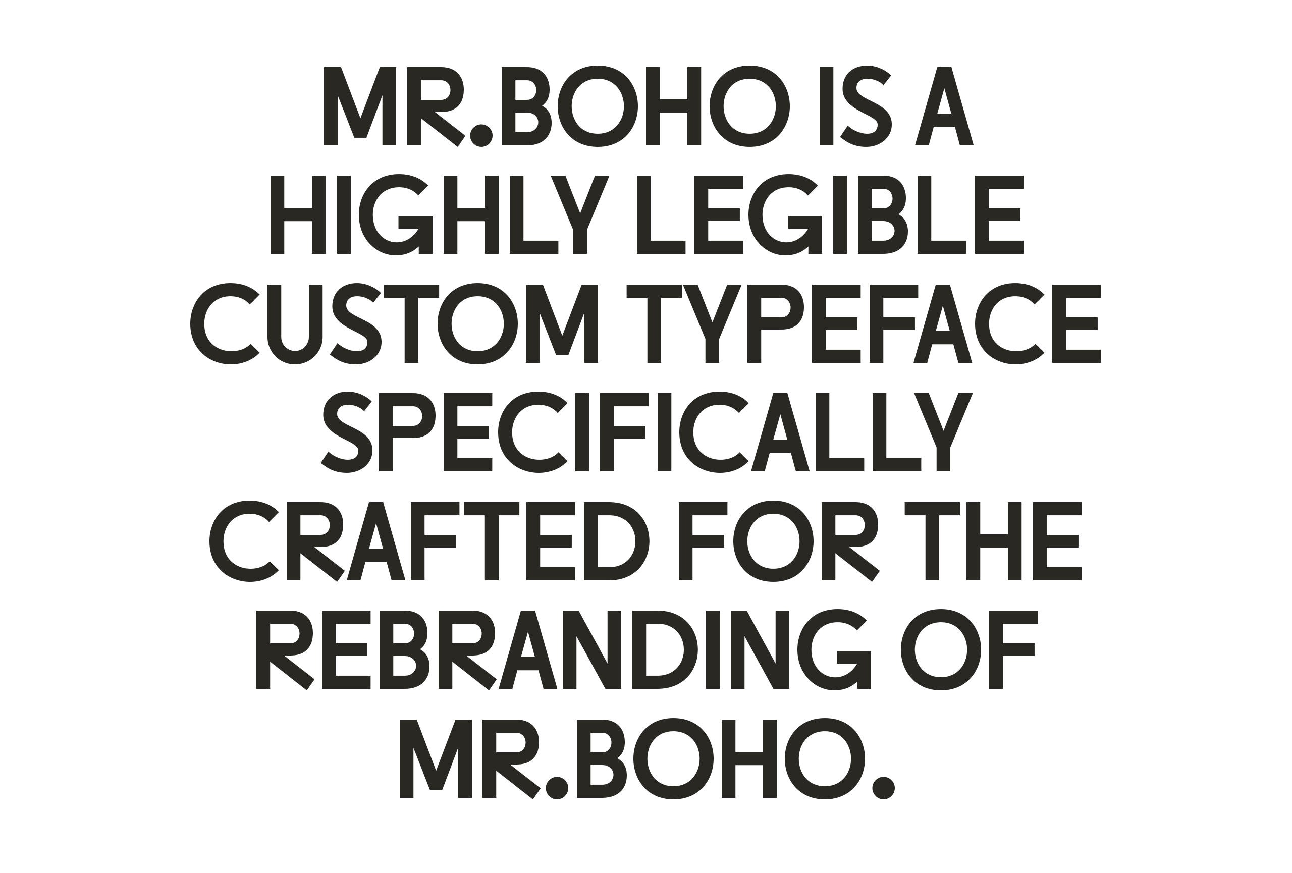
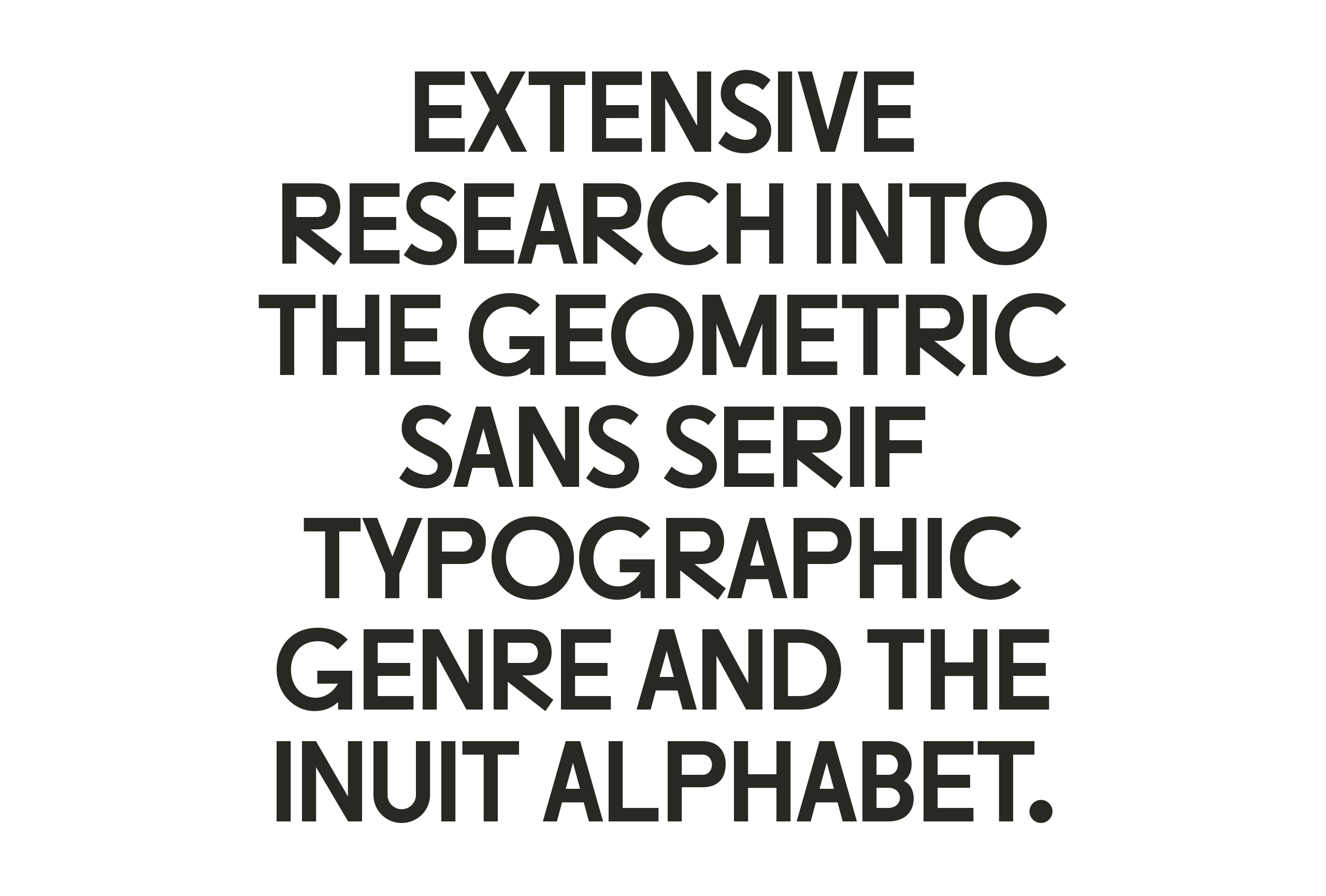
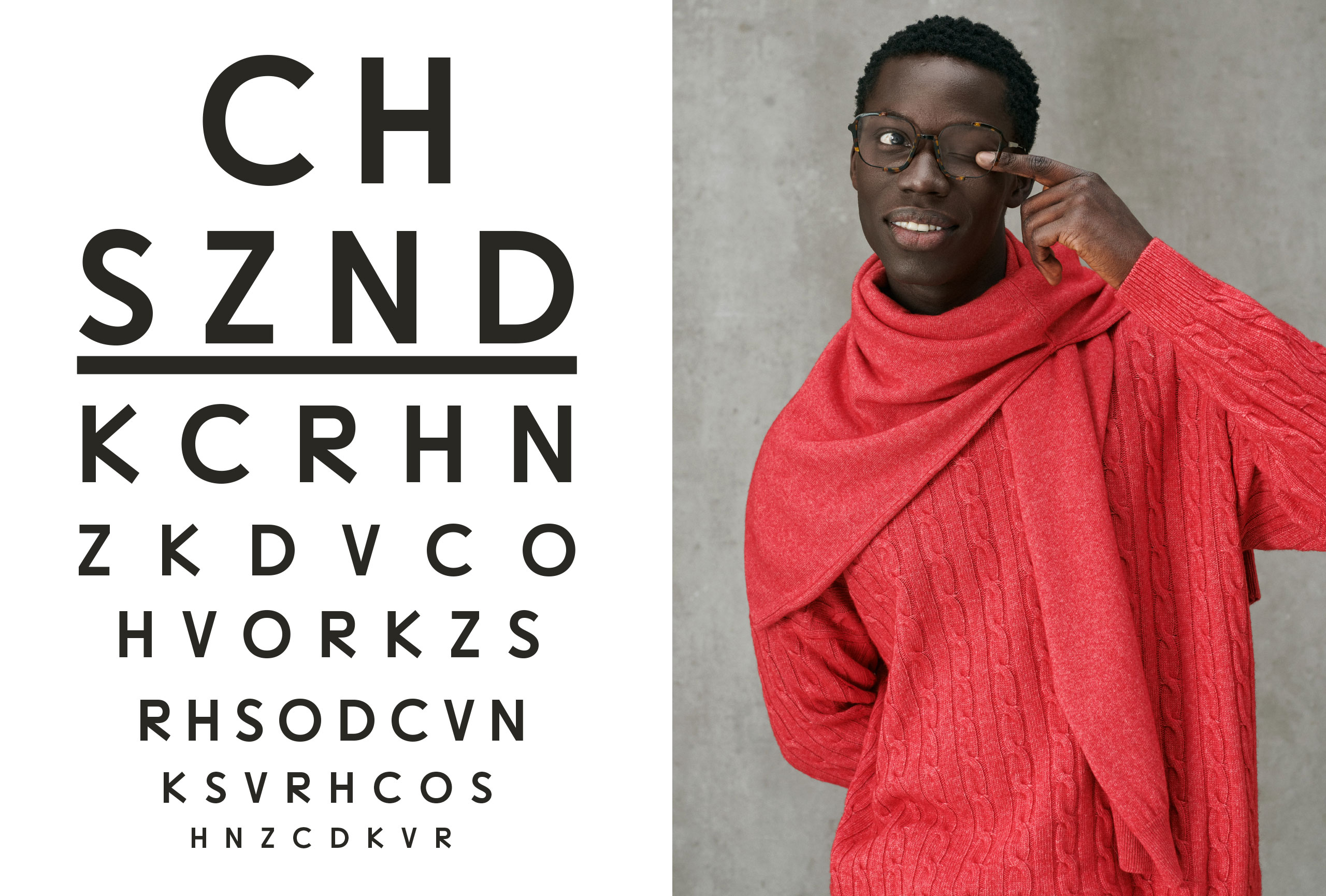
The proposal is based on creating a customized typeface, developed in collaboration, to establish a unique and exclusive visual language. The inspiration came from the roots of eye protection. Delving into the history of the first tools designed for this purpose, we discovered fascinating stories of ingenuity and creativity, such as those of the Inuit people. They devised clever ways to protect their eyes from the sun and its reflection on the snow. During our exploration of their culture, we immersed ourselves in the writing system used in Inuktitut, structured as an abugida.
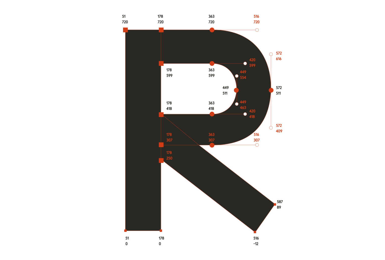
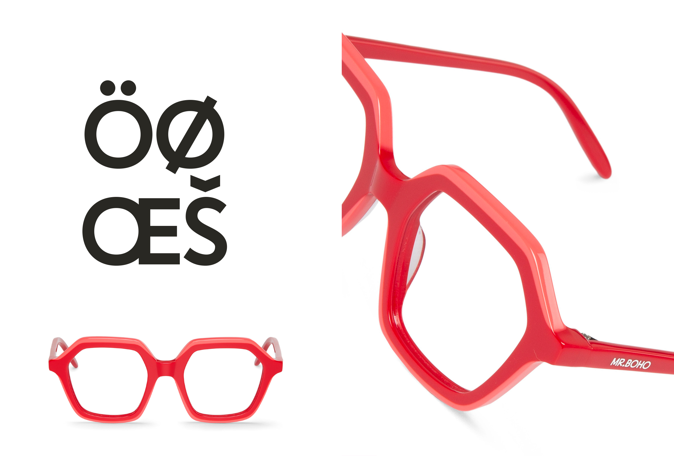
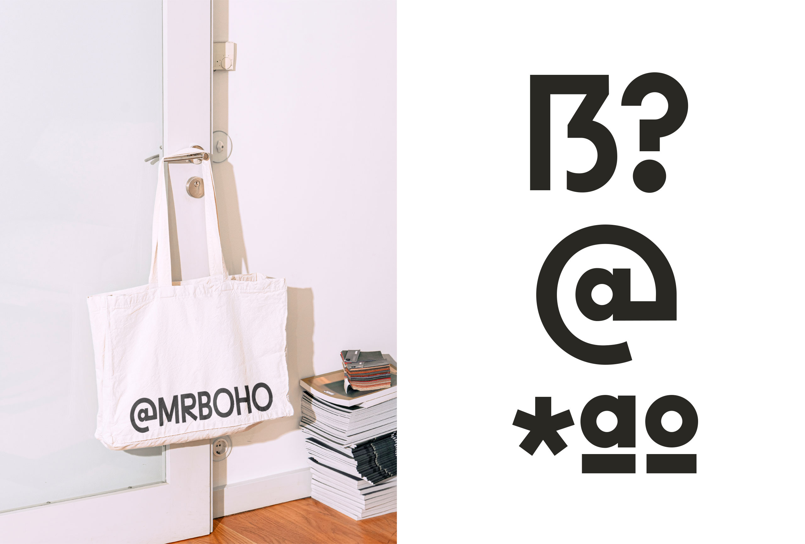
This abugida system is used by Inuktitut speakers, who generally inhabit the northern regions of Canada, in the areas of Nunavik and Nunatsiavut, in the provinces of Quebec and Labrador, respectively. In an abugida, glyphs represent combinations of consonants and syllables. This type of writing differs from systems like the Latin script, where each symbol represents an indivisible sound unit. The most distinctive feature of Canadian syllabics is their rotation system. The characters’ anatomy is predominantly based on geometric constructions with circular and square shapes, which rotate to change the vowel of each syllabic unit. We have tried to reflect this in the new brand font, which also mirrors the design principles adopted by MR. BOHO for their creations.
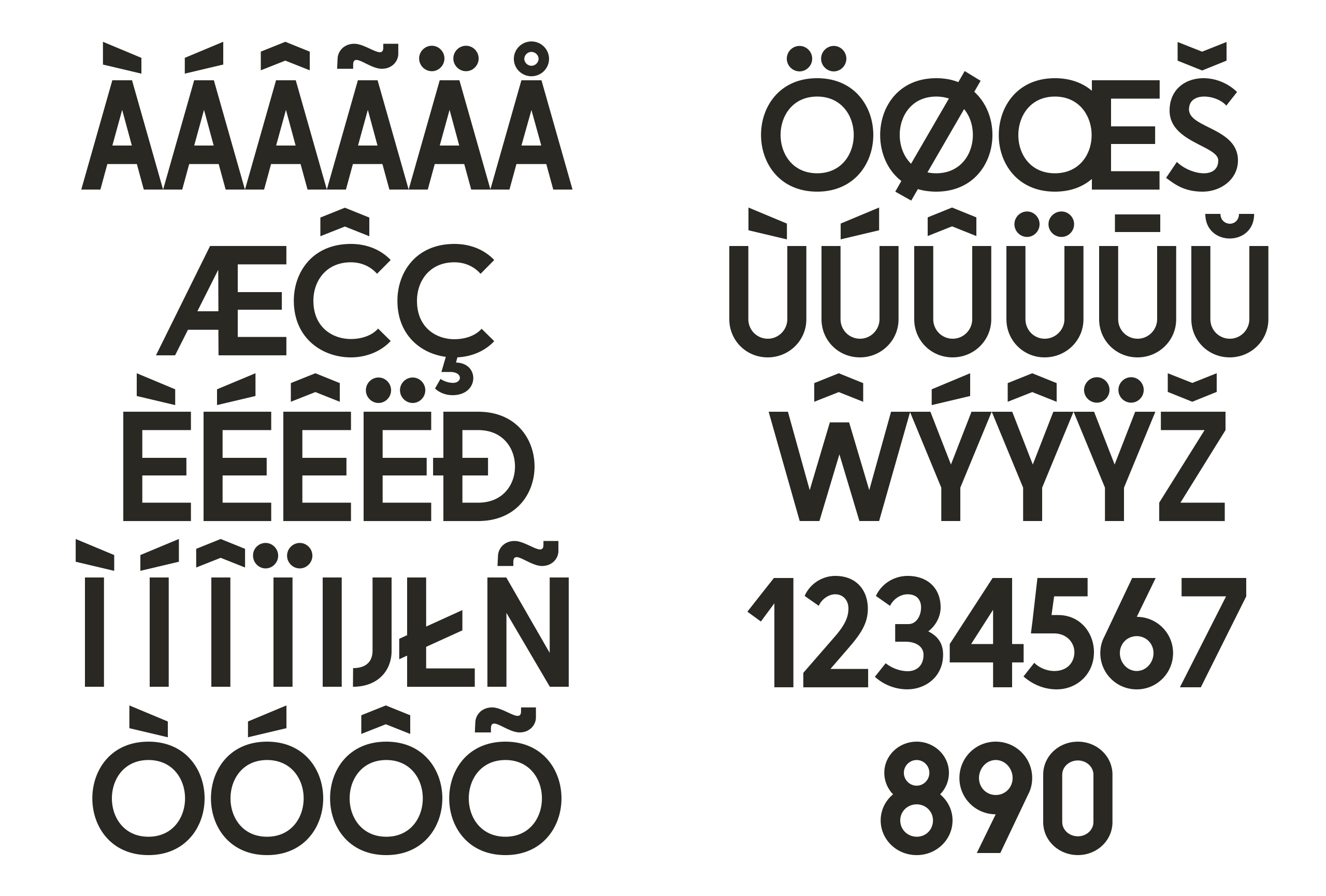
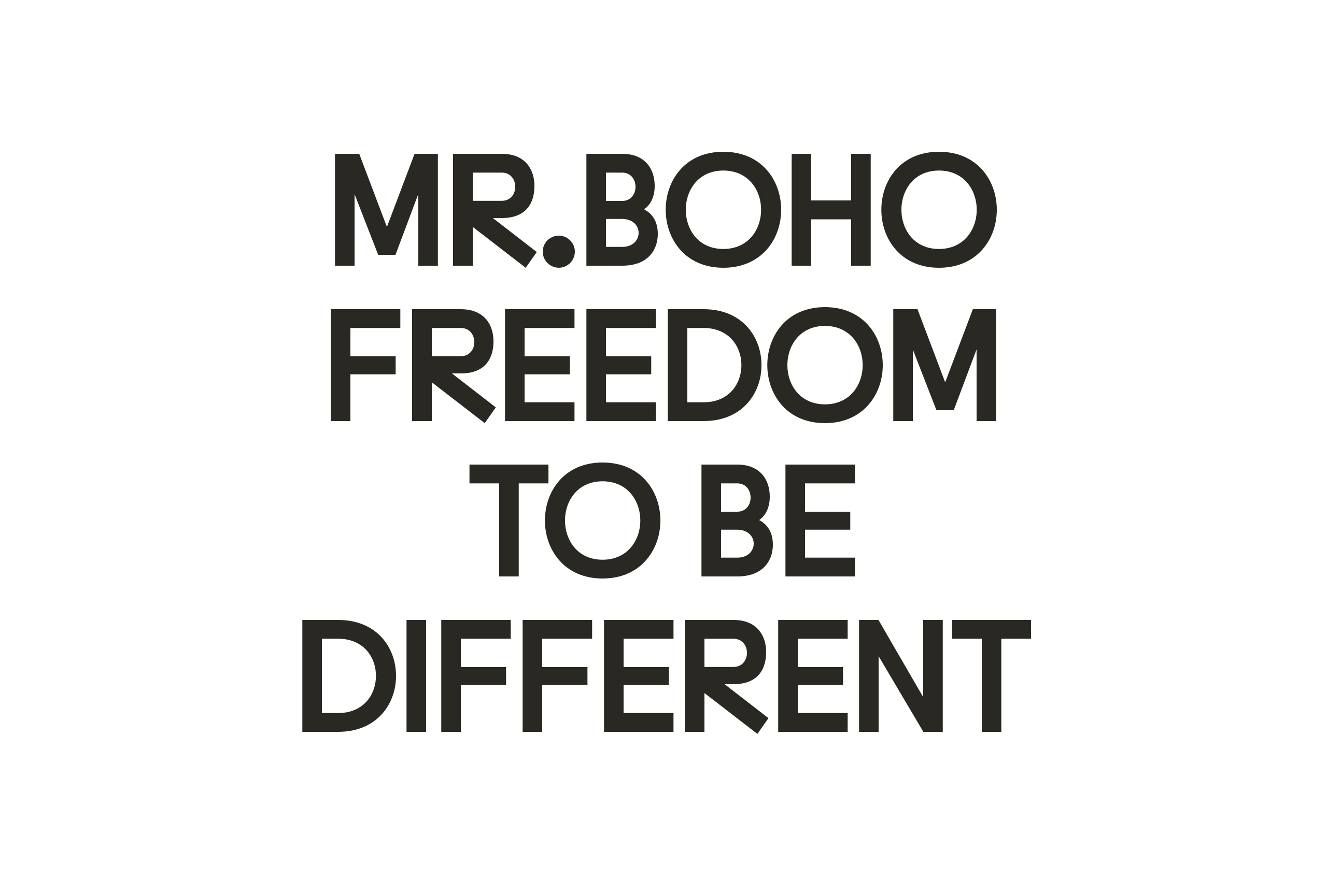
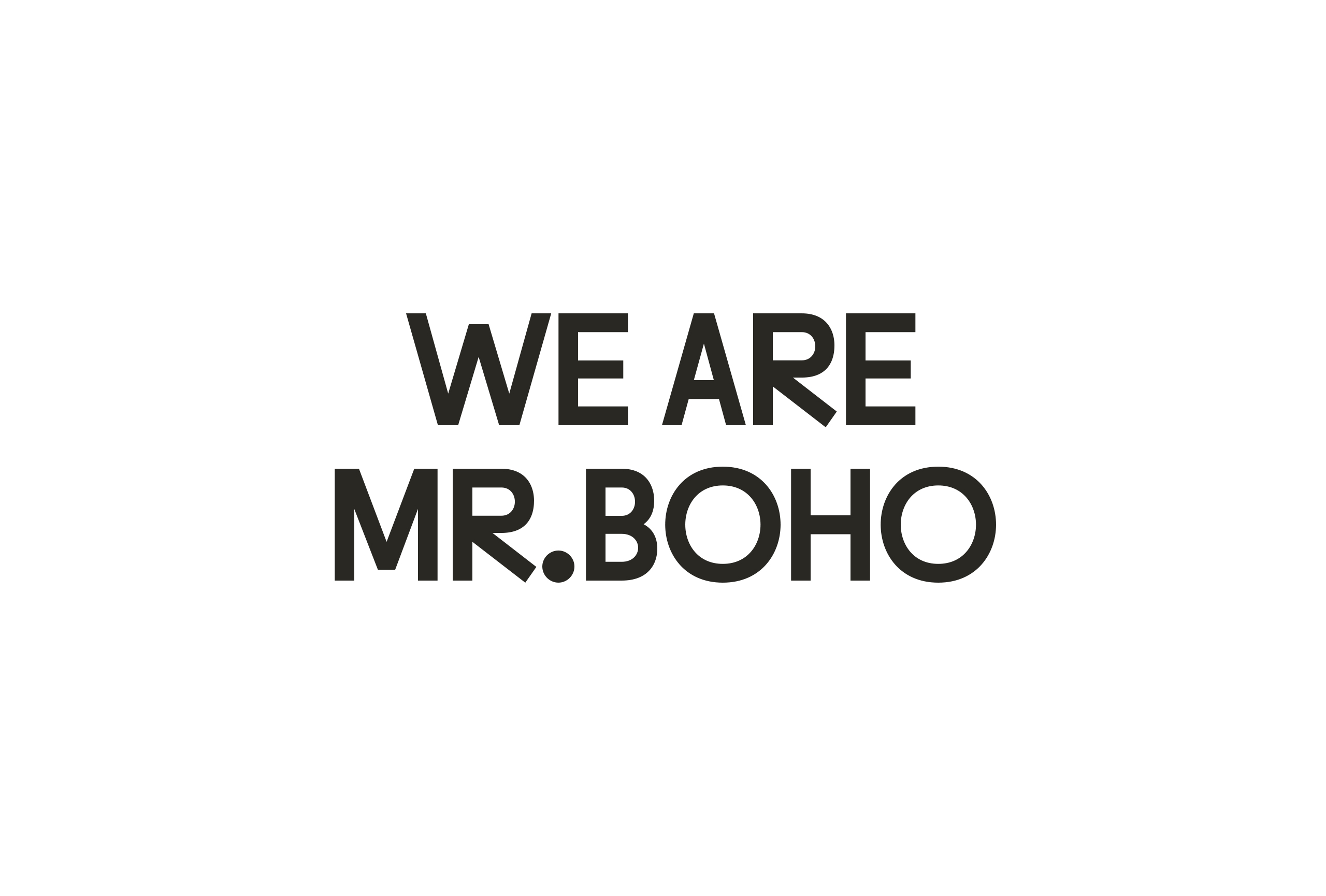
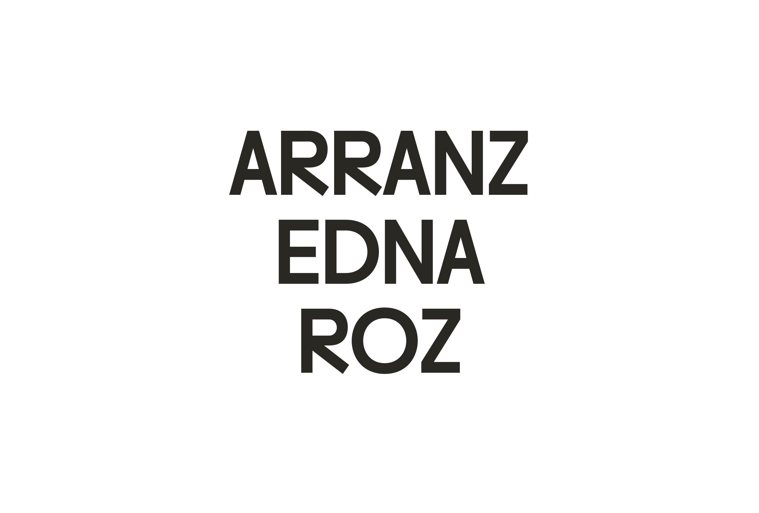
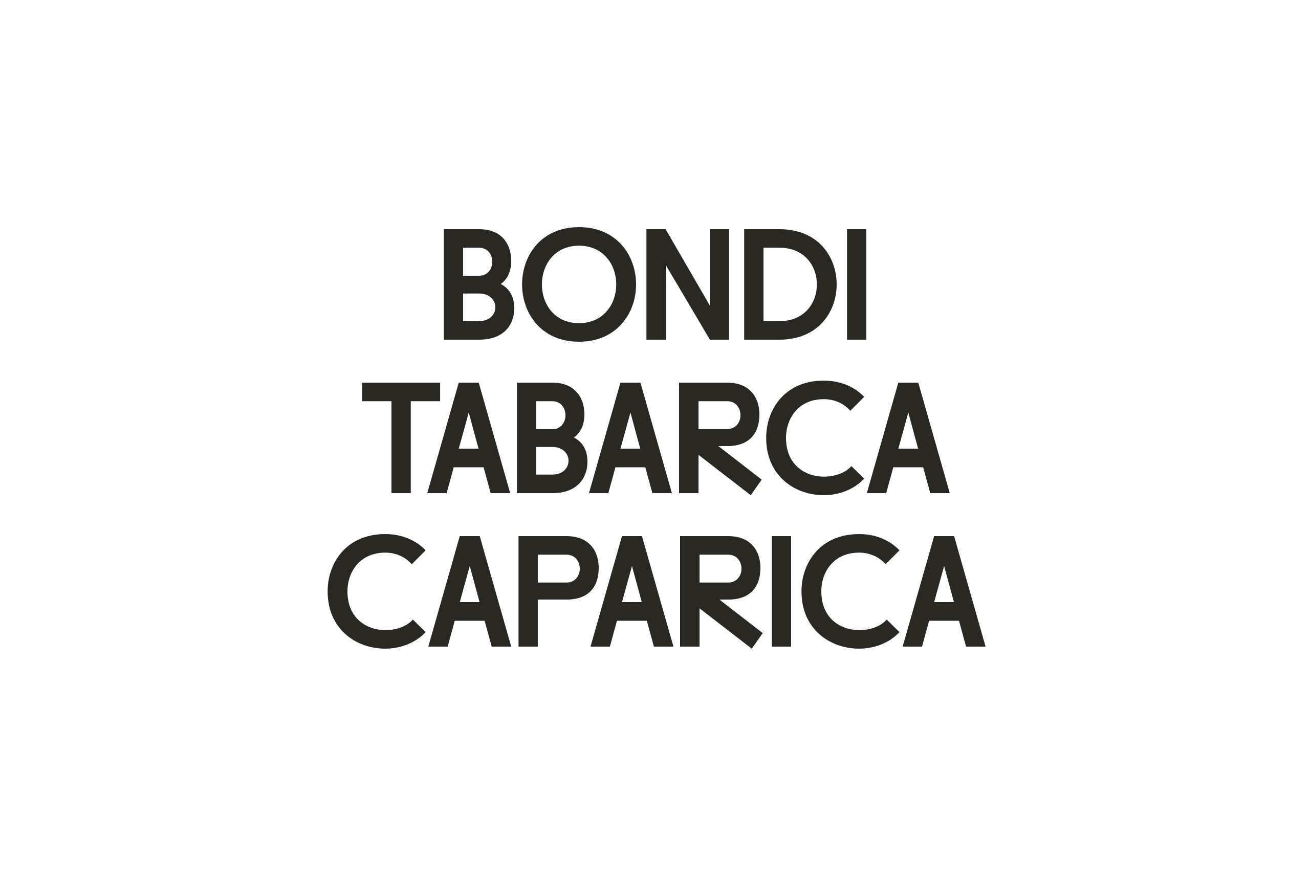
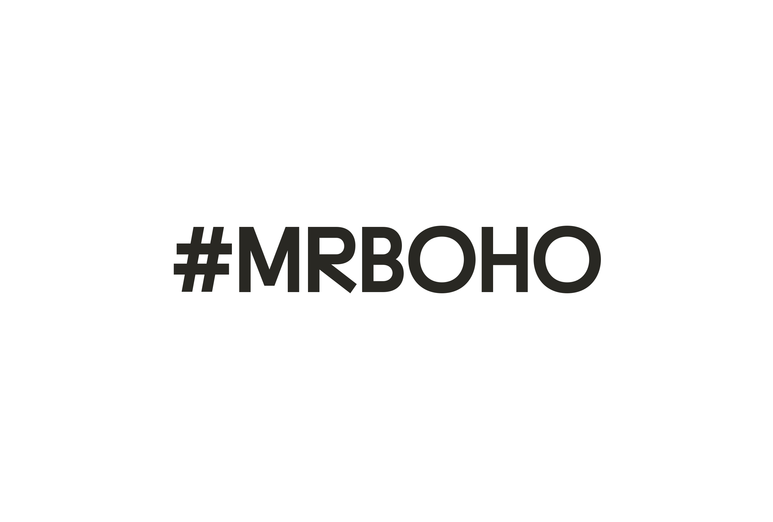
This new typeface, inspired by the Inuktitut writing system, is the heart of the rebranding. It brings a contemporary feel while establishing a connection with the past and history. Comprising a single weight, MR.BOHO does not include lowercase letters. The capital letters are designed with two ranges of widths, providing distinctiveness and making it well suited for various applications, including both print and digital contexts such as interface and app design.
Prizes: Silver Laus Award 2024 in the category of Corporative Typeface
MR BOHO Case Study (link to Vimeo)
For more information about the Inuktitut writing system:
https://github.com/typotheque/syllabics-knowledge
Type Engineering: Joancarles Casasín
Review of the texts: Hector Mangas
Photography: Georgina Millet