




Multi, rejuvenating the Sans Serif for editorial design
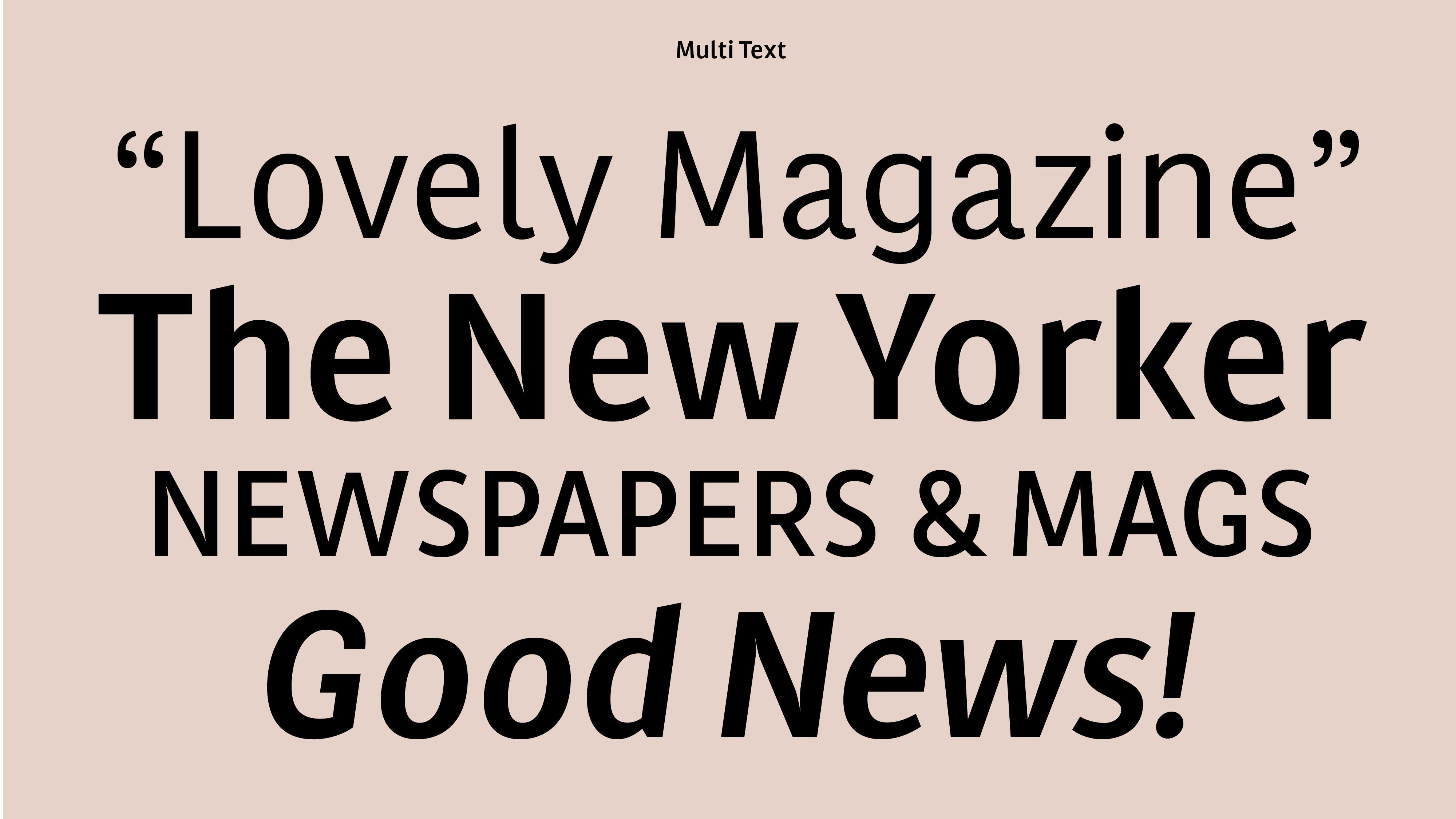
Multi, the first extensive typeface family created by Laura, was initially commissioned in 2011 for the redesign of Dutch regional newspapers. The project’s objective was to complement the serif typefaces used (Lexicon and Tiempos) for a comprehensive layout overhaul, under the supervision of editorial art director Luis Mendo. The client specified clear attributes for the typeface: warm, dynamic, optimistic, friendly, and human. The project resulted in the creation of two series: Multi Text (featuring two weights in roman & italic) and Multi Headline (comprising six weights in roman).
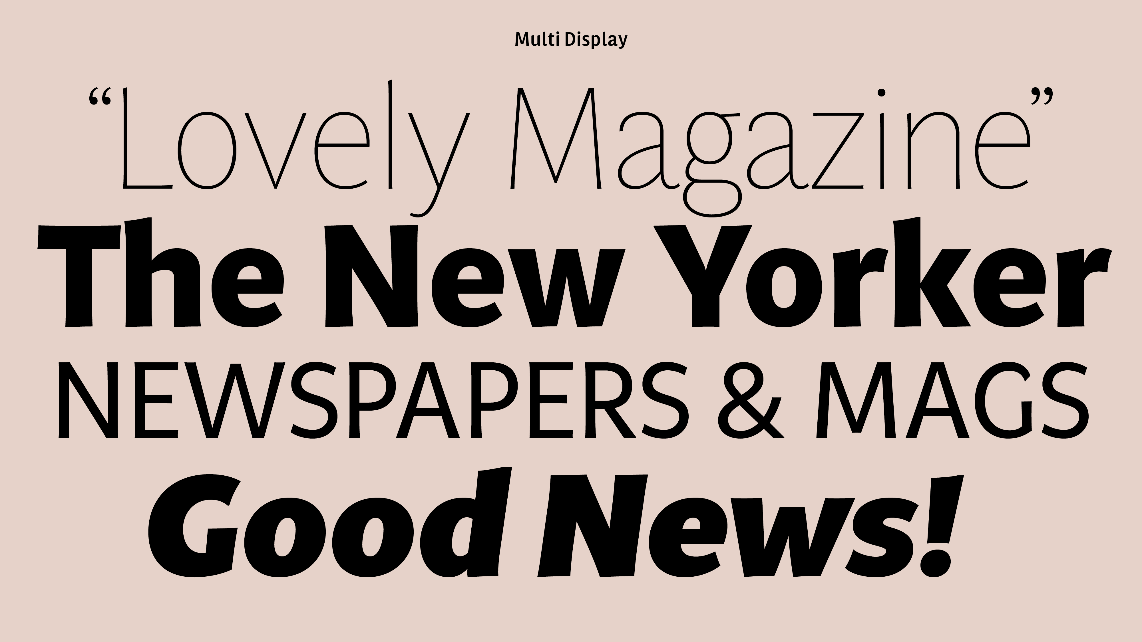
For the retail version, developed some years later, Laura expanded the character set and the family, alongside implementing several modifications. Multi Text includes three weights (in both roman & italic), and Multi Headline was rebranded as Multi Display, offering seven weights in both roman & italic.
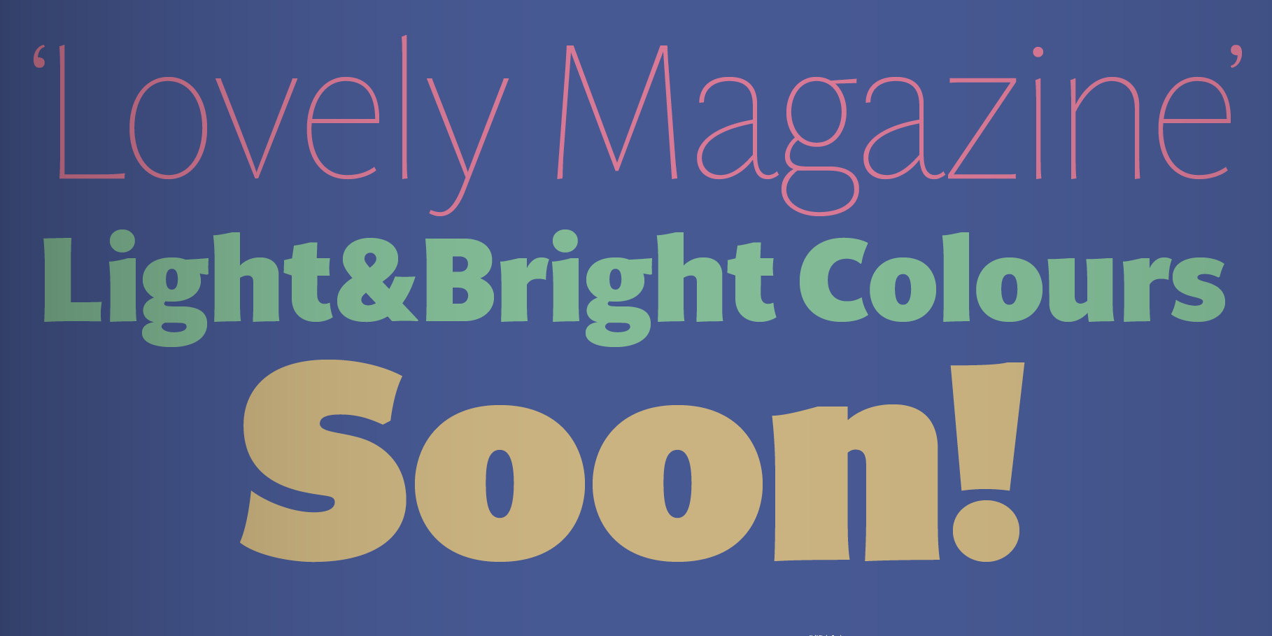
Multi exudes vitality. It possesses a distinctive ‘phrasing’ in the musical sense, residing in a unique space between humanist and glyphic styles, exploring uncharted design territories. The overall design is pragmatic yet not overly rigid, featuring subtle incised touches that add a touch of flair. This distinctive character is particularly evident in Multi Display, where the roman lowercase letters exhibit softly tapered, asymmetric stems with bevelled, sharp upstrokes. Notably, these idiosyncrasies are consistently shared across all weights, ranging from Thin to Poster. In Multi Text, deliberate adjustments were made, including lower contrast, wider proportions, and shorter ascenders and descenders, to cater to the legibility requirements for both paper and screen. Additionally, Multi Text introduces new features such as the outstrokes of the roman ‘l’ and the italic ‘a,’ which contribute a subtle calligraphic touch to the flow of text.
You can see Multi Text in use in this site as the “navigating” typeface. Probably one of the most iconic is Leer Madrid. A project developed by Applied Wayfinding and Avanti-Aavanti as local team.
Client: NCR Media Group, later adquired by Mediahuis Nederland
Type Designer: Laura Meseguer
Art Direction: Luis Mendo
Programming and production: Joancarles Casasín and Noe Blanco.
—
Prizes & Mentions
Favourite typefaces of 2016 at Typographica
Read the review by Yves Peters.