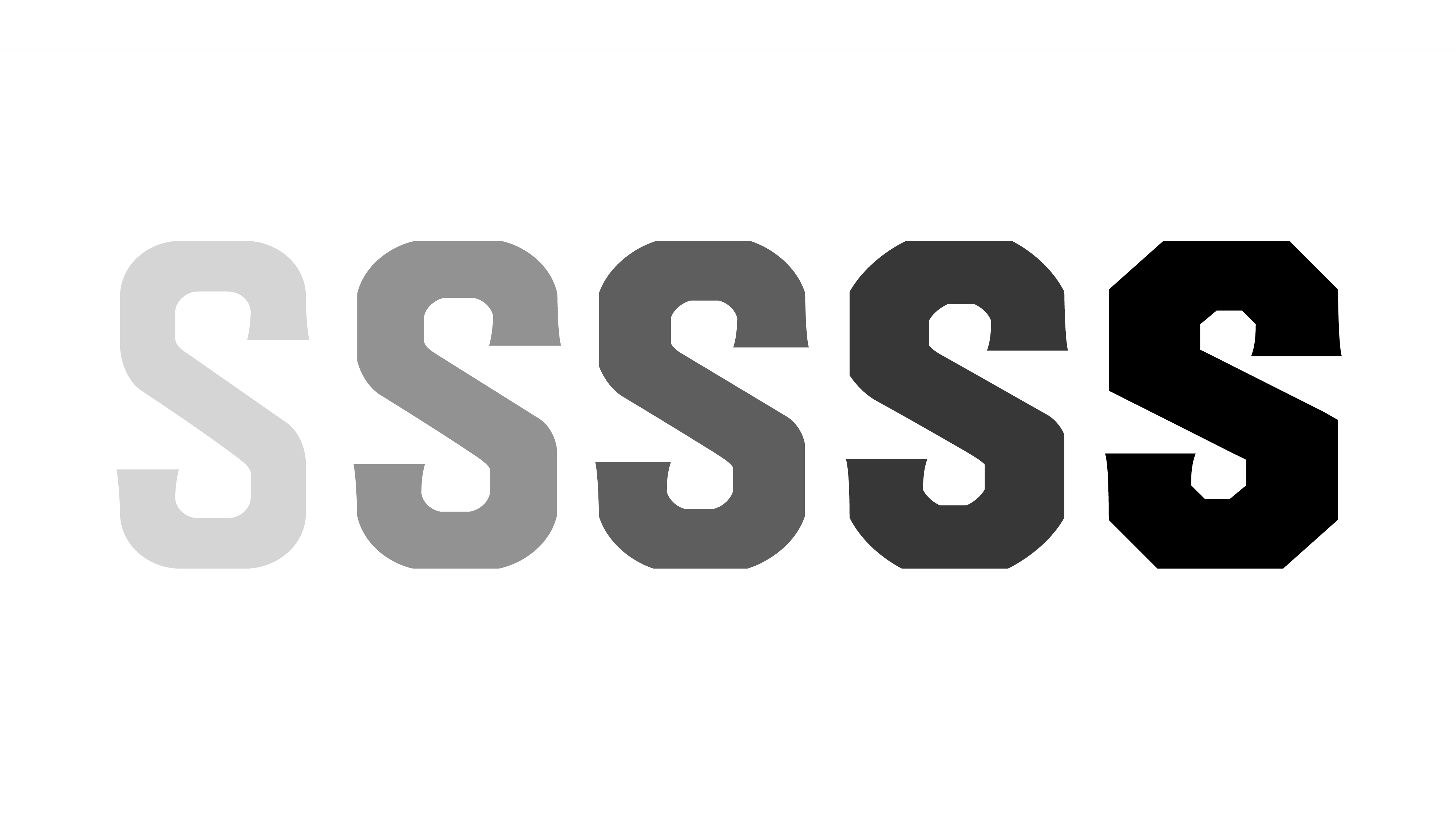

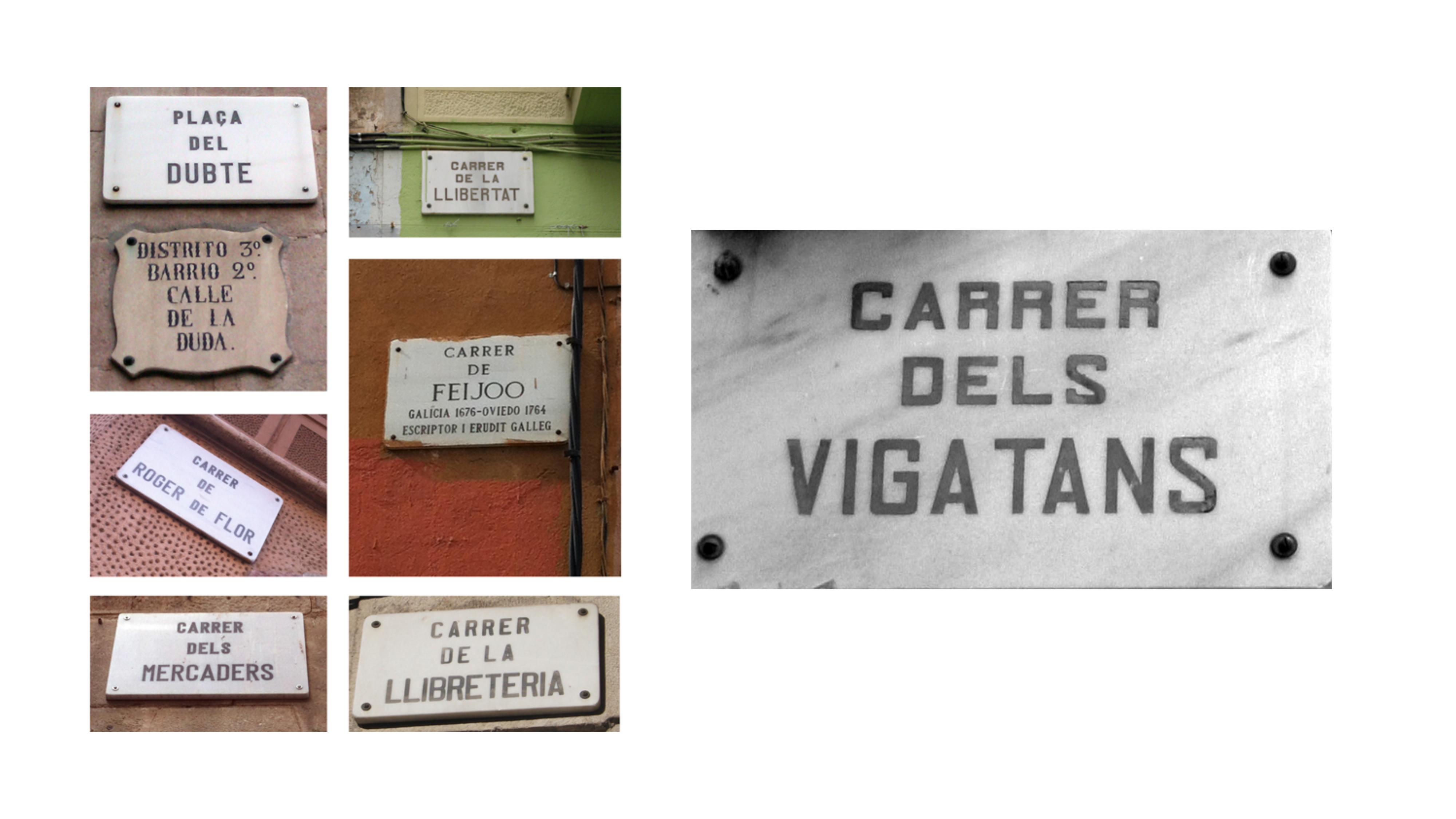
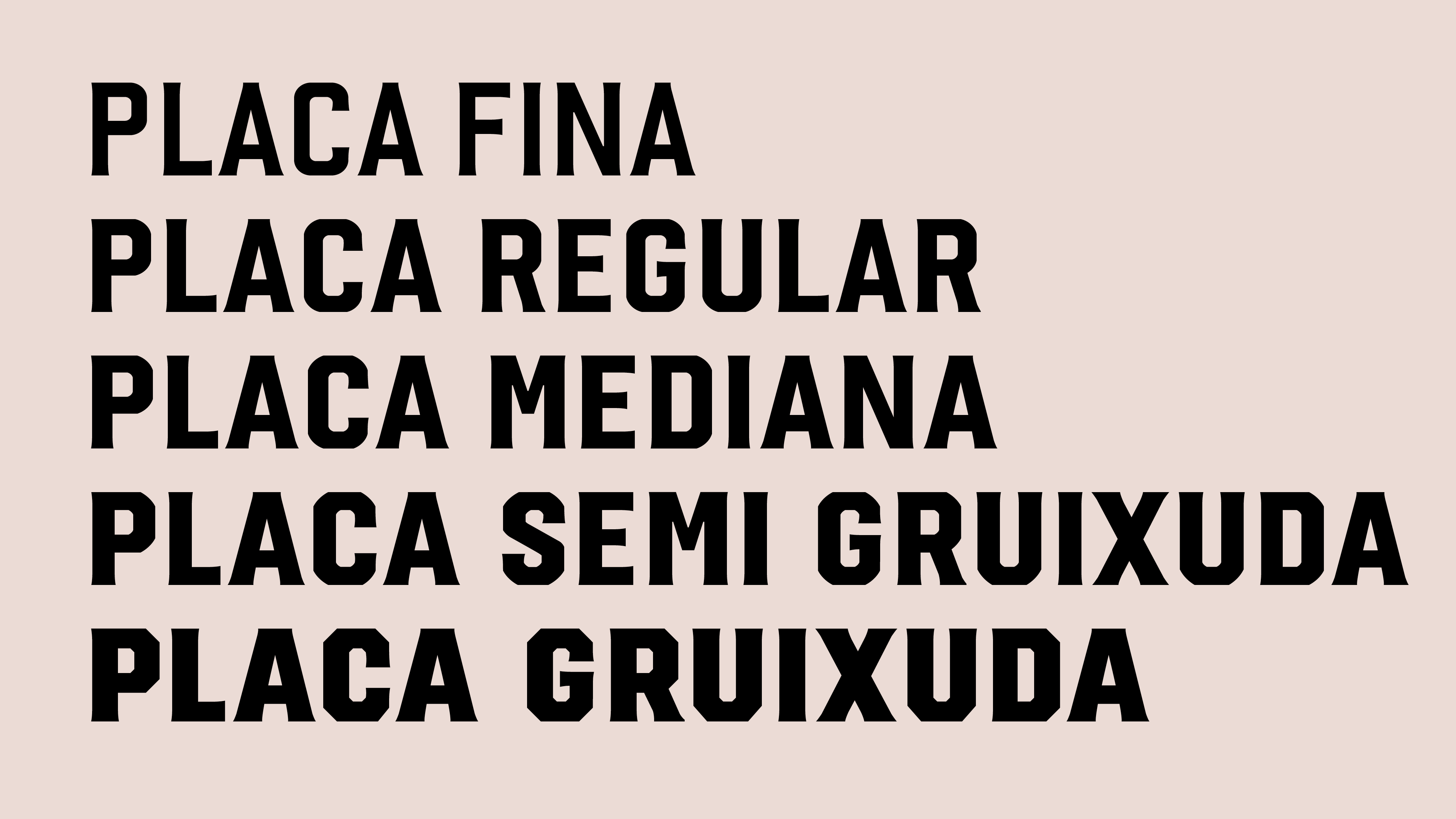


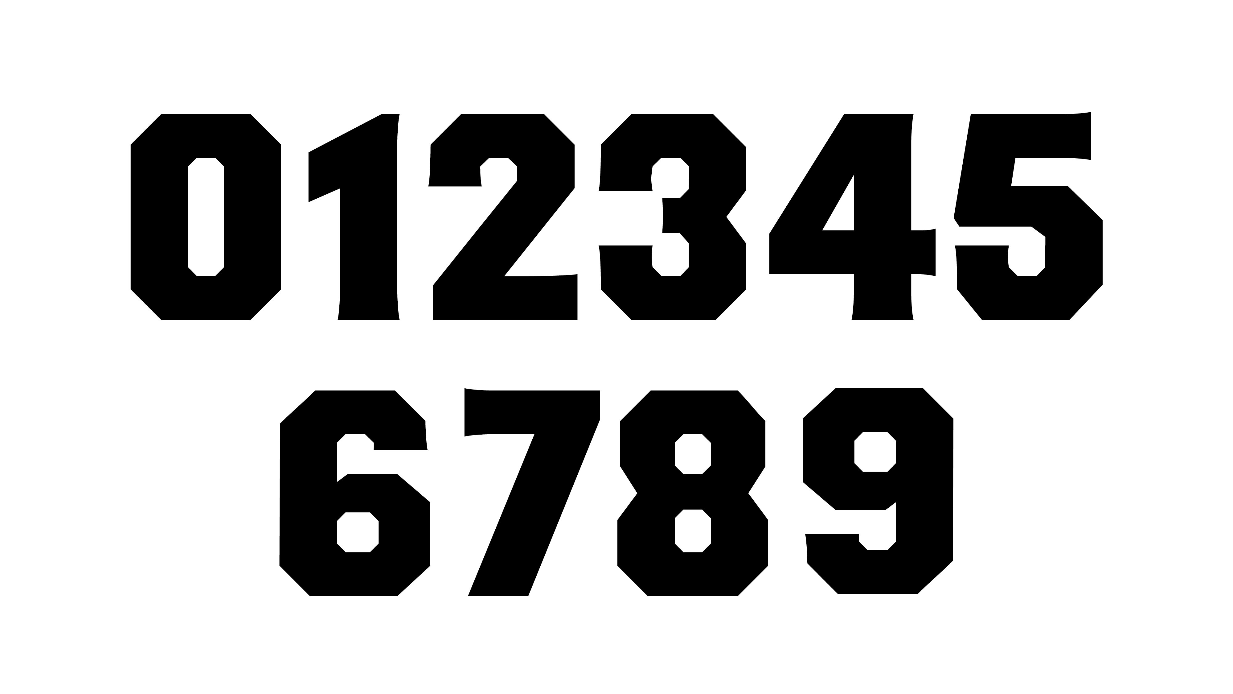
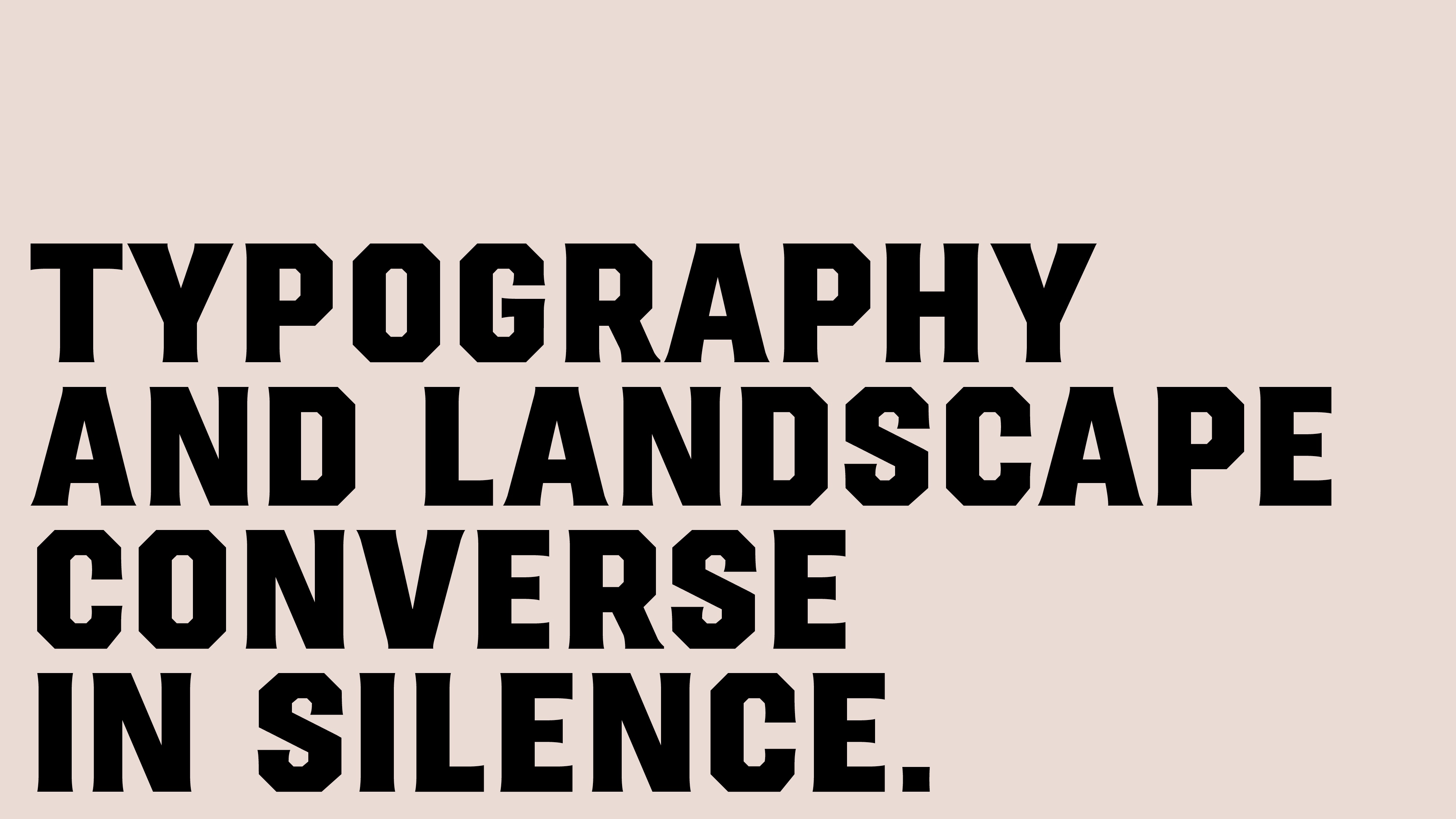
Placa is Laura’s typographic interpretation of the most prevalent lettering style found on Barcelona’s street signs.
The origin
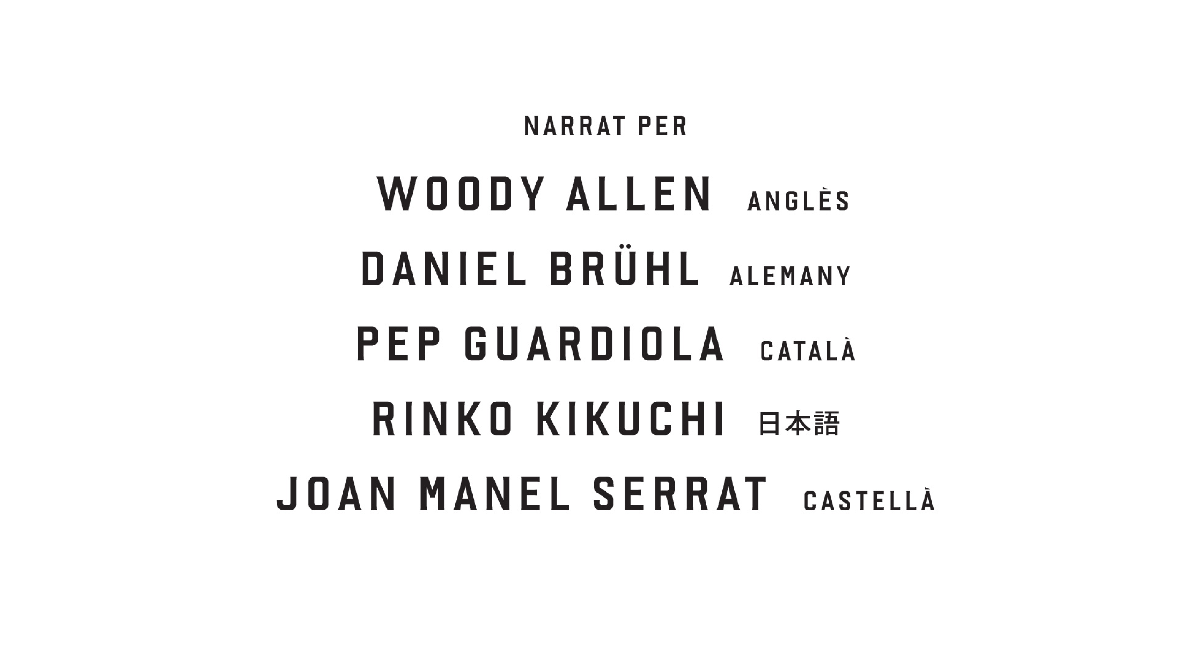
The development of the PLACA typeface family took place in two distinct phases, beginning as a specific commission for the documentary ‘Barcelona. The Rose of Fire’. This project, a collaboration between Mariona Omedes of Nueve Ojos and Media Pro’s production team, directed by Manuel Huerga, aimed to immerse the viewer in a 3D journey through the city of Barcelona. Music, three-dimensional sound, and narration in multiple languages were also key elements. Here you can watch the trailer.
The objective was to create a typeface that represented Barcelona. The key question was: Which typeface would best represent the city? At the time, and still today, Barcelona lacked a clear and strong typographic identity. Inspiration came from the streets of Barcelona were Laura identified that the predominant typeface in signage was a condensed geometric sans serif. The result was an incised sans serif typeface, designed with stylistic details that make it stand out in display use while remaining functional and readable.
Expansion as PLACA Typeface Family
Years later, Laura decided to revitalize Rosa de Foc, expanding it into a complete typeface family. The PLACA family now ranges from Final (Light) to Gruixuda (Black) styles and includes a Variable Font, improving its performance in small sizes and on screens. It is also used as a custom typeface on her personal website. The name Placa, meaning “Plate” in both Spanish and Catalan, was chosen in a conversation with Ferran from Toormix.
Third Phase: Expansion of the character set
PLACA is now available for licensing at Type-Ø-Tones
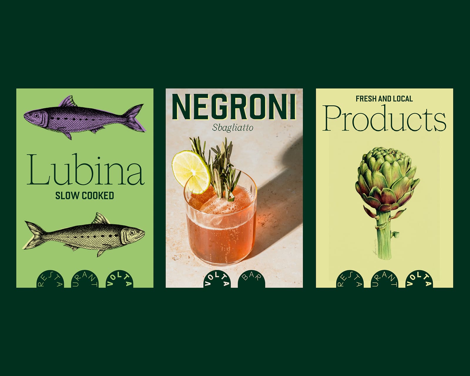
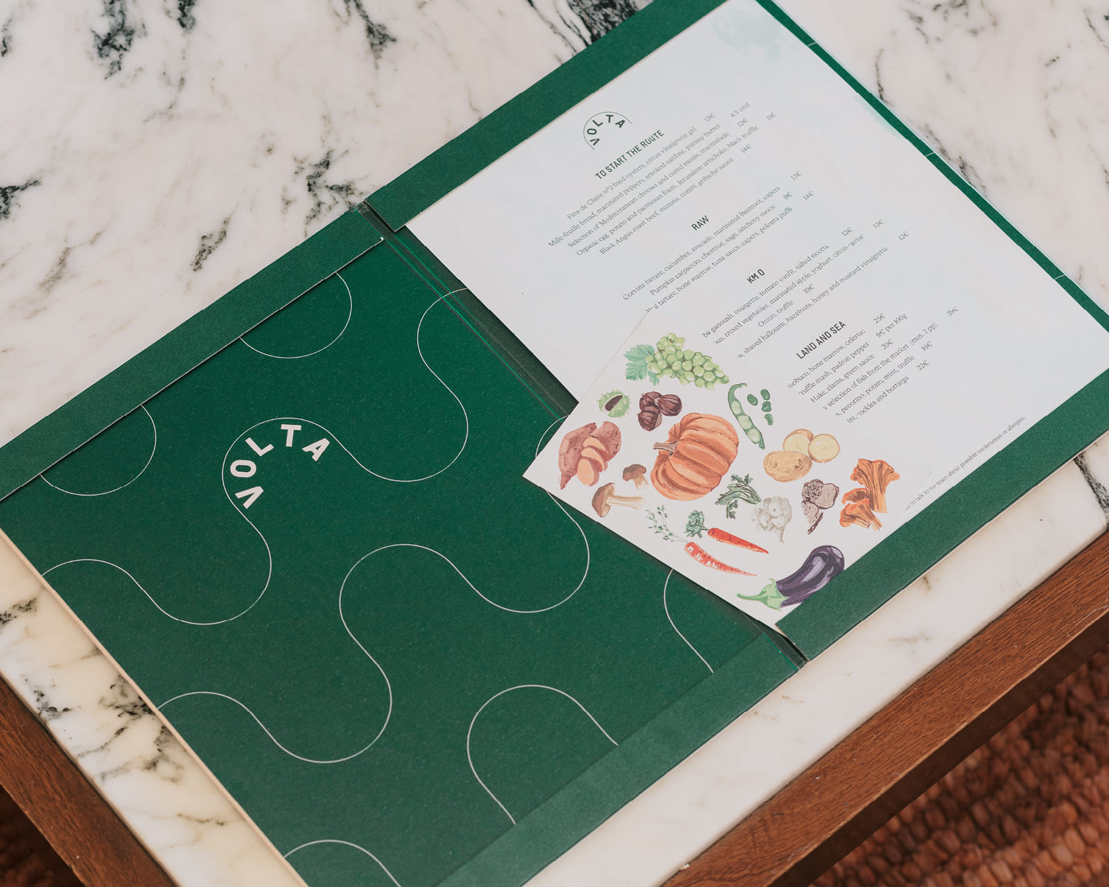
Placa in use: Visual identity in «Volta», designed by Toormix
The restaurant «Volta», located in Hotel Borneta, features a visual identity where typography plays a key role. The project incorporates Cigars serif typeface conbined with PLACA, as it was inspired by Barcelona’s street name plaques, reinforcing its local connection.The curved logo composition echoes the vaulted arches of Porxos d’en Xifré, symbolizing both the architectural space and the idea of a culinary journey. The typeface integrates seamlessly with a fresh, dynamic visual system, complemented by vibrant colors and subtle illustrations. You can see it here Restaurant Volta
Type designer: Laura Meseguer
Engineering: Rainer Erich Scheichelbauer
——
Prizes: Bronze Laus Award 2026 in the category of Typeface Family