Custom typefaces for Productos Baixens
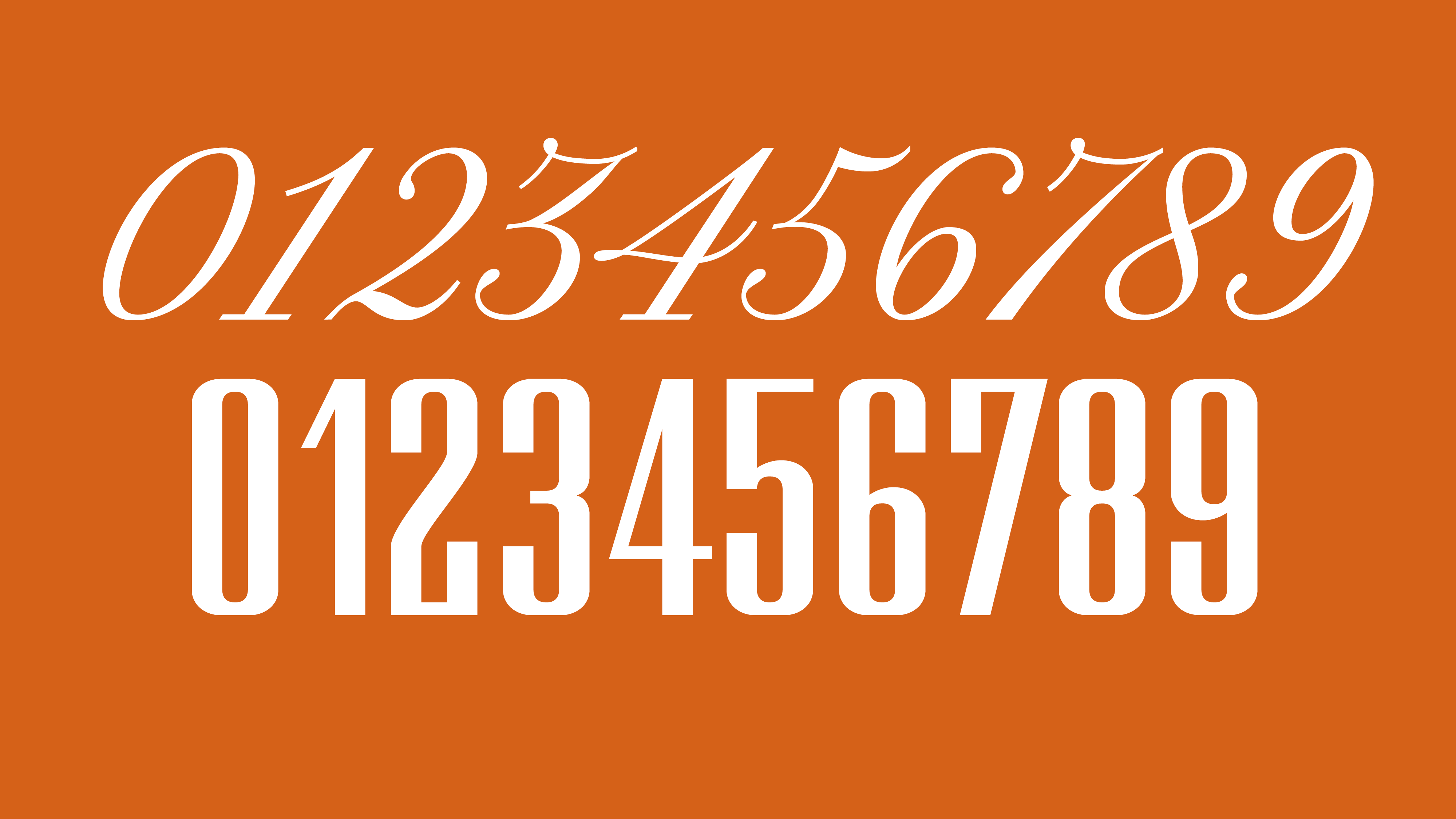
The custom type project consisted of the design of two typefaces based on the original logo, composed of two different styles:
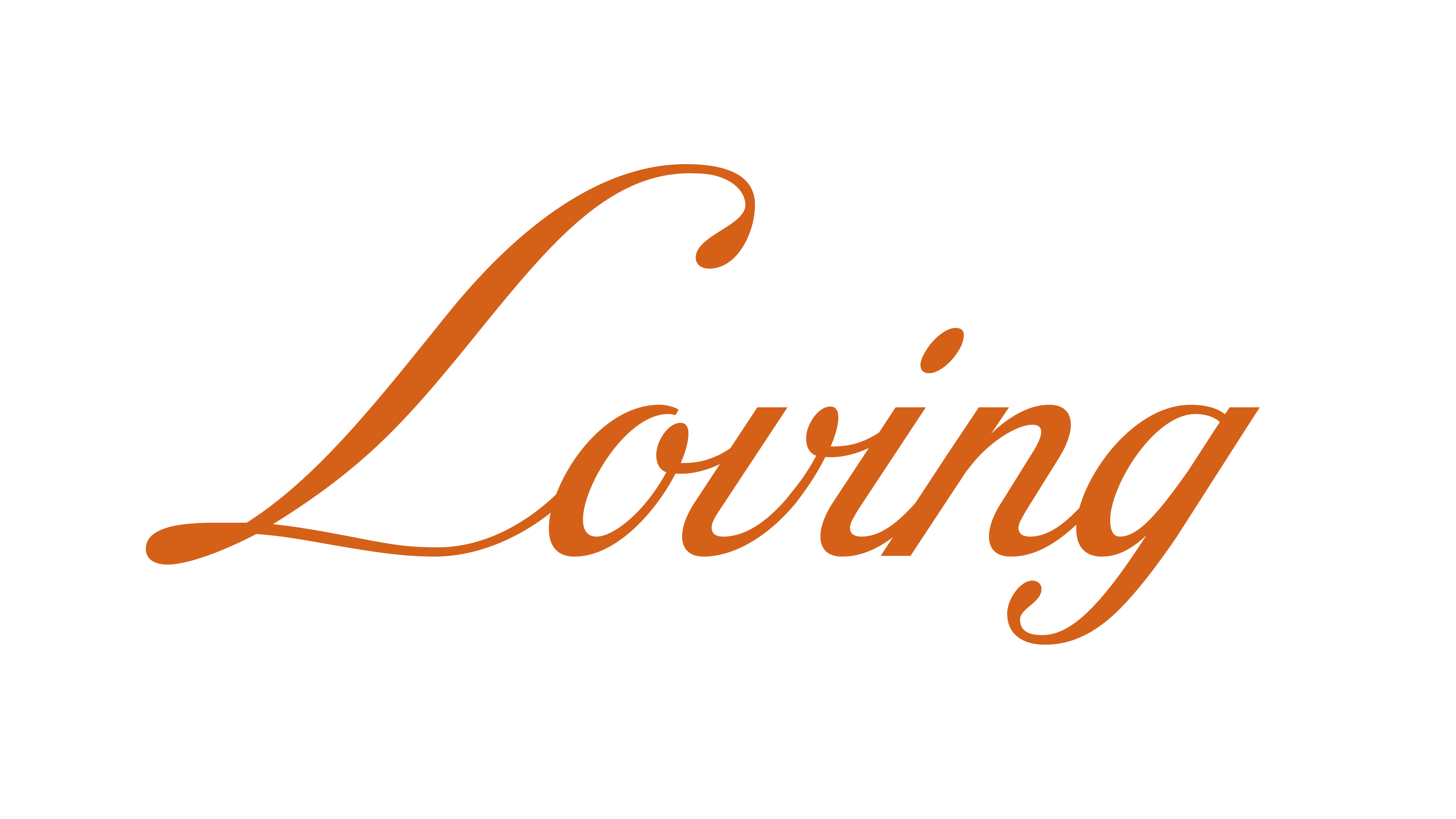
Productos
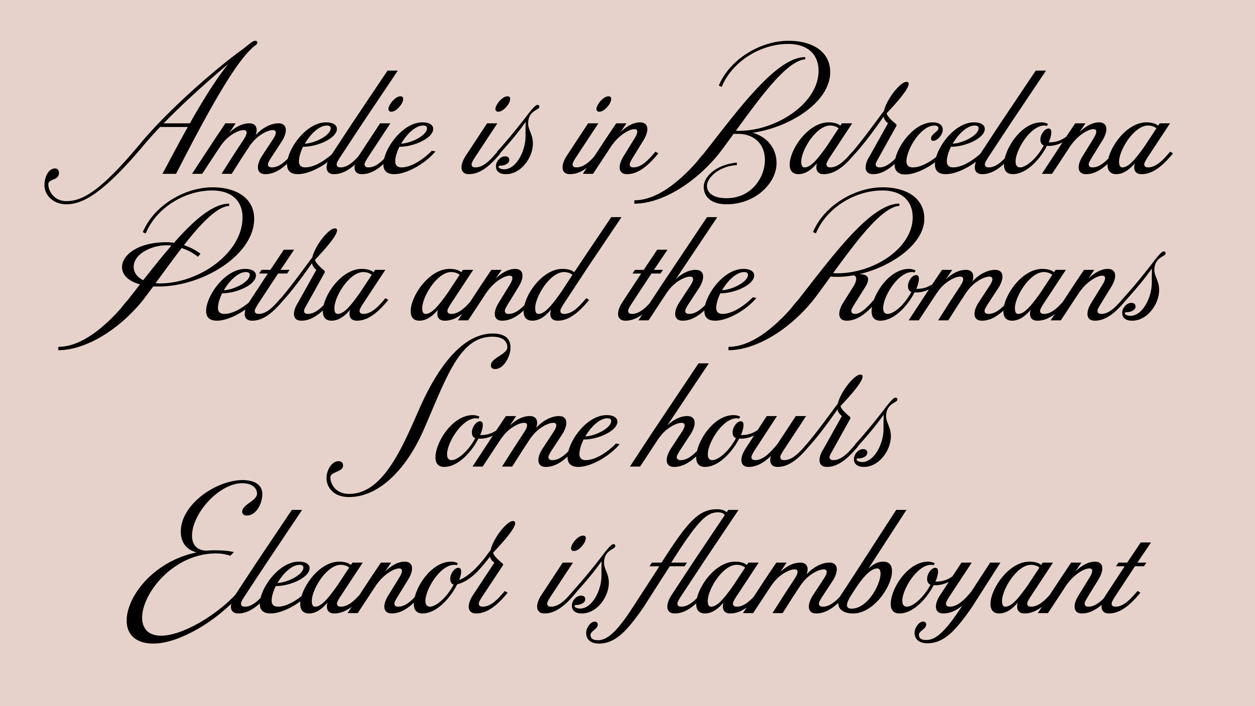
“Productos” is a calligraphic typeface that draws inspiration from the copperplate calligraphic style, which likely influenced the original designer of the logo. This typeface includes a comprehensive set of basic characters for the Latin alphabet, encompassing uppercase and lowercase letters, numerals, basic fractions, punctuation, mathematical signs, and additional ligatures that enhance the text’s flow.
The standout feature of “Productos” lies in its decorative and prominently sized capital letters, creating a distinctive visual appeal, one of the most striking peculiarities of the original logo.
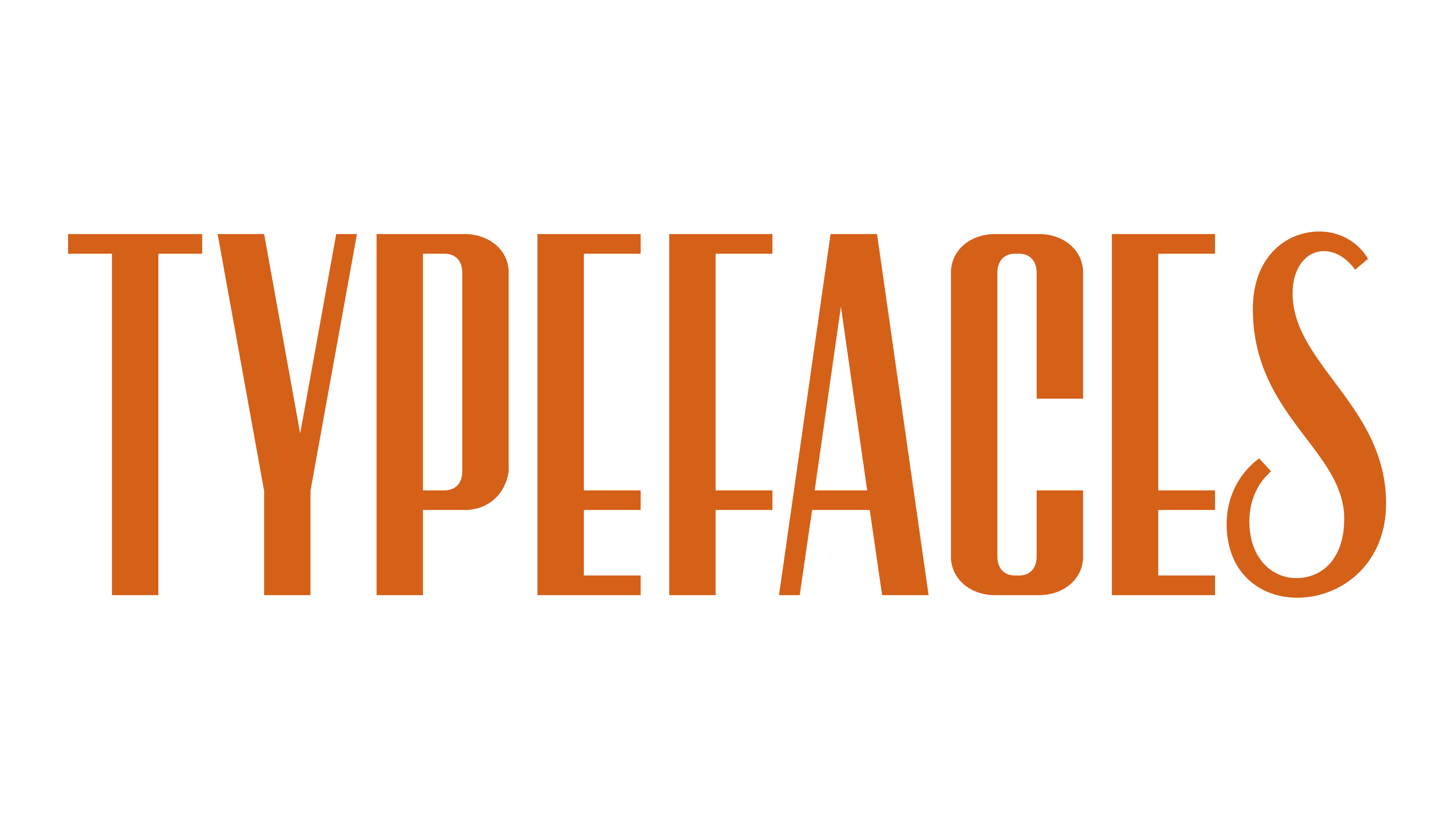
Baixens
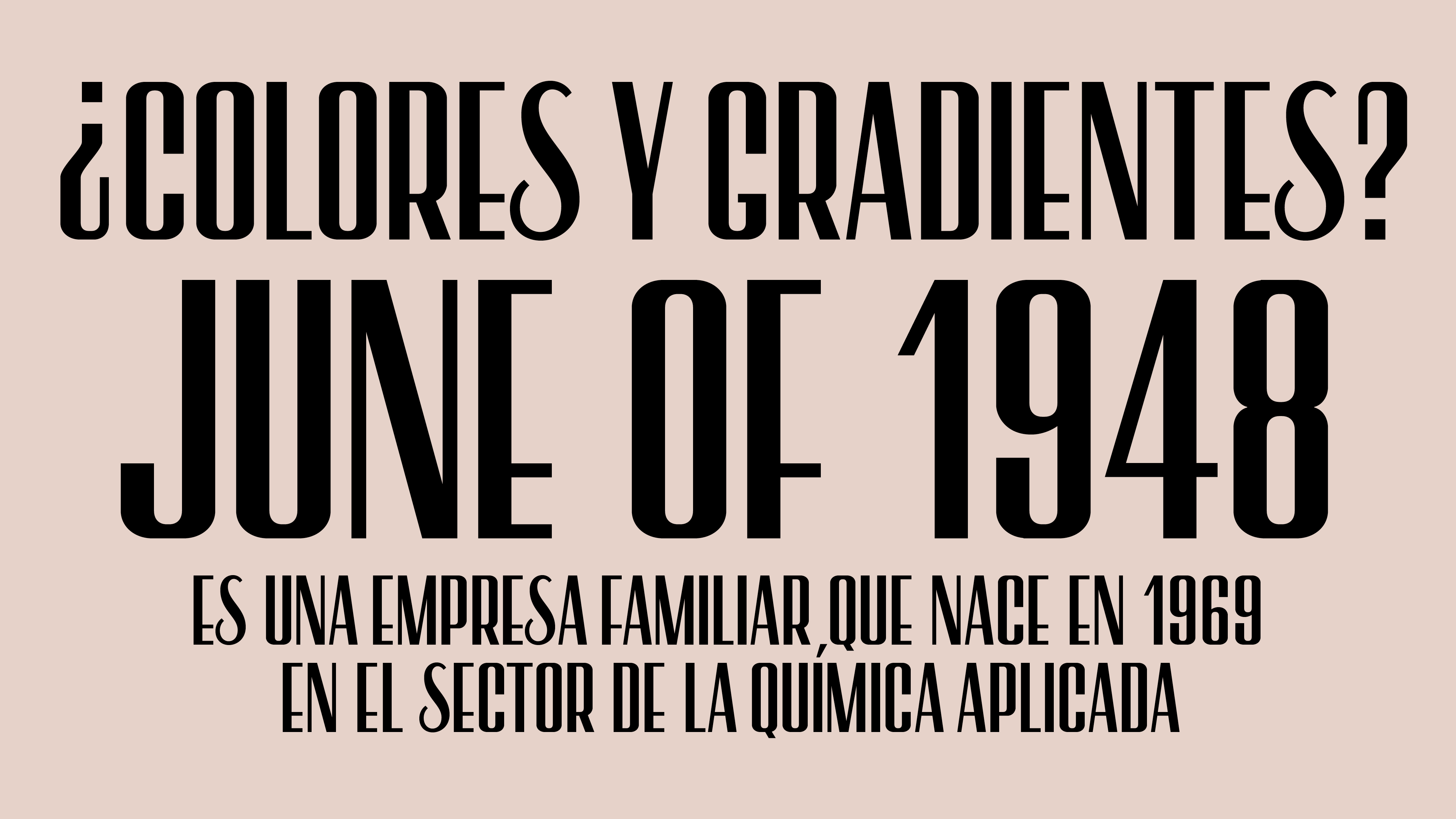
“Baixens” is a condensed sans-serif typeface, available in both contrast and regular weights, crafted from the original letter design of the logotype. It encompasses a comprehensive set of basic characters for the Latin alphabet, comprising uppercase letters, numerals, basic fractions, punctuation, and mathematical signs. Notably, Baixens does not include lowercase letters.
The key feature that sets “Baixens” apart is the high contrast in its capital letters. Certain characters, such as S or N, retain the distinctive traits of the original logo, establishing a direct and recognizable link with the brand.
Client: Productos Baixens
Type Designer: Laura Meseguer