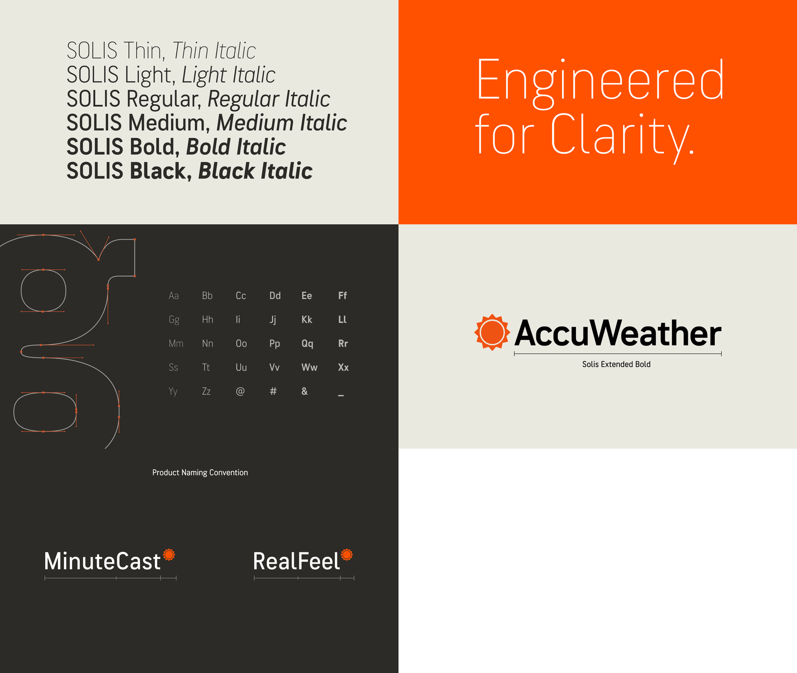
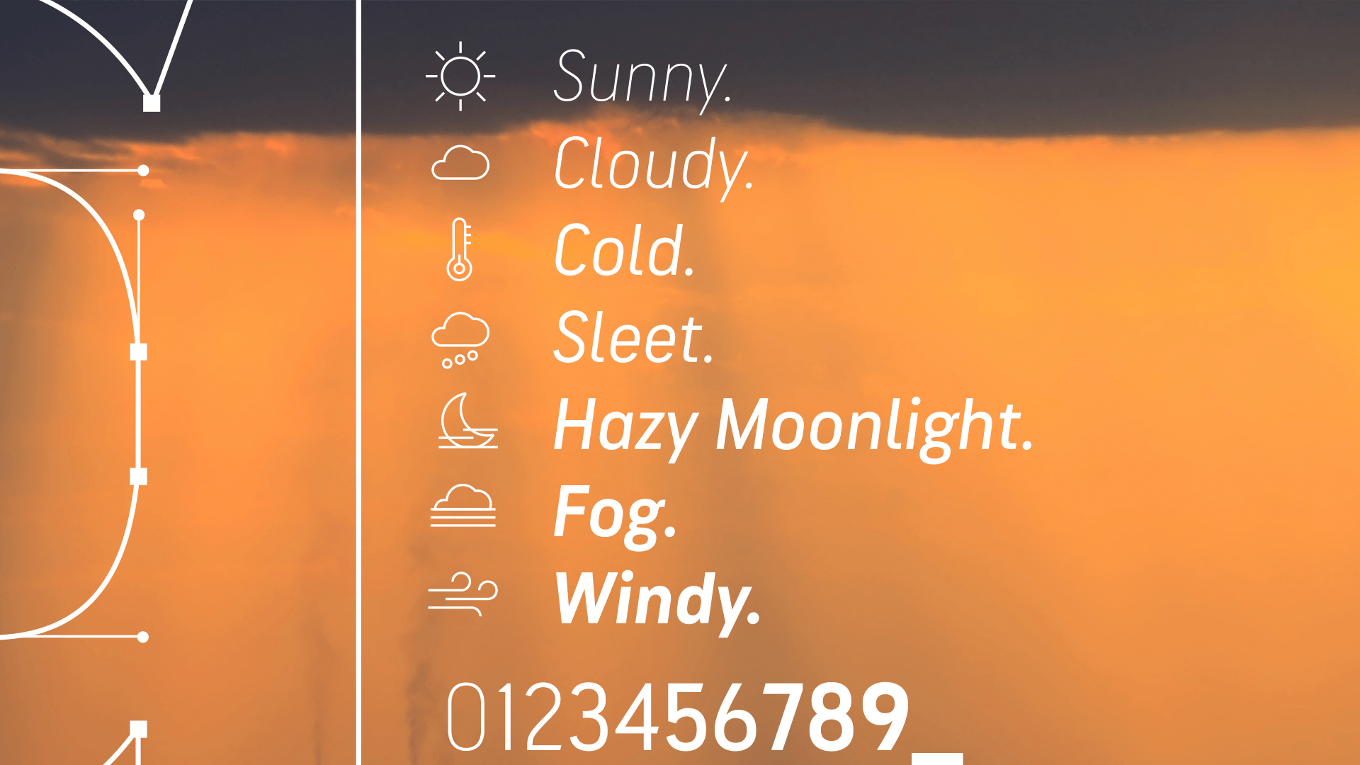

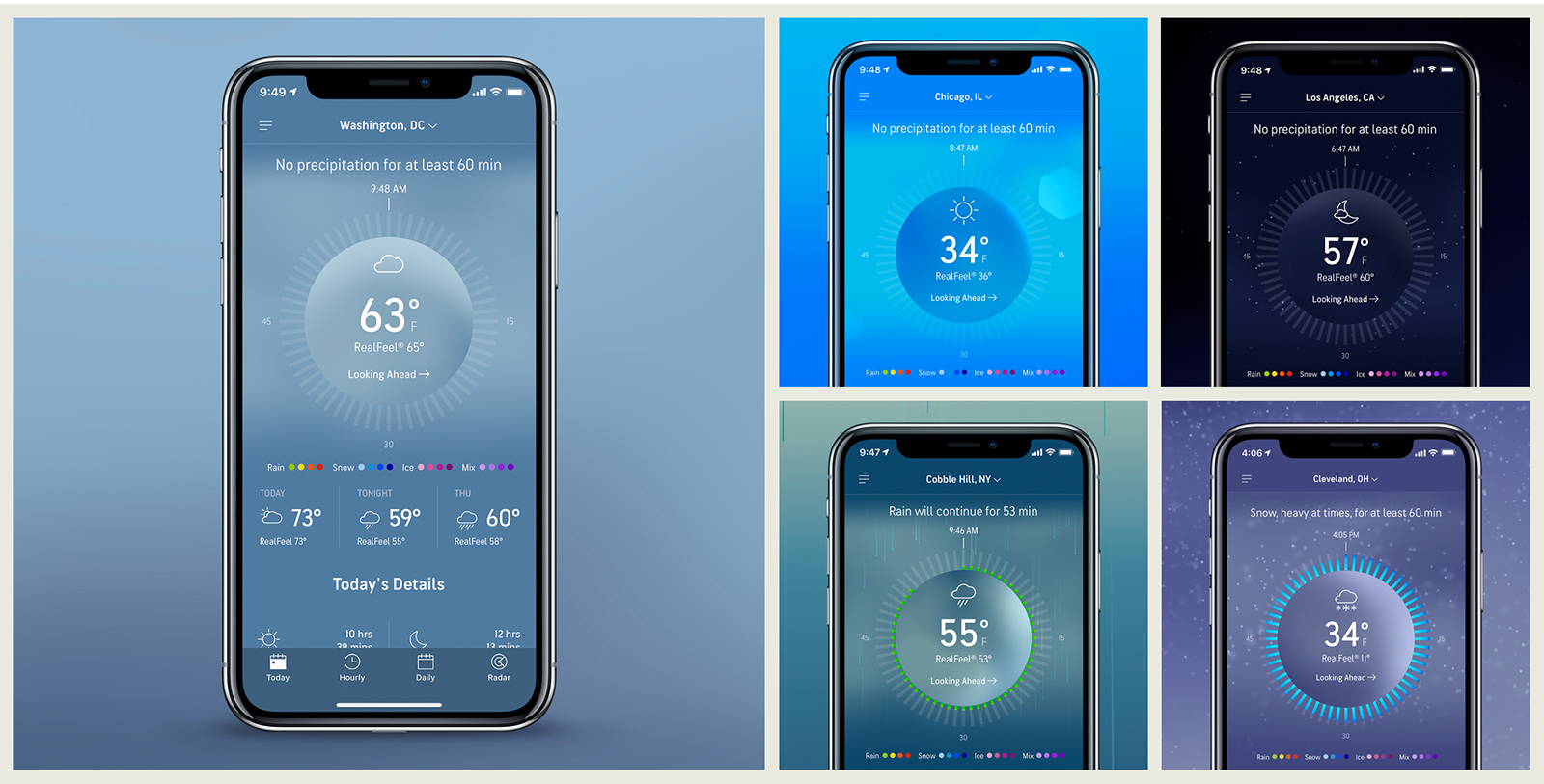
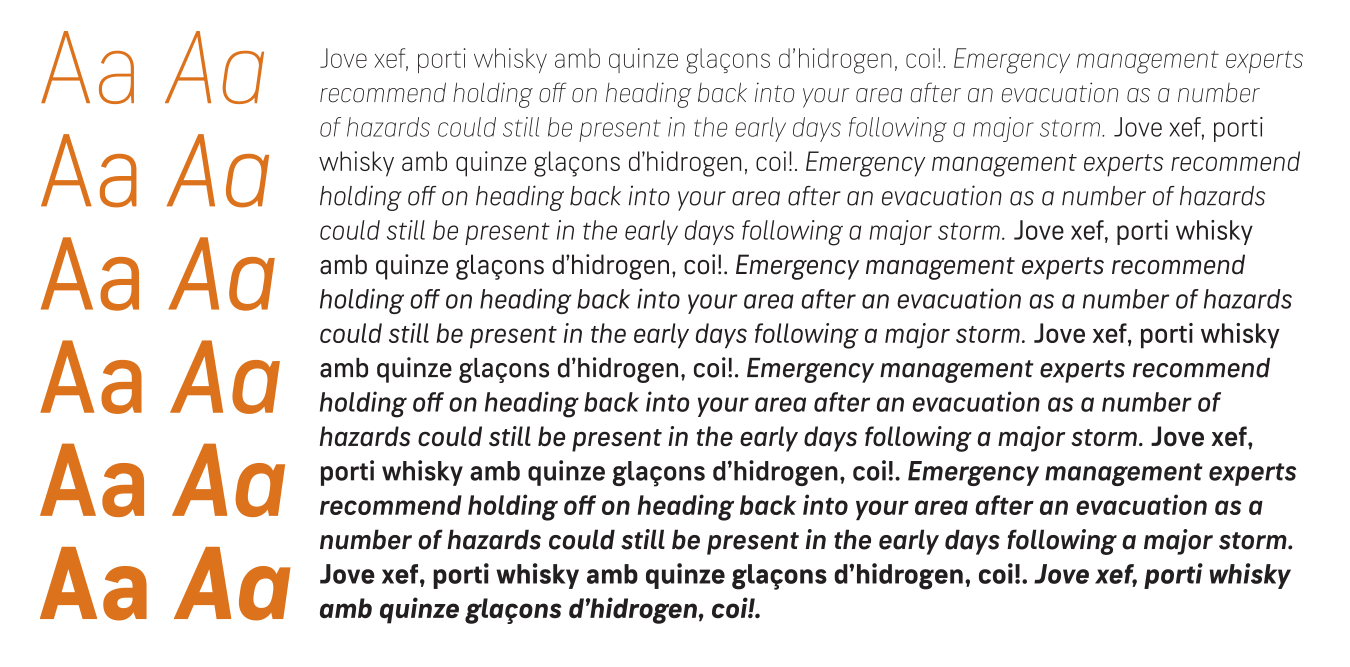
Solis is a sans serif typeface family used for the AccuWeather rebrand in 2019.
With 12 fonts in 6 weights—from Thin to Black—plus italics, Solis covers the entire range of needs demanded by a major rebranding effort.
The creative branding agency loyalkaspar created a flexible design system to enhance global trust in AccuWeather, providing clarity and focus through consistent and accessible design. Solis’s unique design was key to the new brand’s DNA. It was, as loyalkaspar put it, “Informed by the sun, engineered for clarity and truly considered for use on vertical screens and information-heavy environments.”
The design features
To start, loyalkaspar provided sketches of several letters and numbers in Regular and Bold weights (A-Z, a-z, 0-9), along with their rationale behind their sketches’ construction. The functional needs and aesthetic desires included:
— Upward and sharp shapes
— Reminiscent of geometric signage typefaces
— Wide-open apertures and curves for an optimal reading experience on any support
— Condensed structure, on mobiles and small devices with vertical screens and dense information
— Versatile family to provide a good hierarchy for larger contents or large sizes
— Accurate design of numbers.
For extra descriptions, you can read the cases studies at AccuWeather, loyalkaspar, and TypeNetwork
Client: AccuWeather
Branding Agency: loyalkaspar via TypeNetwork
Type Design: Laura Meseguer (helped by Dyana Weissman and Noe Blanco)
Programming & Production: Noe Blanco and Dyana Weissman (Kerns and Cains)