Custom Typeface for Last TOUR and Bilbao BBK Live 20
Sumendi is a custom typeface created by Laura Meseguer for the 20th anniversary of the Bilbao BBK Live festival. Designed to meet the unique demands of the festival communication design, Sumendi combines condensed proportions and high-impact display features, making it ideal for visual communication in music events.
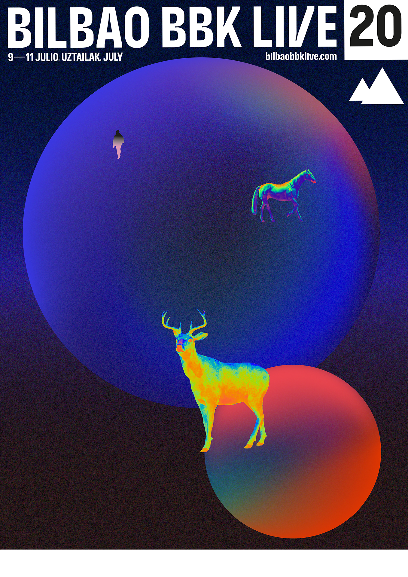
This typeface was developed to strengthen and unify the festival graphic identity and communication strategy. Its versatile design allows it to perform across posters, banners, merchandise, and digital media, maintaining consistency and recognition in every application.
Design Goals
To mark its 20th anniversary, they decided to take a big step by showing a new identity through a customized typeface designed to unify the brand’s global communication. It is named Sumendi, designed under the art direction of Eider Corral and Josema Carrillo. The goals were:
-
Create a display typeface with strong personality
Ensure legibility for multi-artist festival posters
Provide a flexible family for diverse applications
Reflect the energy of music and nature, inspired by Bilbao’s landscapes
Type Design Solution
Sumendi comes in two variants:
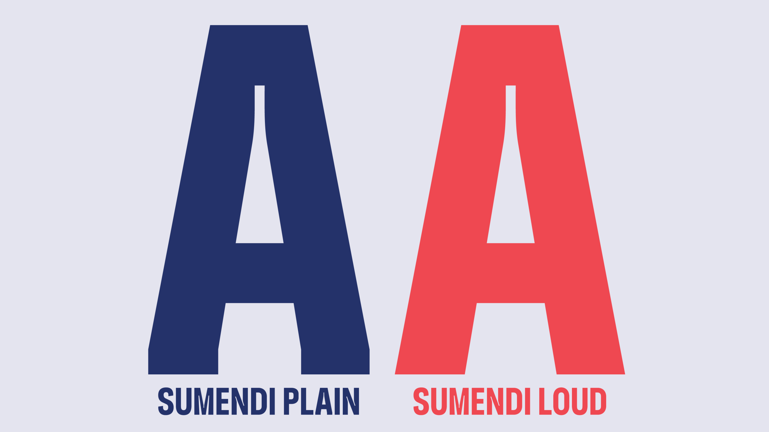
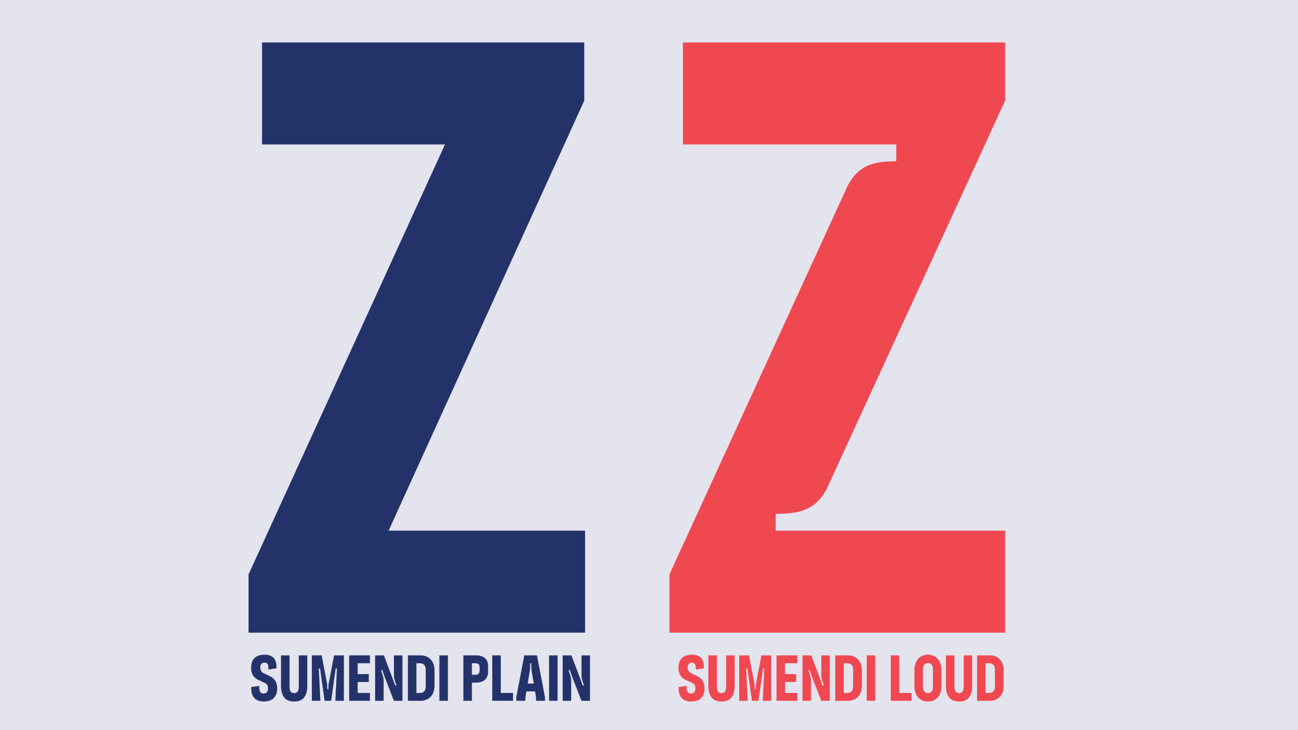
Plain: clean and legible, perfect for extended text
Loud: bold and expressive, ideal for titles and headlines
Its condensed proportions maximize space on posters, while subtle organic details add a unique character.
Key Features
Sustainable, Nature, Green, Mountain, Forest, City and Identity where the key words that had to be reflected in the letter shapes and the visual identity, together with some typographic requirements:
1. Vertical Emphasis for “Compact Power”
— Vertical Emphasis: Sumendi features condensed character proportions designed for compositions with a strong vertical solving the “Tetris problem”.
— Space Optimization: These condensed letters allow designers to pack extensive lineups into single lines without the text appearing thin or weak.
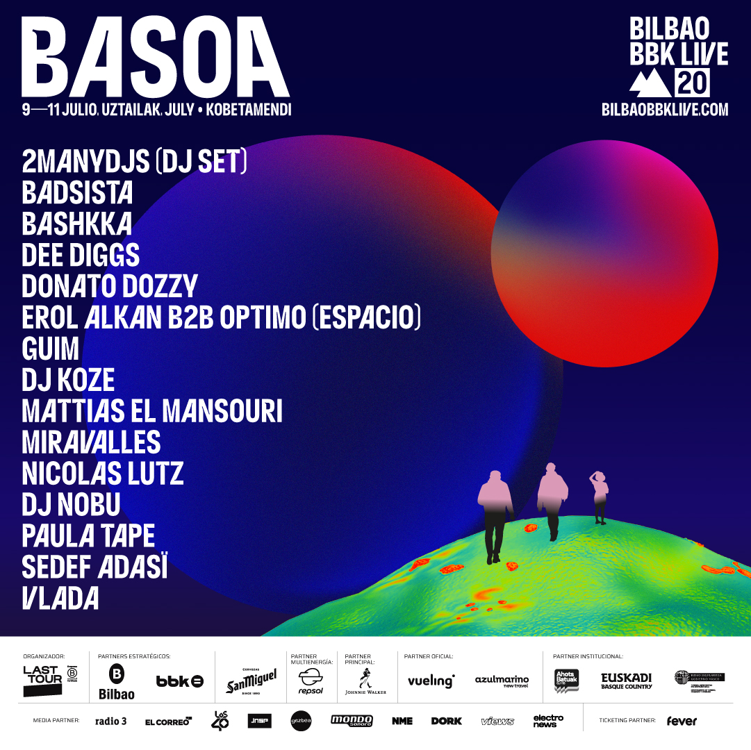
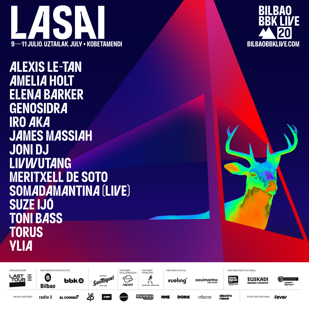
— Uppercase Focus: The design prioritizes uppercase characters to create a dense, rhythmic “wall of type” that commands attention and allows to be applied over background images as a tool to articulate and “personalize” the typographic voice.
2. Visual Punch-out and Hierarchy
— Plain and Loud Styles: The family offers a cleaner, highly legible Plain version and a high-impact Loud version for big headlines.
— Heavyweight Impact: Sumendi is a high-impact display typeface.
— Background Legibility: This density creates a solid block of color that acts as a physical “punch-out” against complex background images, ensuring the lineup is readable from a distance.
— Systemic Utility: The typeface serves as a tool to articulate and “personalize” the typographic voice across all sub-brands under the BBK Live umbrella.
3. Identity-Driven Details
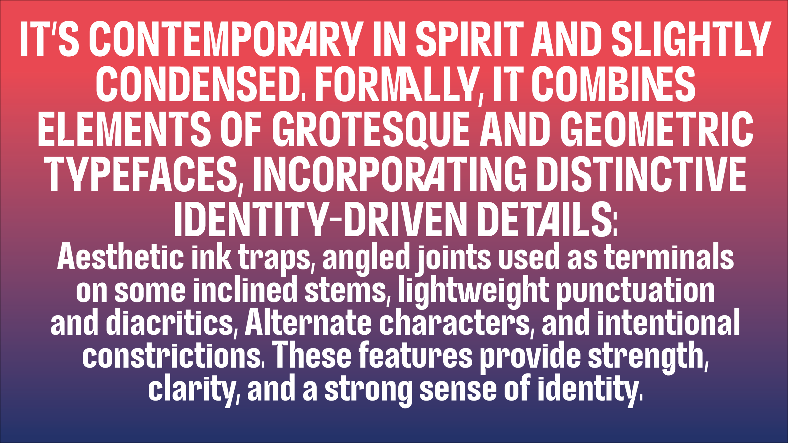
The typeface blends Grotesque and Geometric models, incorporating sharp, nature-inspired features:
— Aesthetic Ink Traps: Sharp cut-outs at stroke connections provide a sharp, modern feel while ensuring clarity when printed.
— Elbows and Contractures: Unique “elbow” terminals on inclined stems and intentional narrowing (contractures) reinforce the jagged, mountain-inspired aesthetic of Mount Kobetamendi.
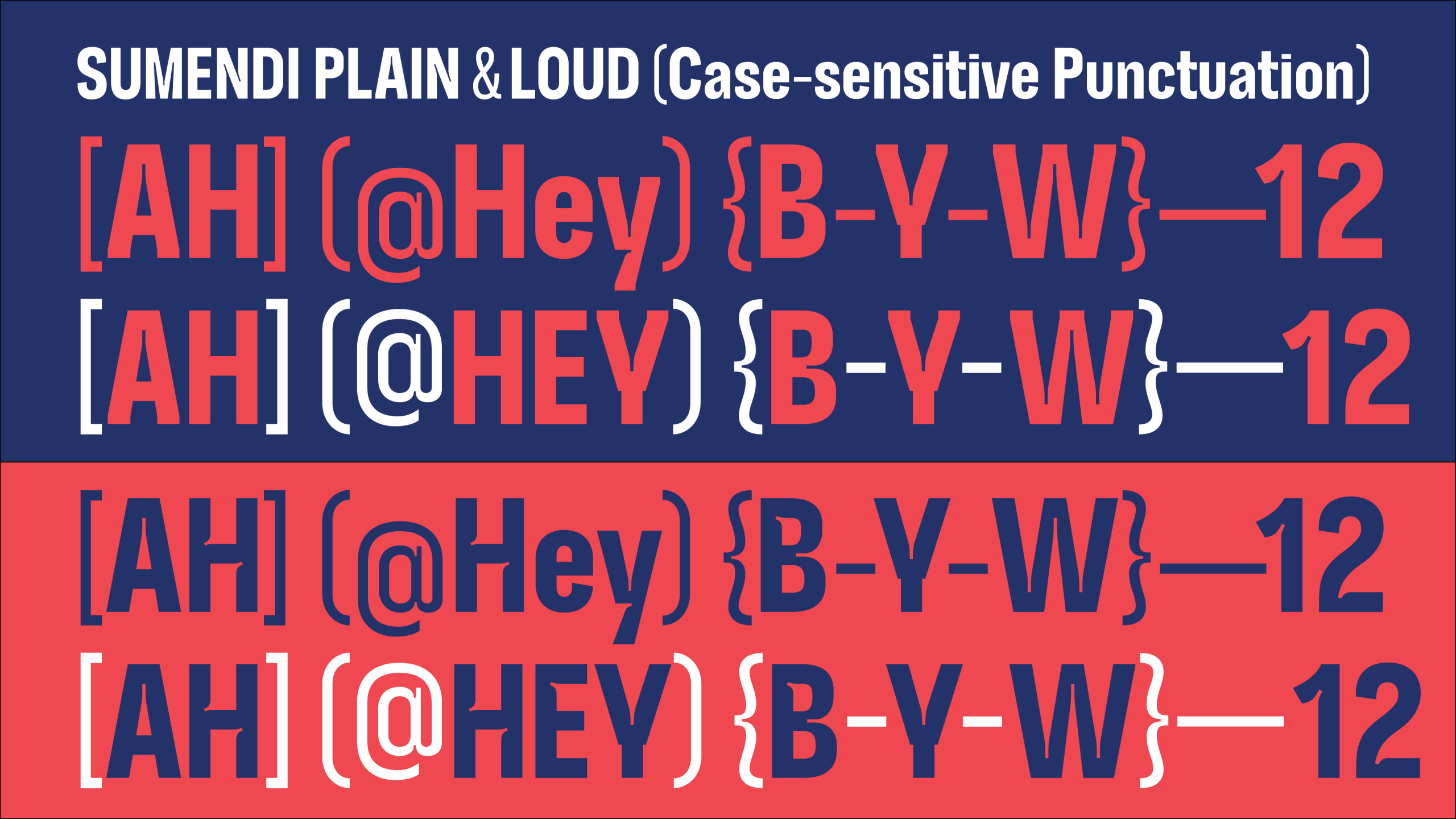
— Weight Contrast: Punctuation and diacritics use a lightweight stroke, providing a delicate visual counterpoint to the heavy letterforms.
4. Advanced OpenType Functionality
The typeface uses complex programming to maintain its “sustainable/nature” look without becoming messy:
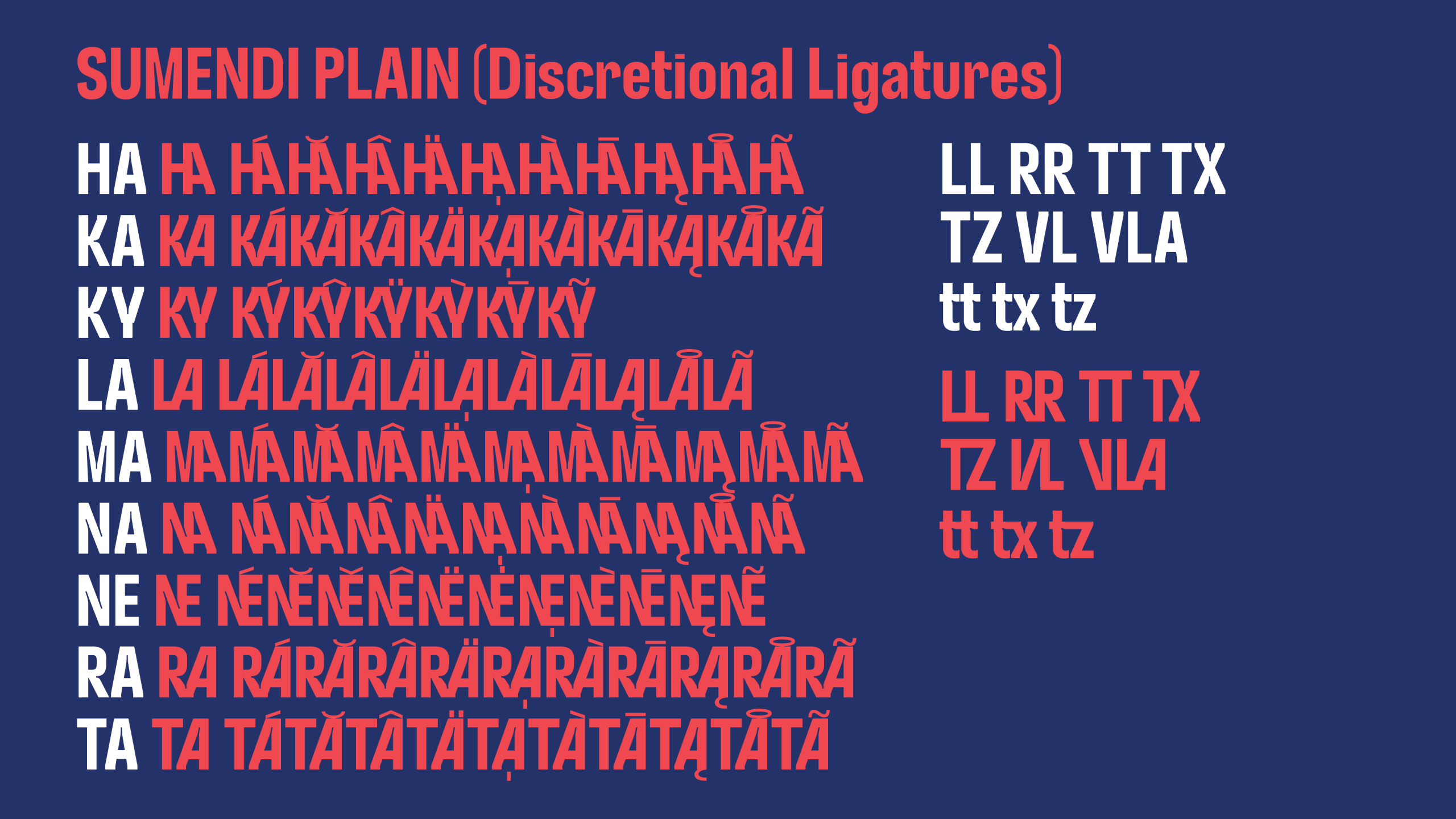
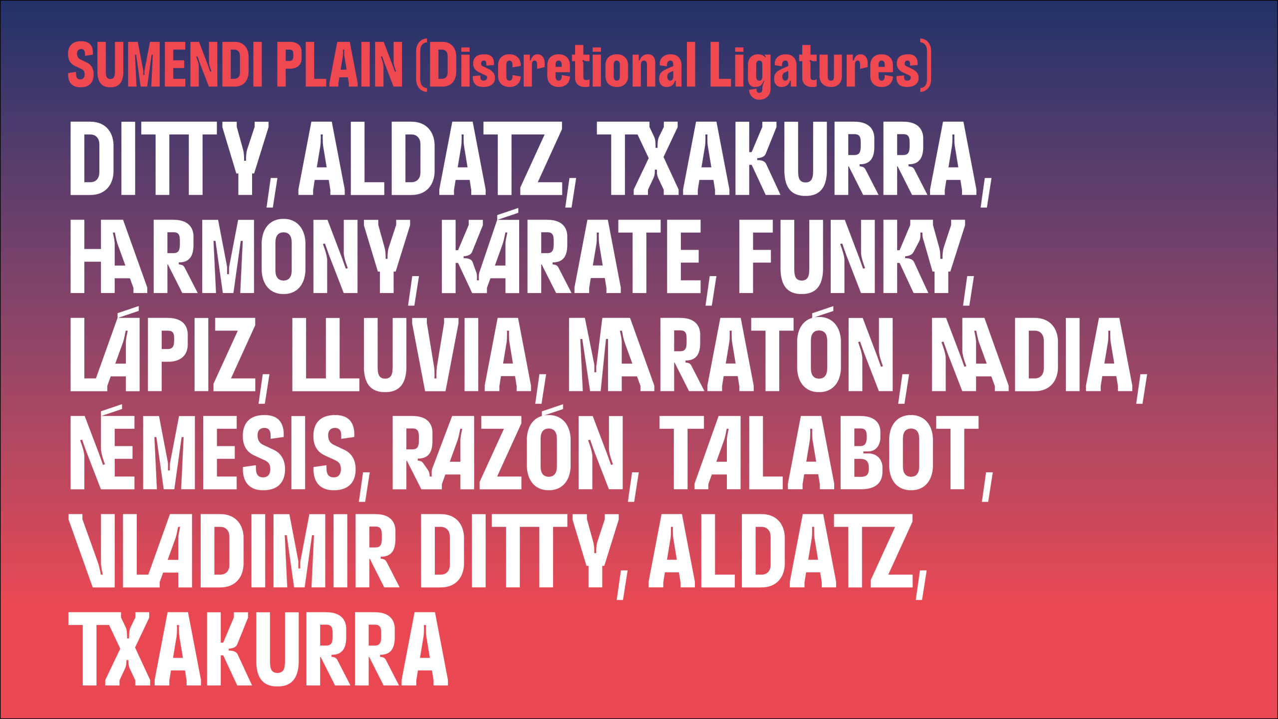
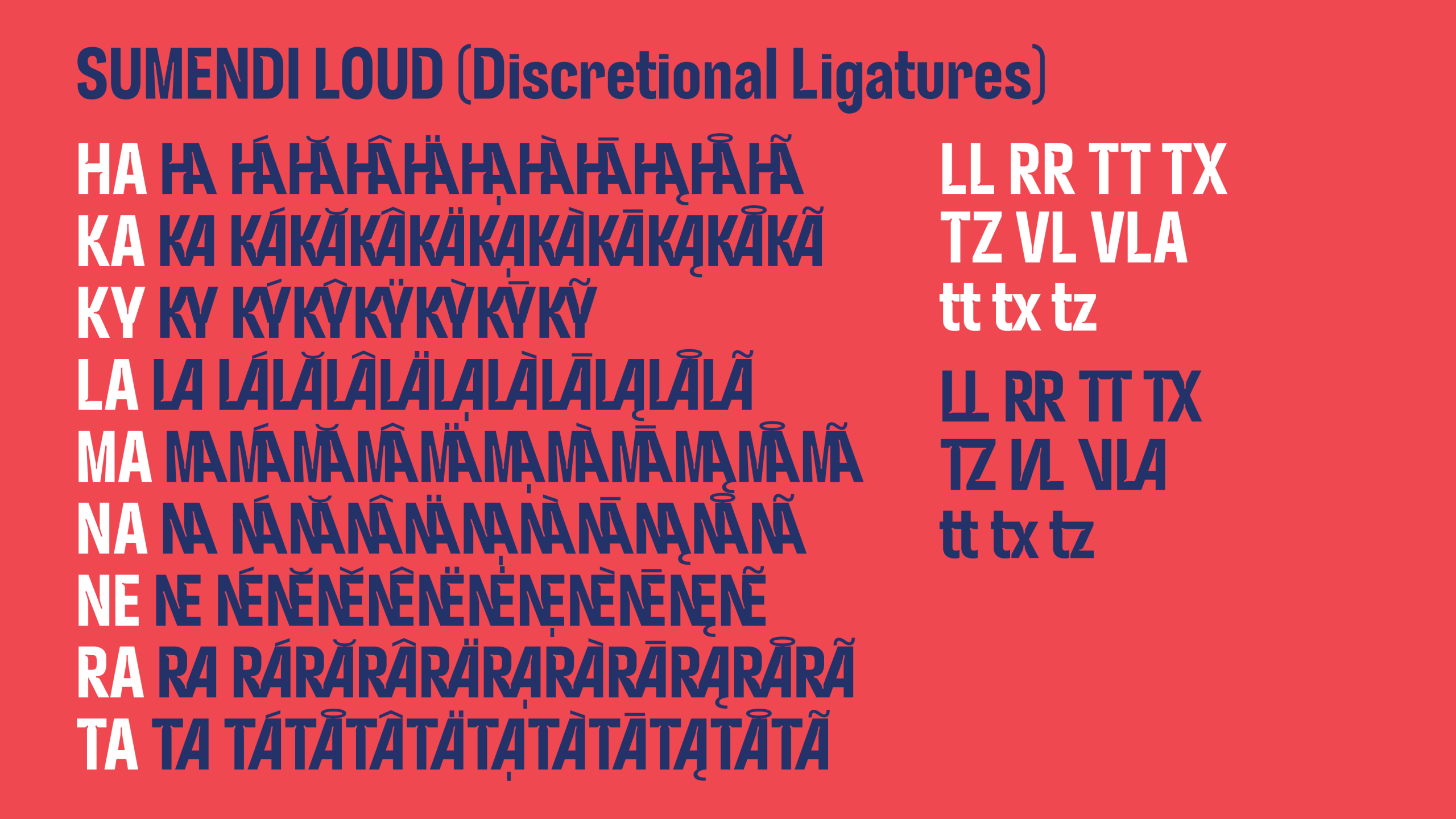
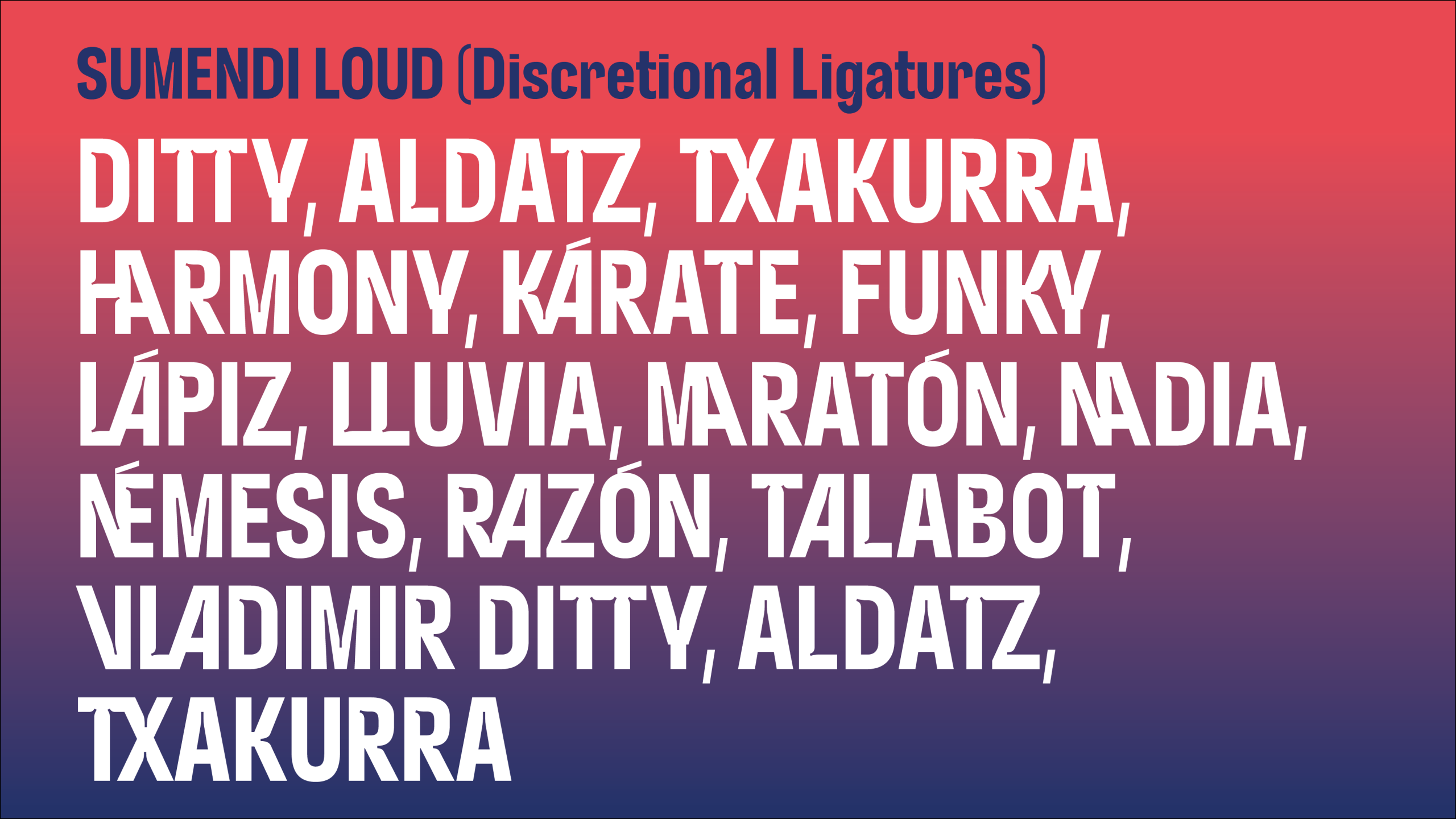
Discretional Ligatures: It includes a formula that limits the use of ligatures to one per word. This prevents the text from looking overly “decorated” and maintains balanced word spacing.
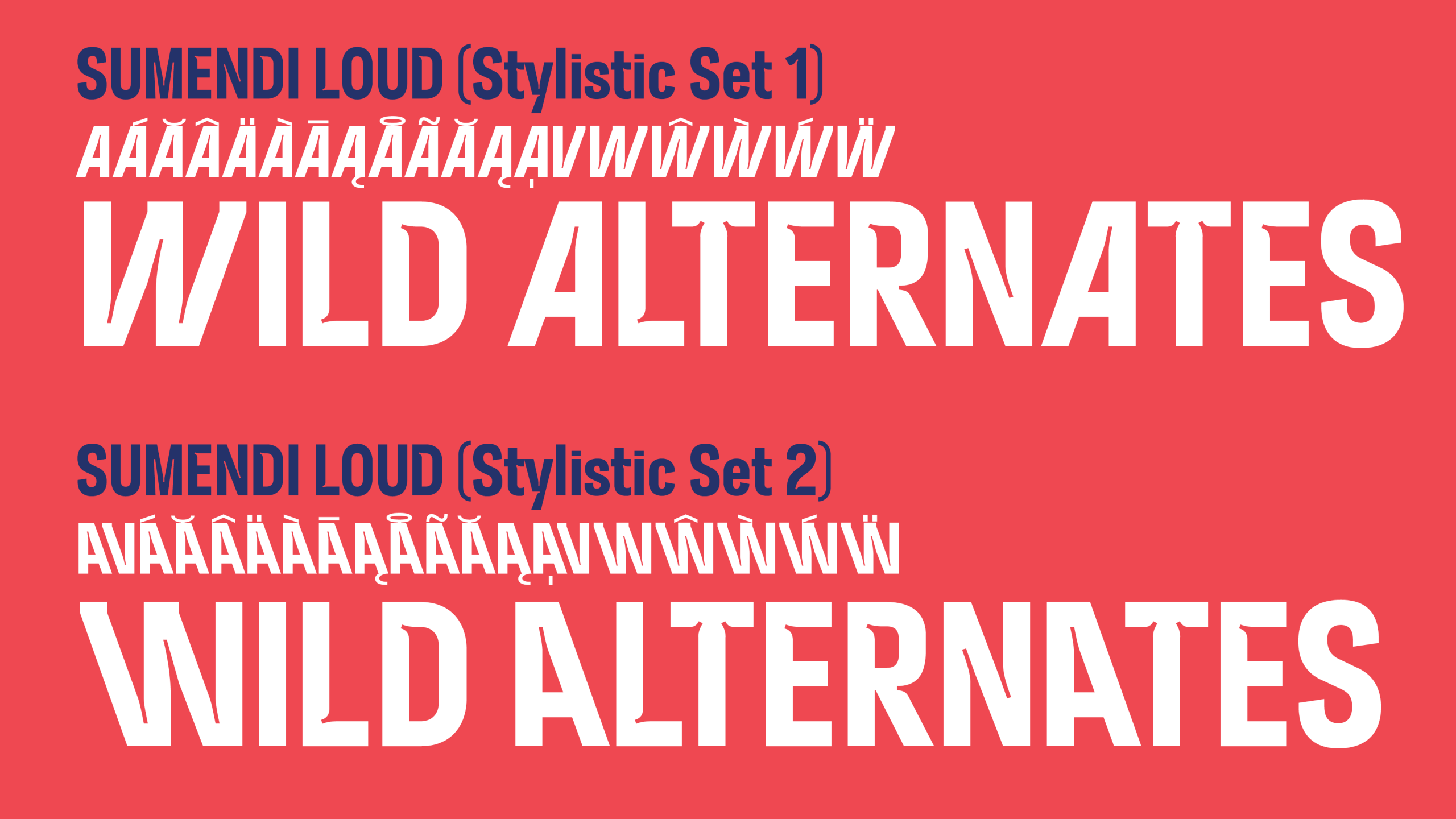
Stylistic Sets (ss01 & ss02): The Loud style features “Wild Alternates”. These allow for variation in characters like A, V, and W, mimicking the natural irregularities found in a forest or mountain environment (sloped on the right or on the left). By having multiple versions of the same letter, the designers can “tune” the text so it never looks repetitive or “canned.” It feels bespoke, much like a curated festival lineup.
Case-Sensitive Punctuation: Brackets, “at” symbols, and hyphens automatically shift their vertical position when used with all-caps text to maintain perfect alignment.
5. Integrated Brand Functionality
Sumendi is a “smart” font that automates brand consistency:
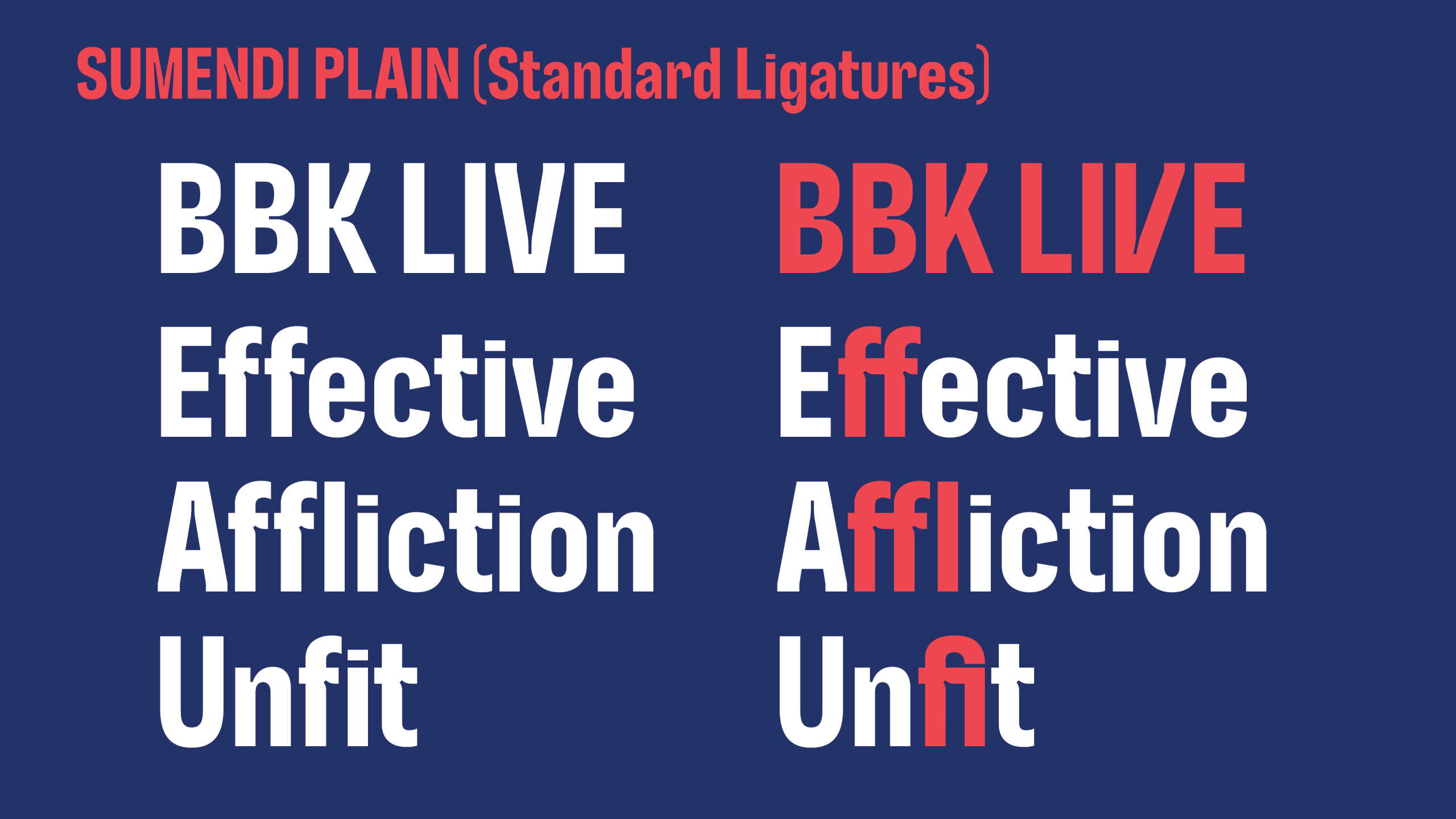
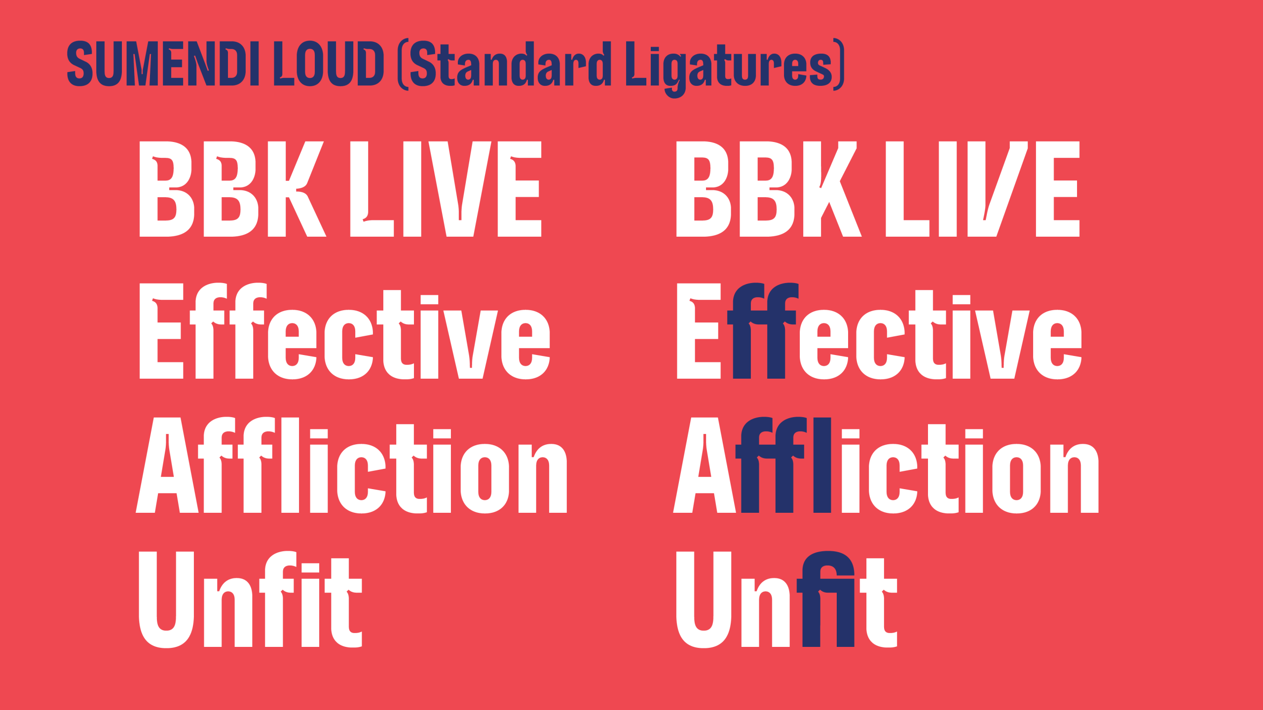
— Automatic Logos: Standard ligatures automatically trigger the BBK and LIVE logos when the names are typed.
— Case-Sensitive Punctuation: Brackets, hyphens, and “@” symbols automatically shift their vertical position to align perfectly with all-caps text.
— Wild Alternates: Stylistic sets (ss01 & ss02) offer variations for characters like A, V, and W, allowing for a bespoke, “hand-tuned” feel that mimics natural irregularity.
6. Character set
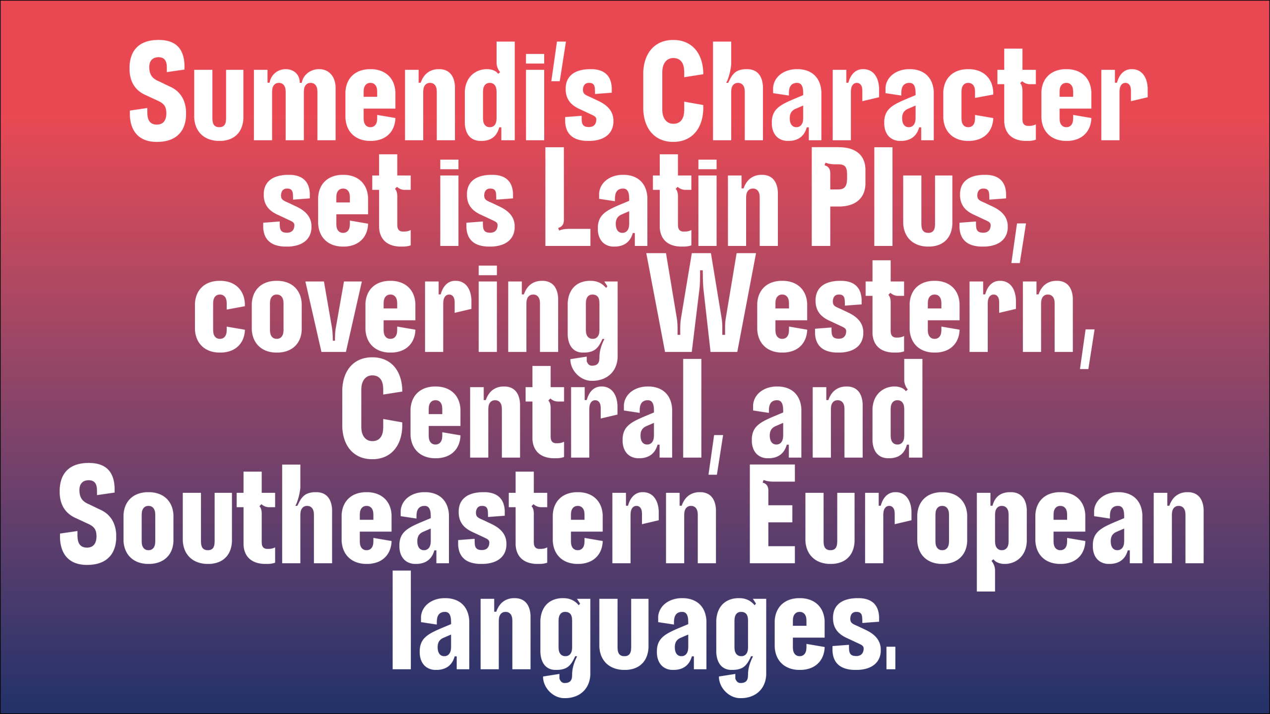
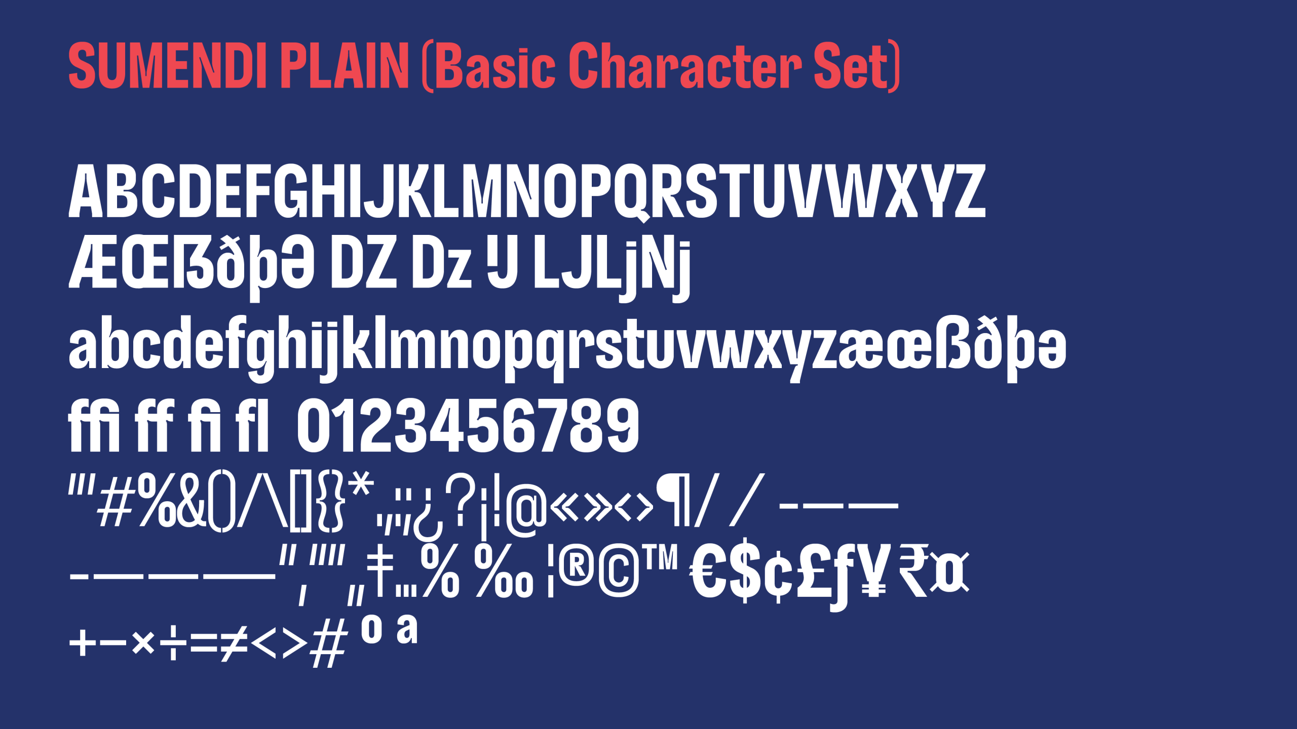
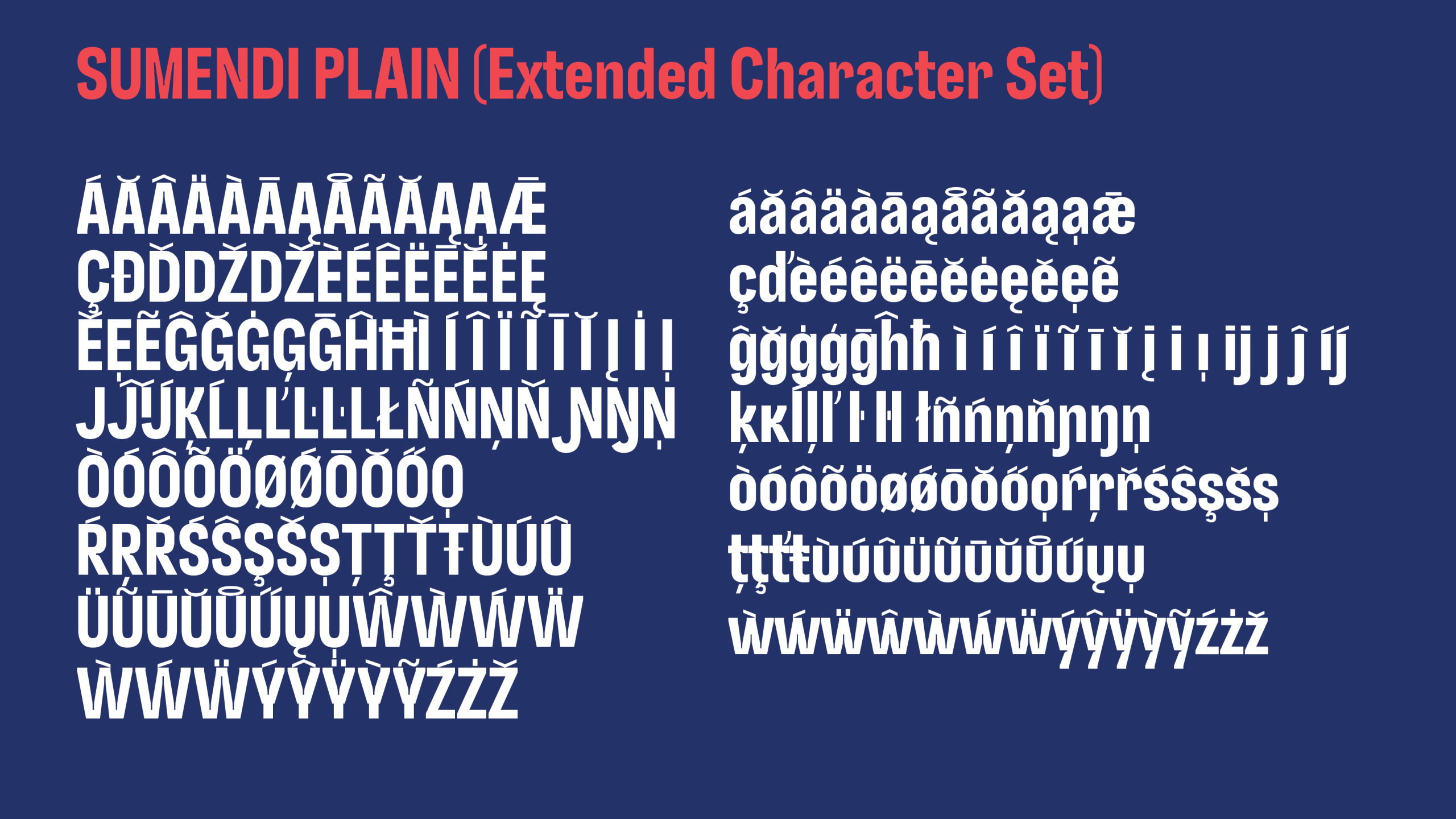
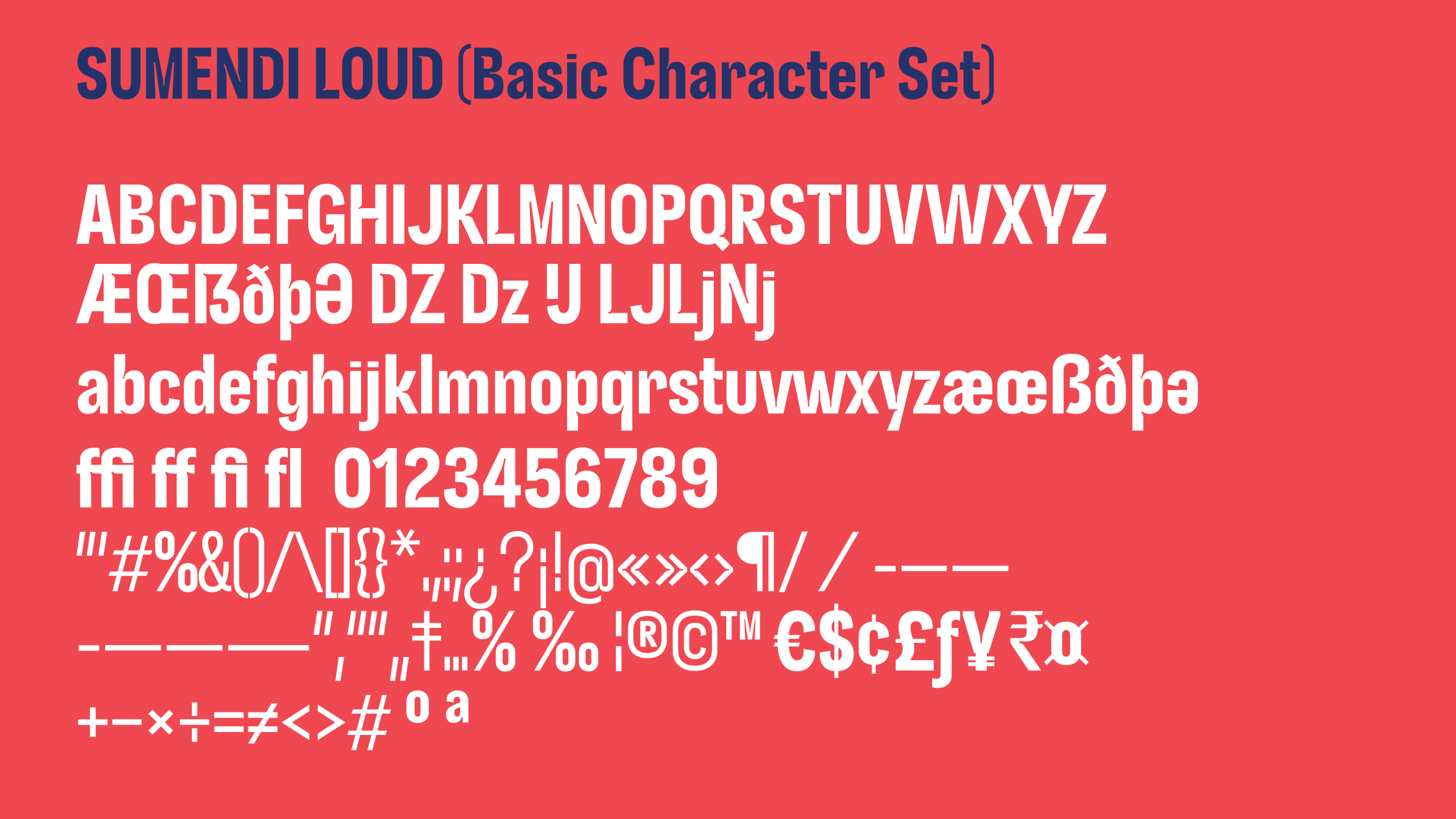
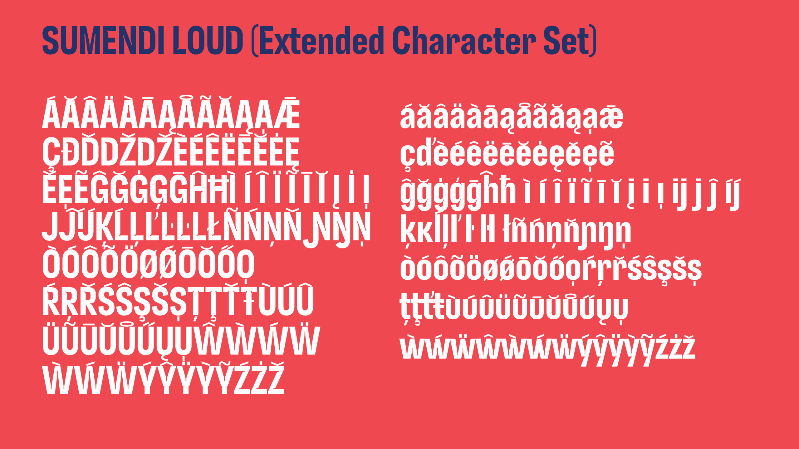
The character set is Latin Plus, covering Western, Central, and Southeastern European languages. This is essential for an international festival attracting global talent and audiences.
The resulting typeface can be described as a sans serif typeface with two variants — Plain and Loud —. It’s contemporary in spirit and slightly condensed. Formally, it combines elements of grotesque and geometric typefaces, incorporating distinctive identity-driven details such as: aesthetic ink traps, angled joints, or elbows, used as terminals on some inclined stems, lightweight punctuation and diacritics, alternate characters, and intentional constrictions. These features provide strength, clarity, and a strong sense of identity to the BBK Live brand, supporting both the identity redesign and the brand’s global communication.
See more examples of Sumendi in use at Bilbao BBK live Instagram account
Type Engineering: Laura Meseguer and Rainer Scheichelbauer.