
Wordmark redesign for Typeform
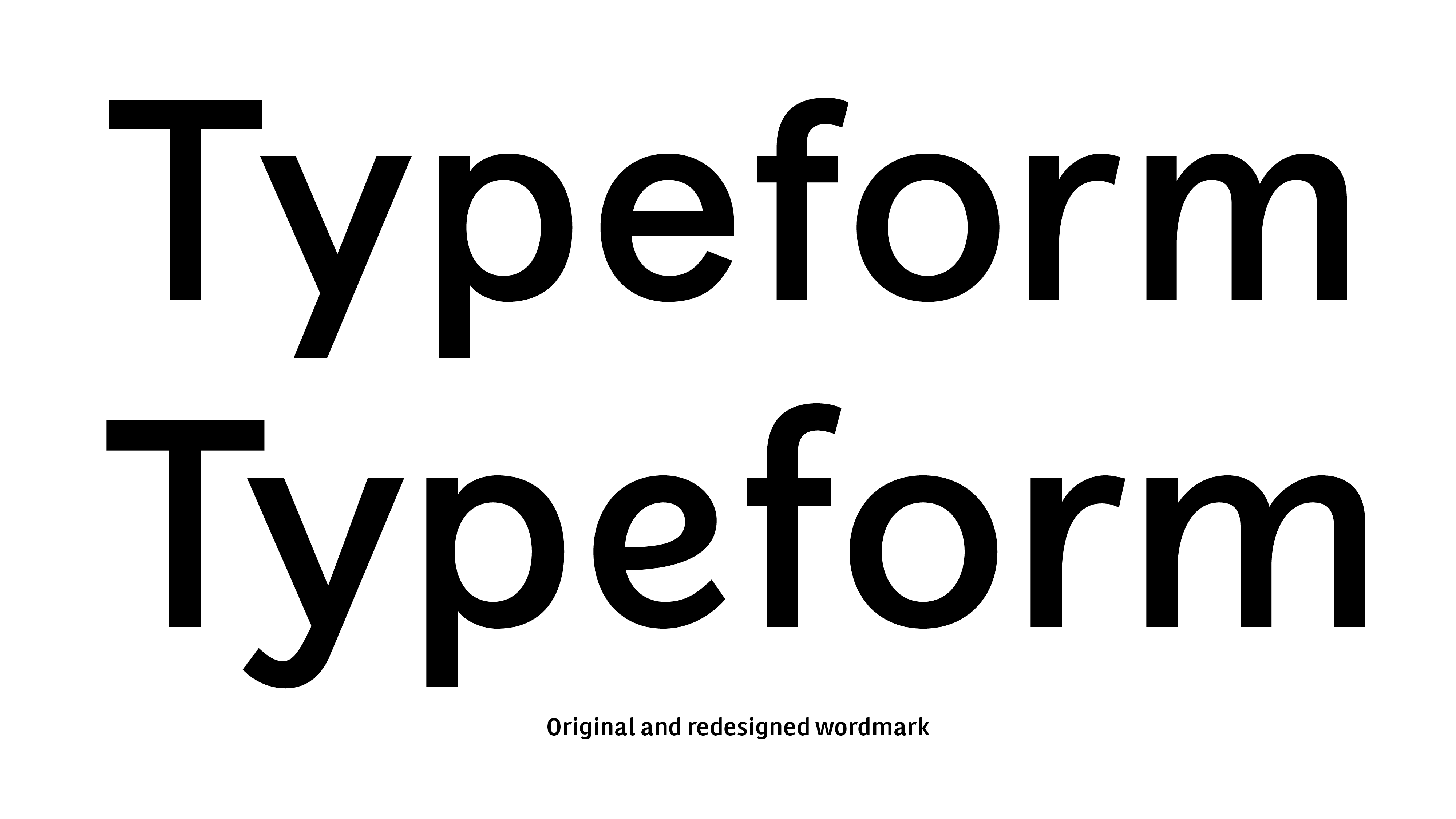
Typeform is a company that offers friendly forms and surveys online. The redesign assignment was focused on the idea that the wordmark could transfer the company’s values, with a subtle transformation.
The briefing
The goal was “To create a beautiful wordmark which works and is recognisable in a variety of different applications and fits the design-led company that we are”.
Wordmark’s Origin
The original was based on the direct use of the typeface Aperçu Regular, a geometric sans serif typeface with very good screen readability without any personalisation, chosen after its qualities for branding: Unobtrusive / Commonly accepted shapes / Fit-for-purpose / Inspiring confidence / Differentiation in the tech environment.
But it also had some weak point as it wasn’t scoring highly or that it was not recognisable enough, and this is what they mainly wanted to solve.
The Design approach
1. Adjusting spacing to perform well in big and small sizes
2. Looking for more recognition
· Changing the shape of “y”, towards a hybrid between the roman and the italic shape by adding a “tail” (to add the feeling of “script”)
· Changing the shape of “e” towards an italic shape (to add the feeling of “script”)
· Enlarging the “f” (to make it more legible at smaller sizes)
· Widening the “m” (to make it more legible at smaller sizes)
· New construction for the arches in “p”, “r” and “m” (to allow the increasing of the contrast)
· Increasing the contrast at the joints (to make it more legible at smaller sizes)
· Slightly increase of the overall weight (to perform better at smaller sizes and on dark backgrounds)
With all these details the wordmark becomes more organic as it connects with the act of writing but without losing the initial attributes (strong, clear, recognisable).
Client: Typeform
Creative Director: Orlando F. Ruiz
Wordmark designer: Laura Meseguer