


TypoMag. Typography in Magazines
Design, curating and editing of a publication devoted to the use of typography in contemporary magazines. Laura’s task was curating the content and design the book, with the help of Floor Koop, Claudia Parra, and Luis Mendo. The selection process was not easy, especially when there are so many new magazines every month, and many of them care deeply about good typography.
From an initial selection of 200 magazines we managed to narrow it down to 29; the design concept came from this process, from the logotype to the binding. For the logotype, I did a lettering job, customising the Poster typeface by Íñigo Jerez, with more contrast and a ‘g’ that descends lower to contain the subtitle.
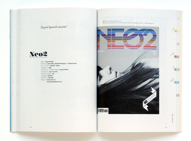
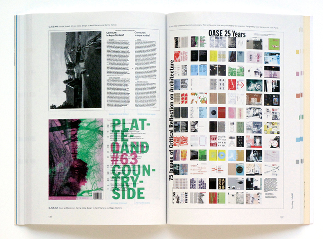
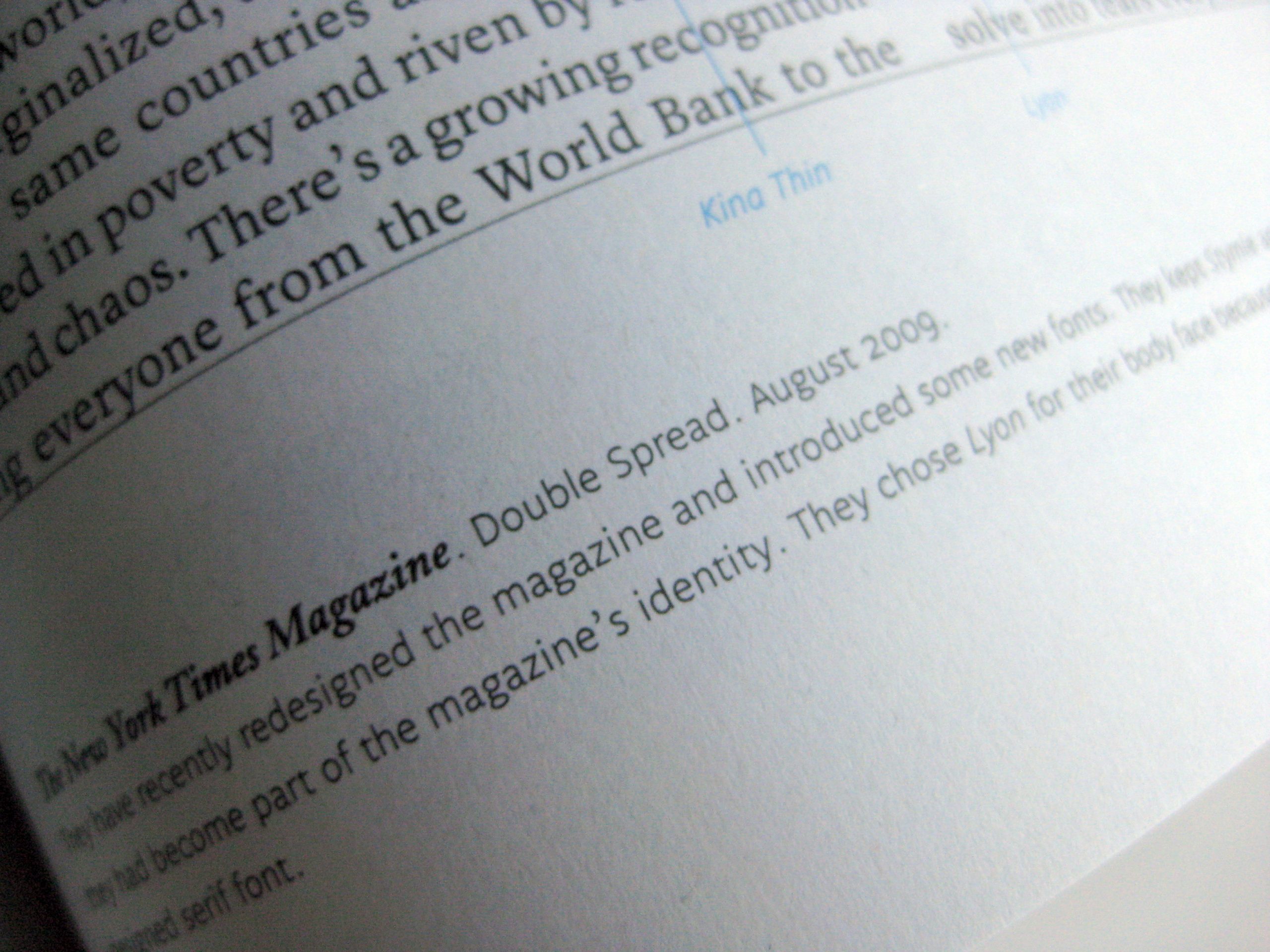
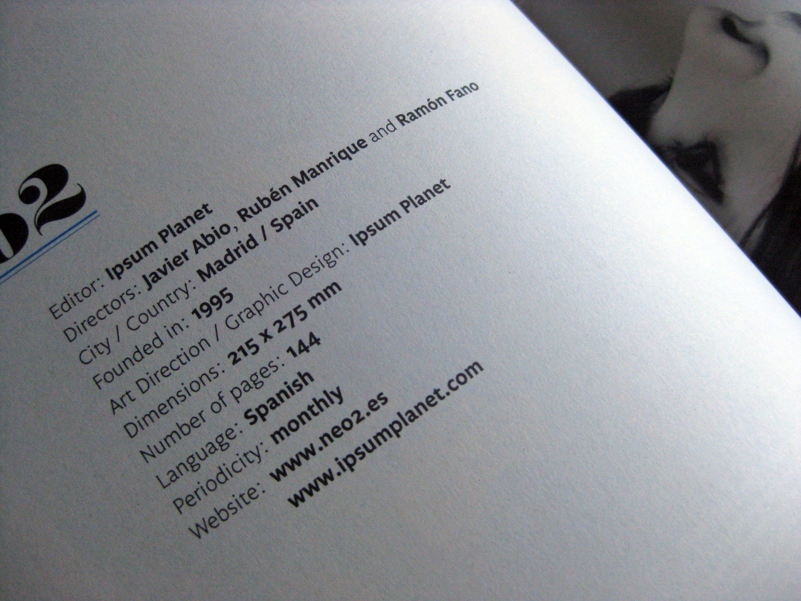
The binding is simple, a paperback, both soft and handy, similar to most magazines. The cover and the jacket play together, mixing coated with uncoated, coloured paper that remains on the inside, for the addendum pages. A personal system of tags for magazine classification was created. Based on ‘typographic qualities’, these serve as a navigation system: by hand, classic, identity, custom type, logo, headline design, and designer. By quoting the designers, showing the fonts in use, and the details in actual size, the content helps to better understand magazine design.
The project received very nice reviews:
Fonts in use
Cuatro Tipos
and a video!
Publisher: Index Book (not existing anymore) and BIS Publishers, 2011
Book designer: Laura Meseguer
Foreword by: Luis Mendo
Collaborators: Floor Koop and Claudia Parra
Prizes:
— Silver Laus Award, 2011