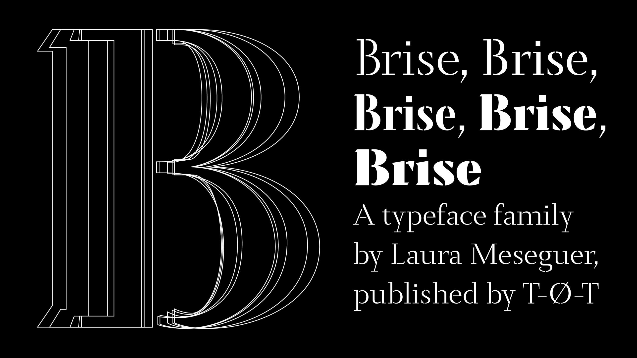
What do Le Corbusier and Brise have in common?
Like the brise-soleil that filter sunlight in his buildings, Brise plays with fullness and emptiness, with rhythm and pause. Both are architecture— one of space, the other of letters and signs.
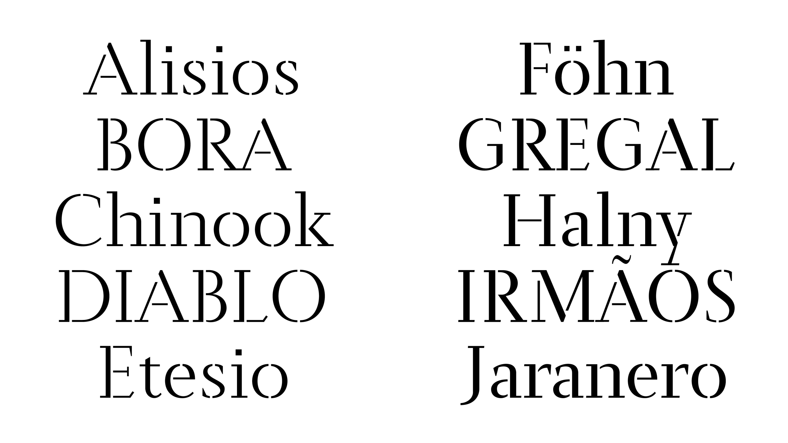
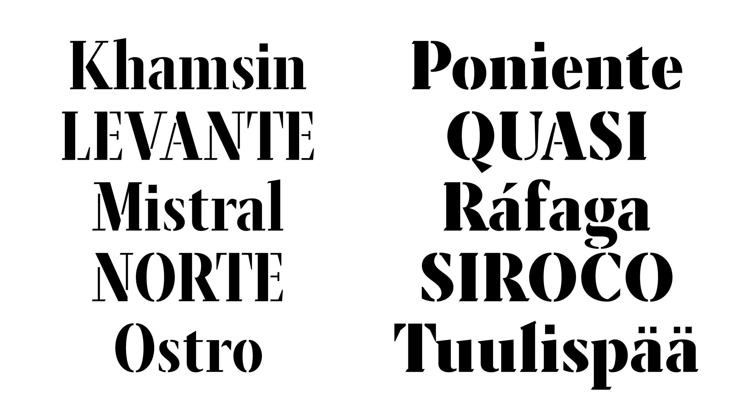
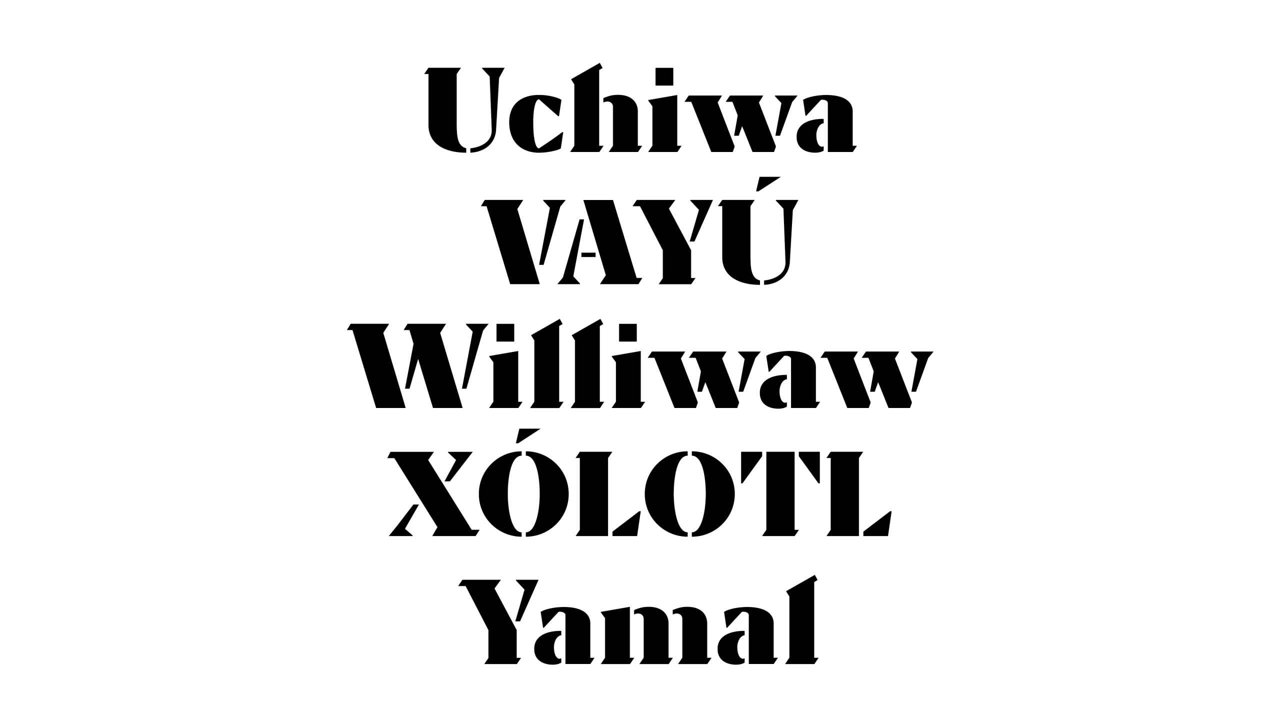
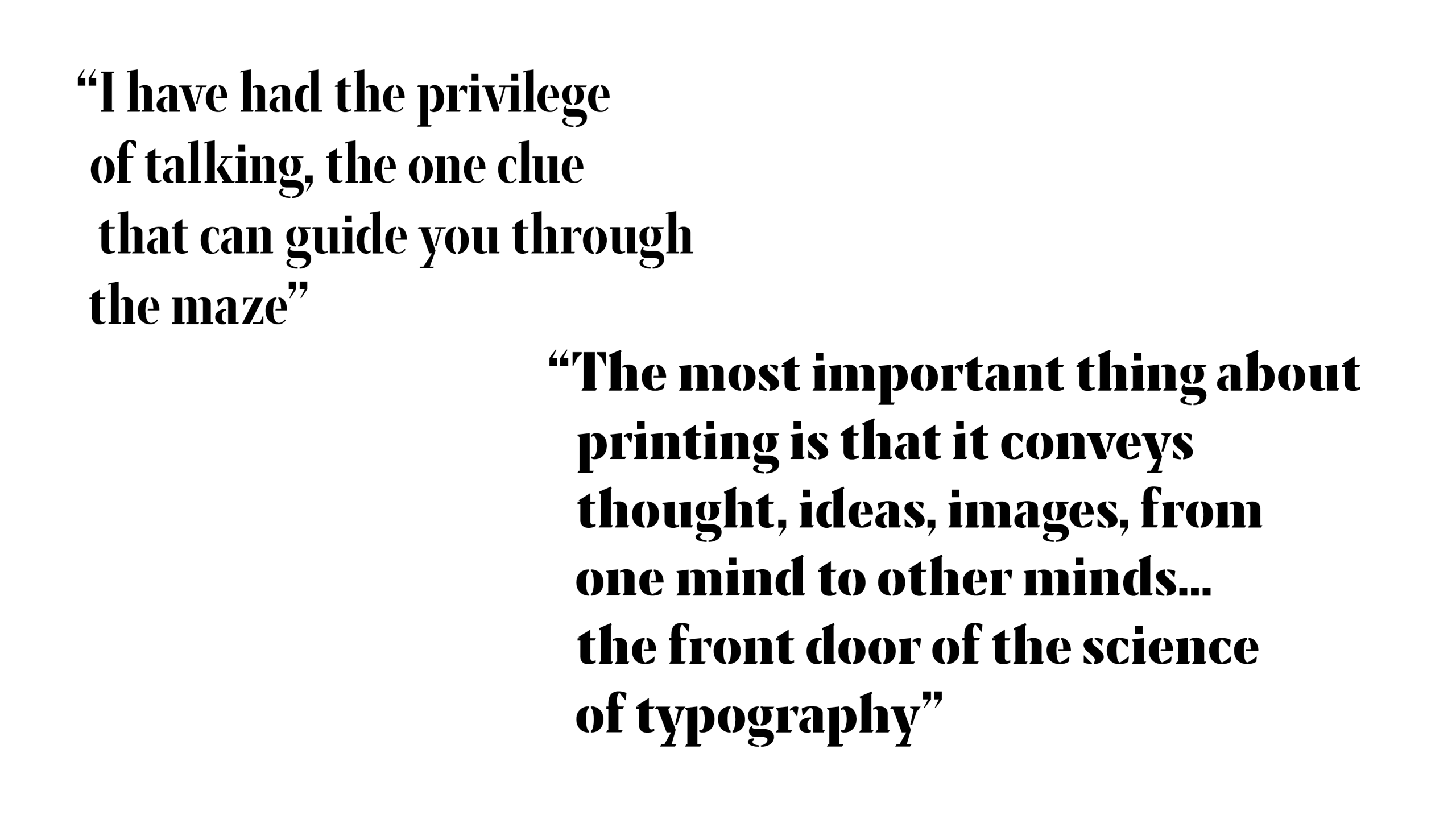
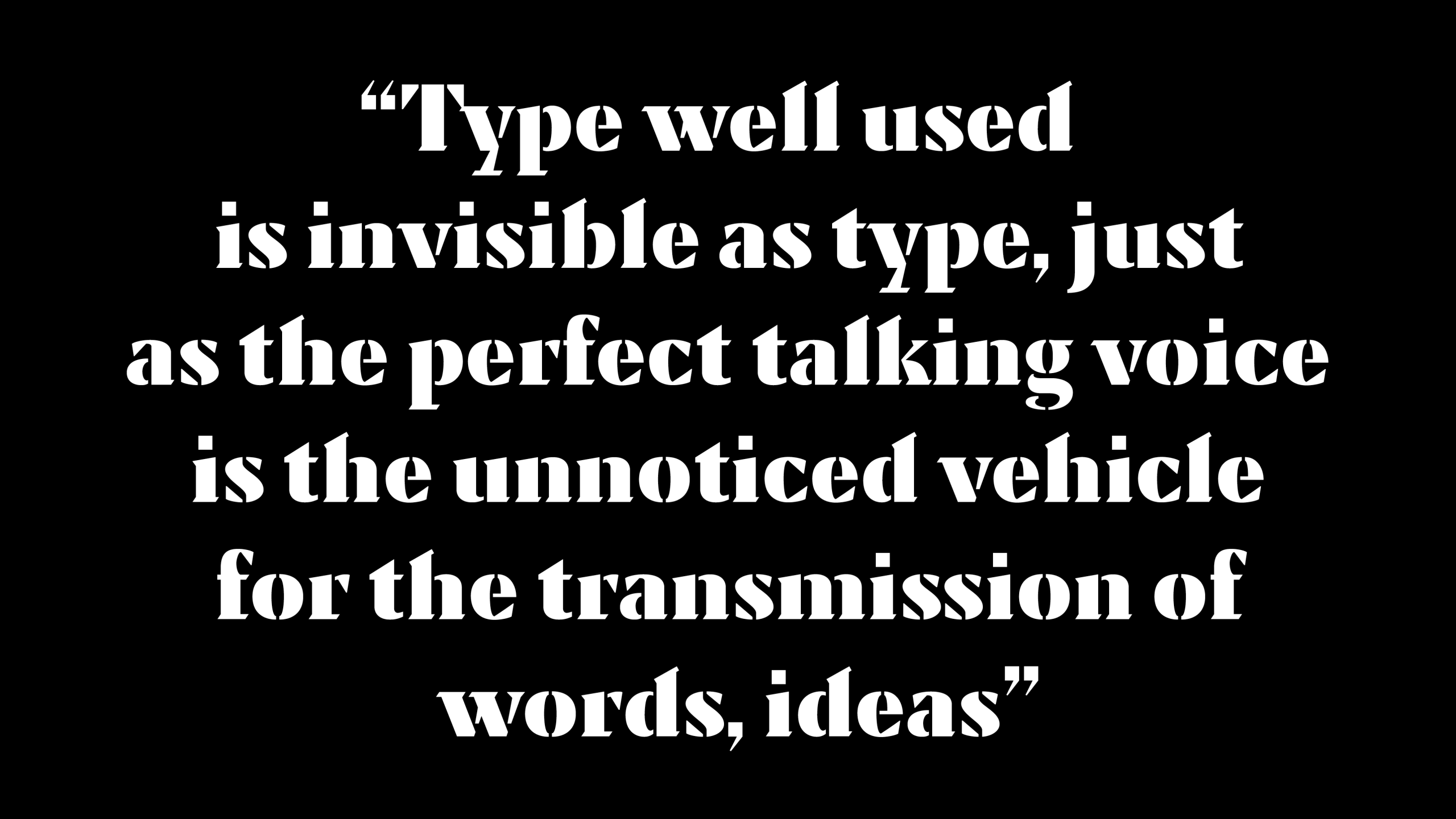
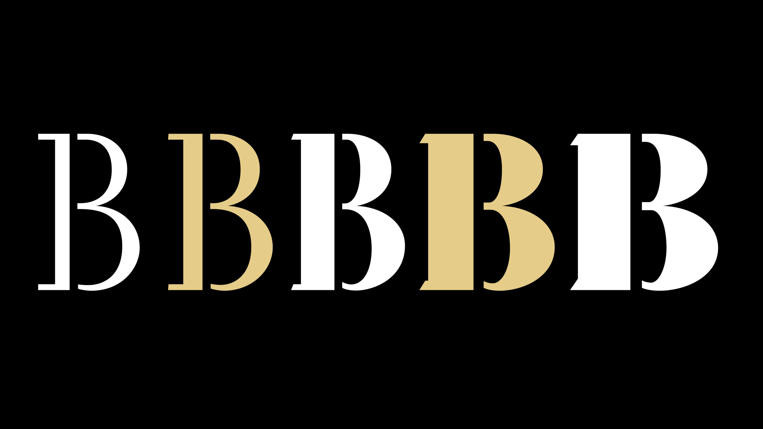
Brise carries the movement of air. In French and German, it means “breeze” — a drift slipping between buildings, filtering through spaces. In architecture, brise-soleil structures break sunlight into patterns of shadow and clarity. The same principle shapes stencil type: deliberate breaks hold the form together, allowing it to breathe.
Inspiration: Architecture and Rhythm
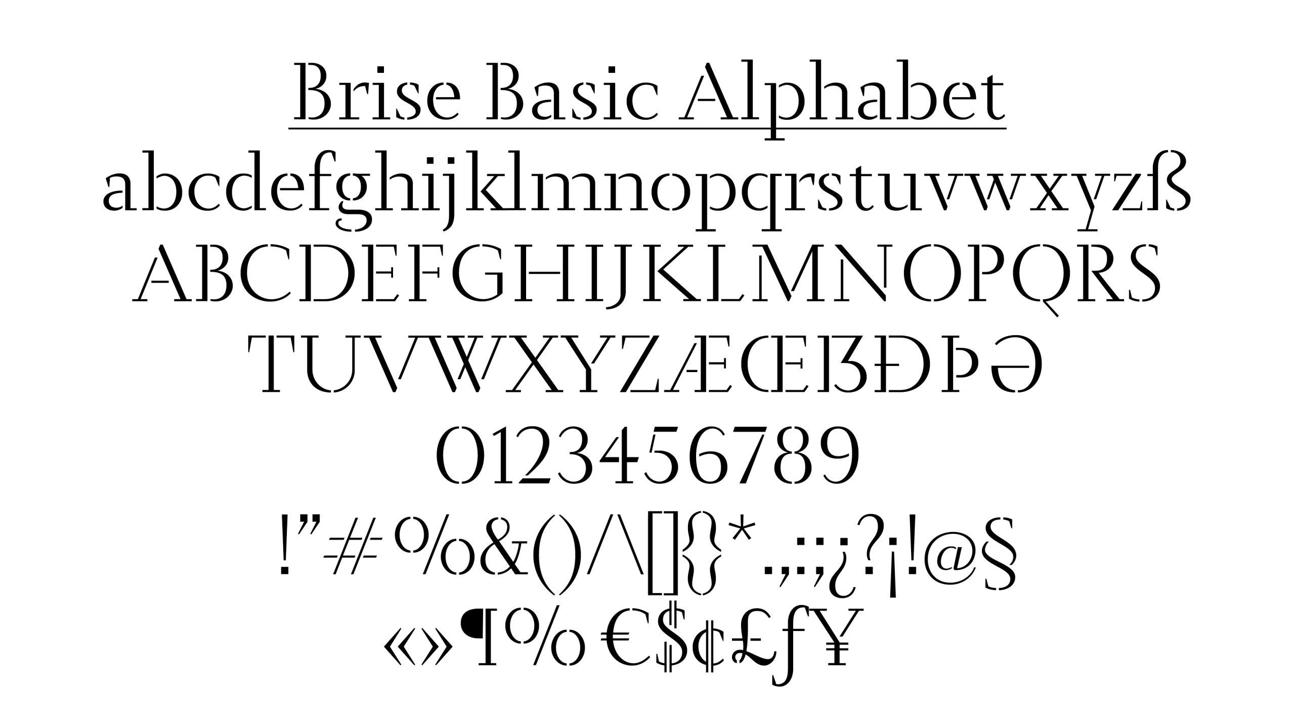
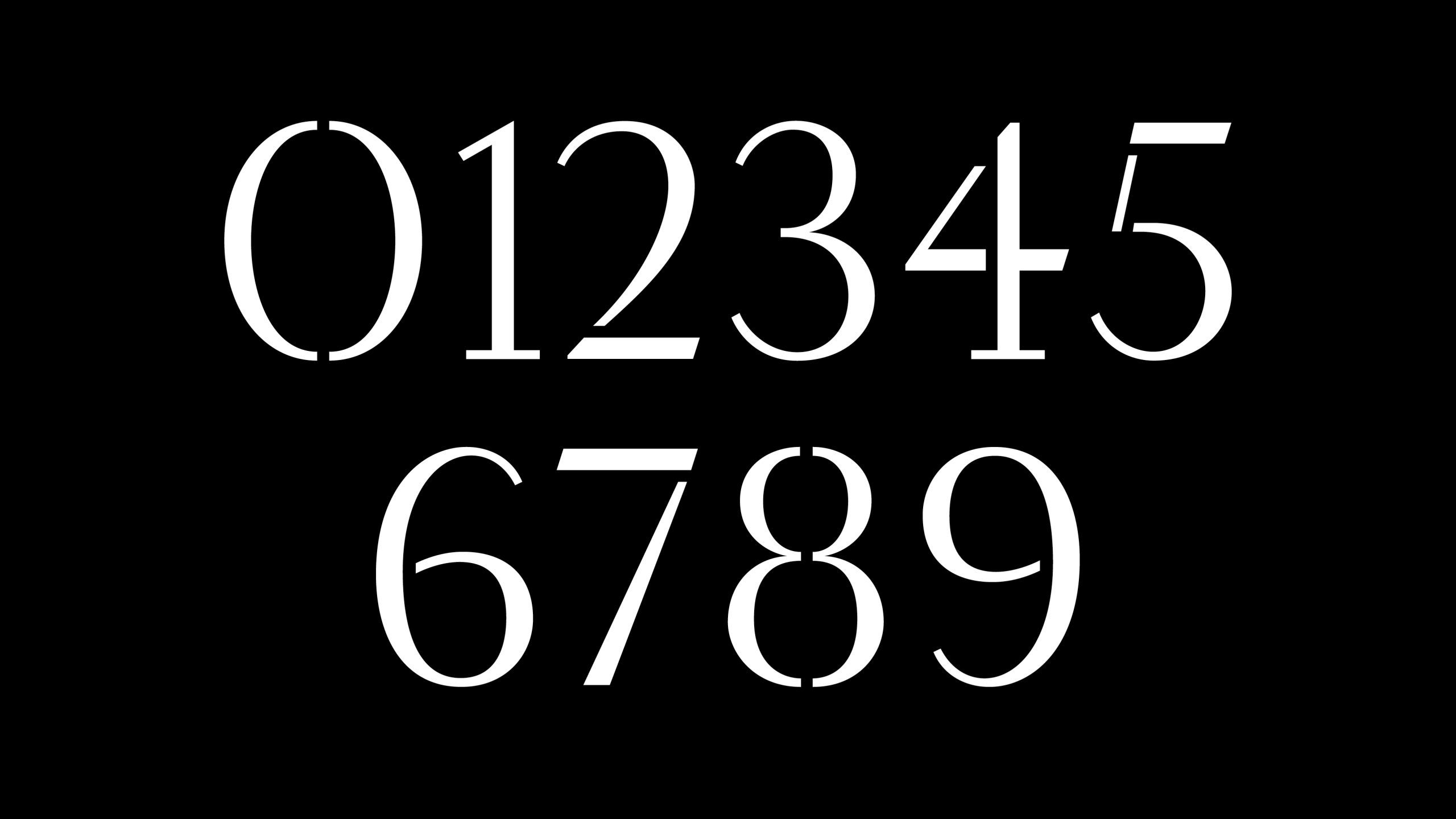
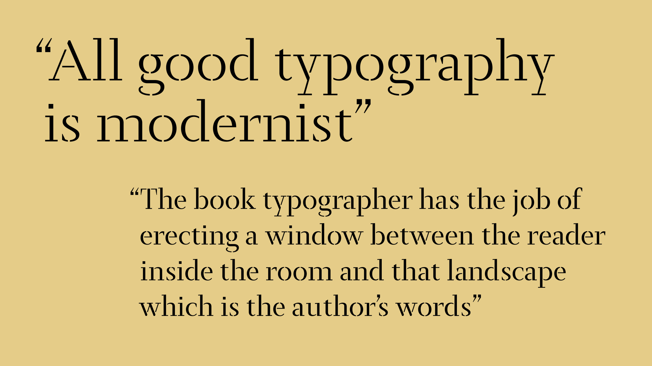
The guiding principle of BRISE comes from the architectural structure of the brise-soleil (sun-breaker), which aims to fragment sunlight into patterns of shadow and clarity. This same principle shapes the stencil design: deliberate breaks hold the form together, articulate it, and literally allow the character to “breathe”. In BRISE, the cuts are not flaws or voids, but precise intentions. They are pauses that give the structure its rhythm and establish a perfect balance between weight and air. This transforms it into a typeface that, while rooted in industrial function and signage, has become an expressive language—fragmented yet entirely cohesive.
Family Versatility
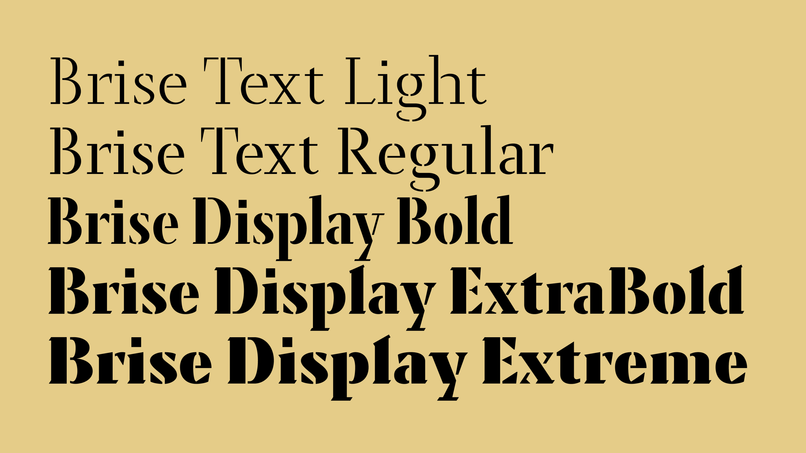
The BRISE family extends from subtle text uses to impactful display expressions:
- Text Styles: Ideal for body text requiring flow and legibility, while maintaining a distinctive touch.
- Display Styles (Bold to Extreme): More condensed and assertive, designed for headlines and branding, with a strong, airy presence.
- Variable Font: Explore without limits the extremes of weight (from Light to Extreme) and usage transitions (Text to Display). Furthermore, it introduces a Condensed Display Bold as an unexpected disruption in proportions, maximizing its creative potential.
BRISE is perfect for projects in branding, editorial design, packaging, or digital environments where a character with personality, texture, and a subtle dialogue between control and freedom is sought.
License Brise here: https://type-o-tones.com/fonts/brise
Type designer: Laura Meseguer
Specimen Concept and Design: Laura Meseguer & Serena Gramaglia
——
Prizes: Silver Laus Award 2026 in the category of Typeface Family