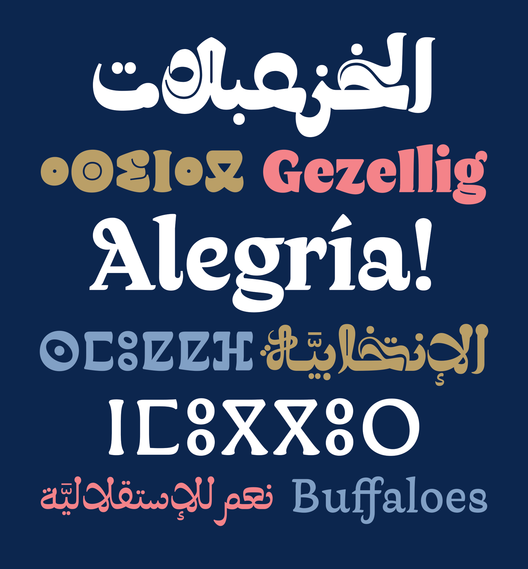
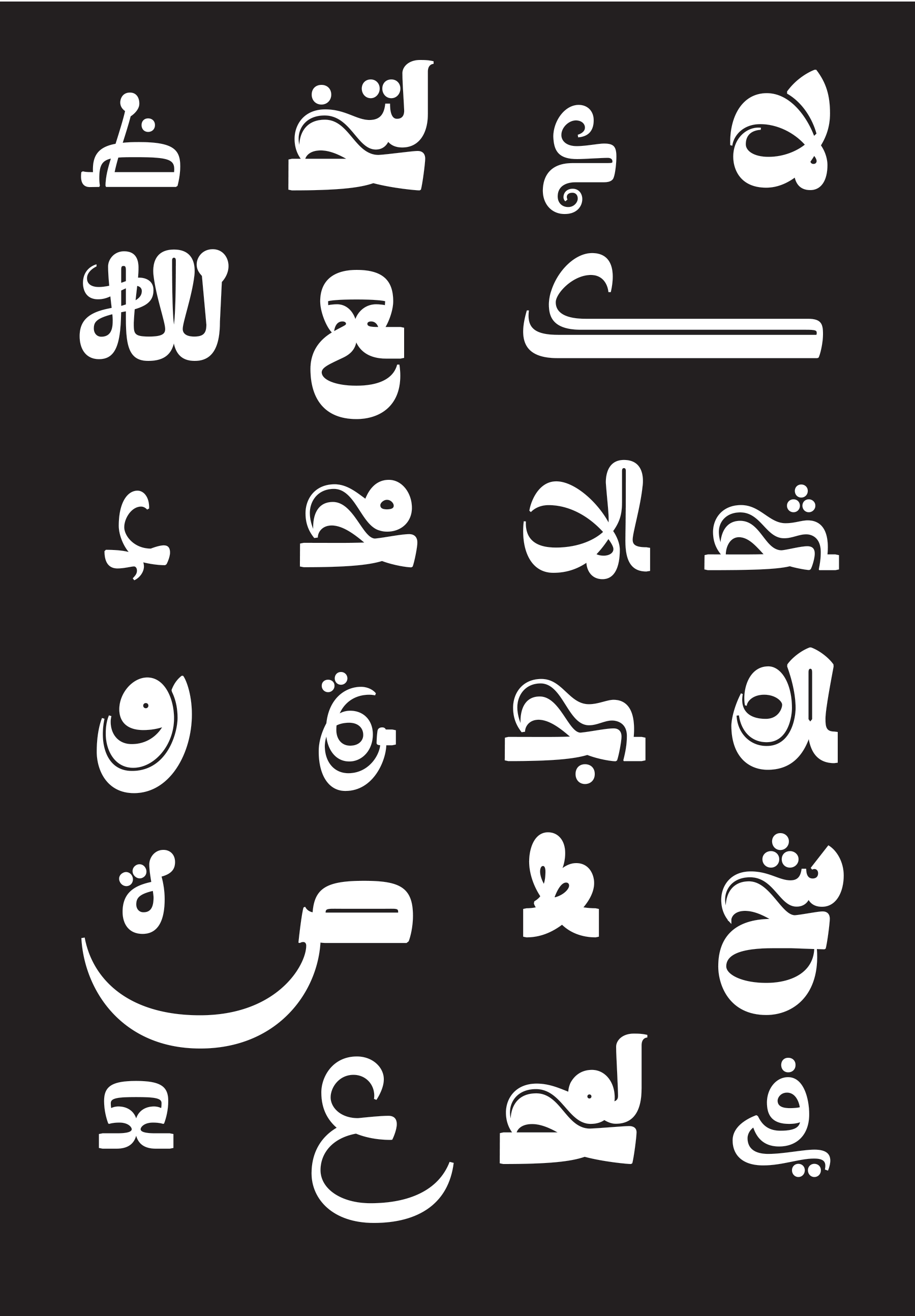
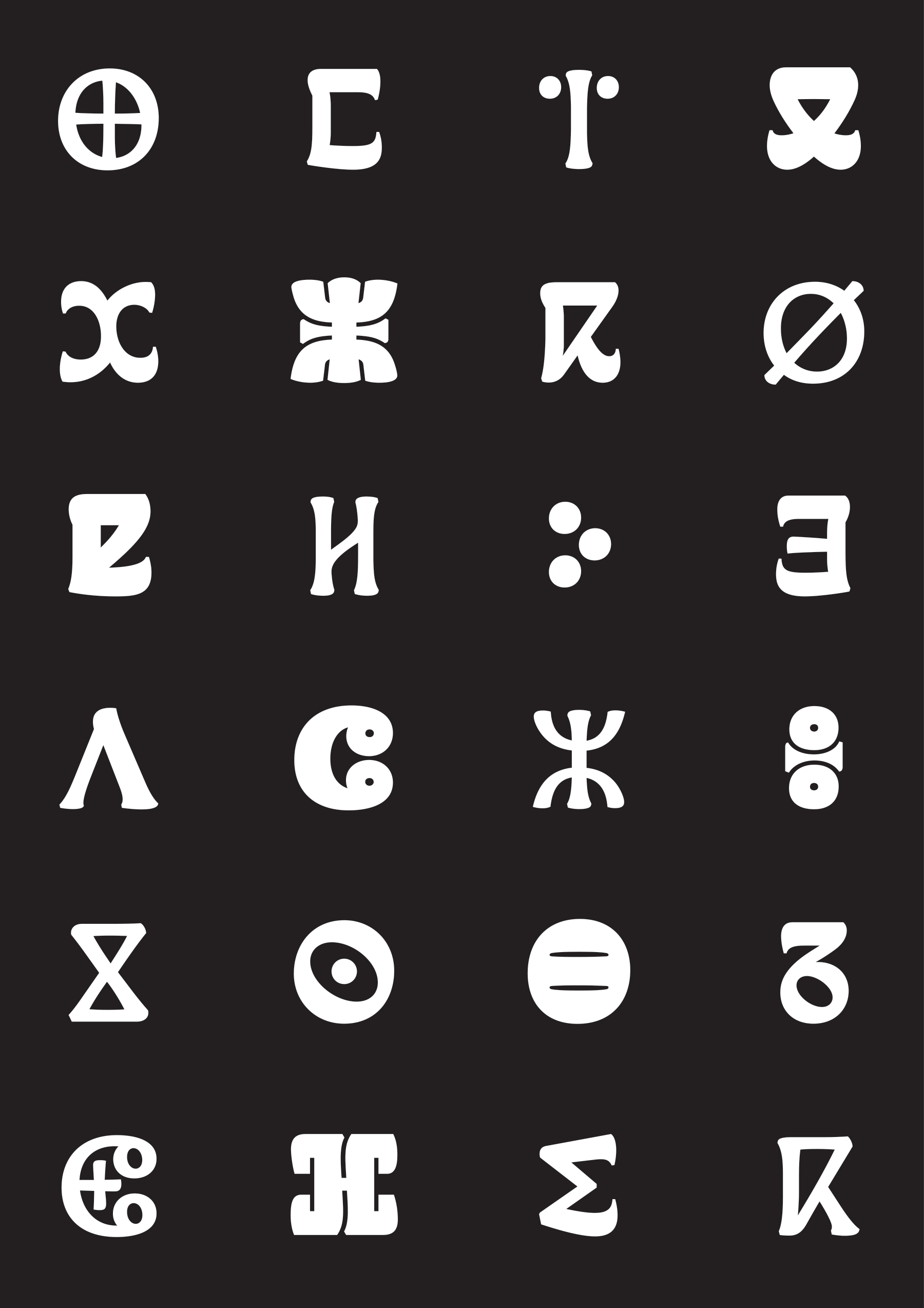
The Qandus multiscript font family is a modern typographic interpretation of the unique Maghribi calligraphic style as handwritten by the renowned Algerian Sufi calligrapher of the nineteenth century, al-Qandusi (d. 1861 CE). The typeface and its name, Qandus, are a homage to this calligrapher’s unique body of work and its graphic expressiveness. The strong graphic language of the typeface design emphasizes and explores the variety and visual potential of the Maghribi Kufi styles, from its simplest to its most expressive manifestations. The Qandus multiscript typeface family was developed within the framework of the Khatt Foundation’s type design research project: Typographic Matchmaking in the Maghrib (2015—2017), which curator is Huda Smitshuijzen AbiFarès. The designers are Laura Meseguer (Latin typeface), Kristyan Sarkis (Arabic typeface), and Juan Luis Blanco (Tifinagh typeface).
Later, Qandus Latin (Solid, Original, and Fluid) were developed much further, and now they are available for licensing at Type-Ø-Tones
A Typographic Maghribi Trialogue
This multiscript typeface system aims at exploring a conceptual relationship between 3 different writing systems: Arabic, Latin, and Tifinagh rather than a purely visual one. It started off as an homage to the work of the brilliant calligrapher Al-Qasim al-Qandusi (d. 1861)—known as the creator of an exquisite, albeit unusual calligraphic script that is seen throughout the Maghrib—and expanded into being a study of the unique combinations of Arabic constructions in the Maghribi calligraphic style, and how to disseminate this feature of the duality of forms into the other two scripts.
The Arabic as the starting point
Based on the work of the calligrapher Al-Qandusi, we extracted 3 different textures. His work is specifically unique because he used wider pens to write this style, normally almost scrictly written in a thin pen. From Regular to Dark, basic skeletons change as well as the contrast and drawing/writing ratio in the structure of the letterforms. They all involve mixing solid and fluid constructions, highly stylised letterforms, rotations in the pen, sudden changes of contrast, but in different degrees. The Regular is the most humble with variations that are not too drastic. The Medium is the most peculiar in terms of contrast, with excess in rotations and thick/thin ratio, and is more drawn than the Regular while the latter is more written. The Dark is the one that involves drawing the most with a highly stylised interpretation of the calligrapher’s work and of the Maghribi style in general.
The Design Concept of the Latin
The biggest challenge for the design of the Latin was to create three different weights that could ‘communicate’ with the Arabic and the Tifinagh in a contemporary design context, but paying tribute to our referent, the Arabic calligraphy manuscripts, matching their spirit, energy and grace, but also to the own script. The starting point was a deep analysis of the construction of this specific sample of Maghribi writing, and the definition of how to reproduce that in a Latin Alphabet:
• Exploration of the reversed horizontal stress based on rotation.
• Definition of how to fluid and how solid it should be.
• Marking the limits between calligraphy and drawing.
• Built as a semicursive, kind of an upright italic, with some reminiscents of the calligraphic ductus in the serifs.
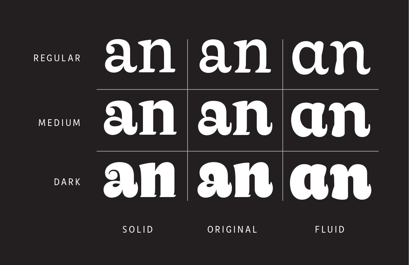
The expansion to Qandus Latin Solid, Original and Fluid
This ‘Original’ construction was the first to be designed, but while designing the three scripts simultaneously, the designers felt the need of designing several Stylics Sets for each weight, what eventually could become a problem for the user. The solution for the retail version was to split the fonts into three subfamilies:
• Original as a mix, in the pure style of Al-Qandusi
• Solid, Kufic structure (for the Arabic), carved (for the Tifinagh), and ‘constructed’ for the Latin.
• Fluid, more expressive (in Arabic), written on sand (for the Tifinagh), and full upright italic for the Latin.
Qandus emerged in 2015 within Typographic Matchmaking in the Maghreb, grew as a multiscript system in 2016 and earned internaational recognition. In 2021 Qandus Latin was refined and released at Type-Ø-Tones. Its development, with the Solid, Original and Fluid styles, strengthened coherence across Arabic, Tifinagh and Latin. The family was shown in The Beautiful People in 2020–21, 2021 and 2023, introducing it to a broader audience.
If you want to know more about the development of the project, I highly recommend you watch this movie “Typographic Matchmaking in the Maghrib” by Jan de Bruin.
Specimen Design
— Gerard Joan
Prizes:
—TDC2 Excellence in Type Design Award , 2017
—Silver Laus Award, 2020