
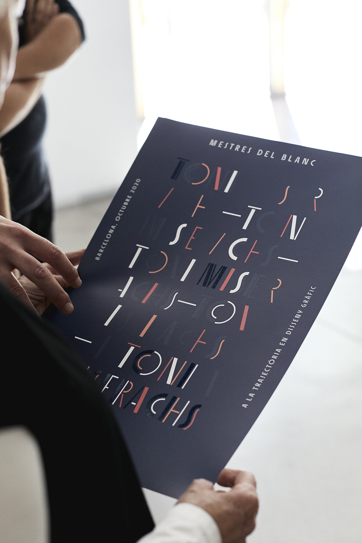
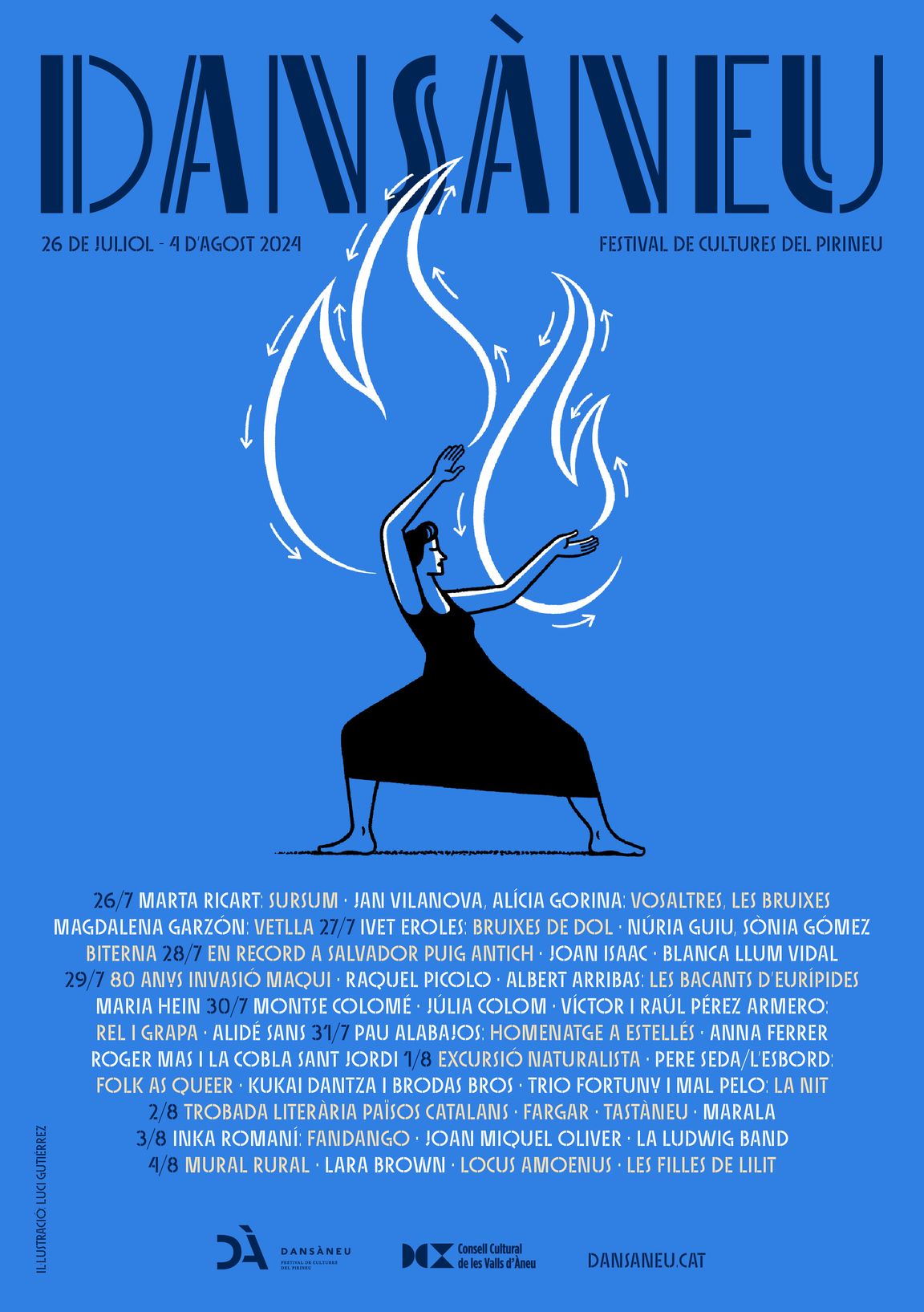
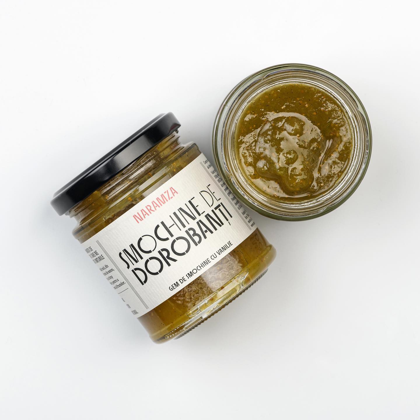
Sisters, a lively set of stencil display typefaces
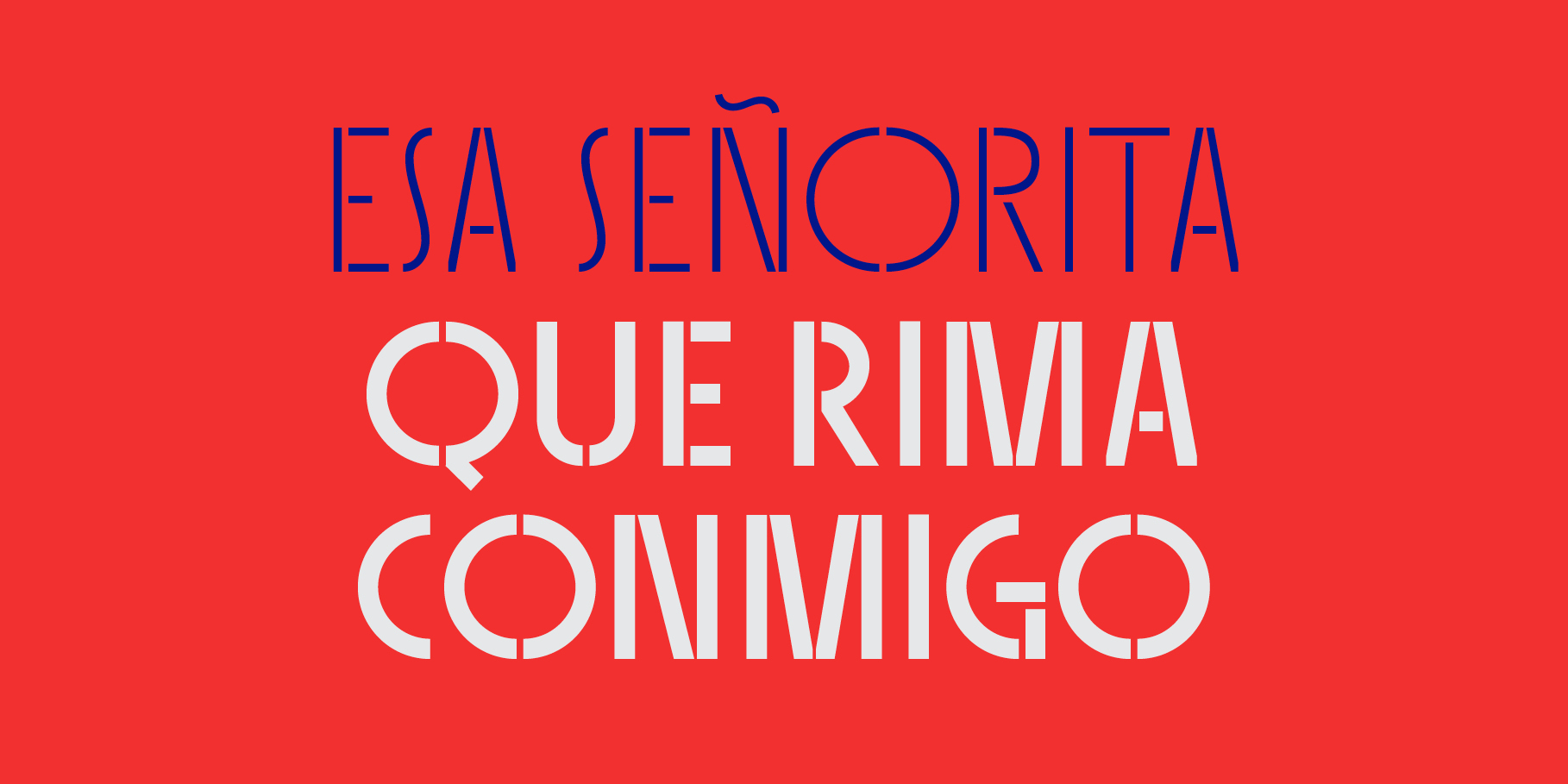
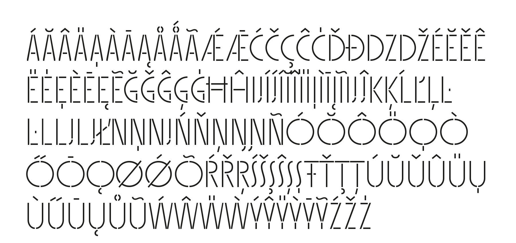
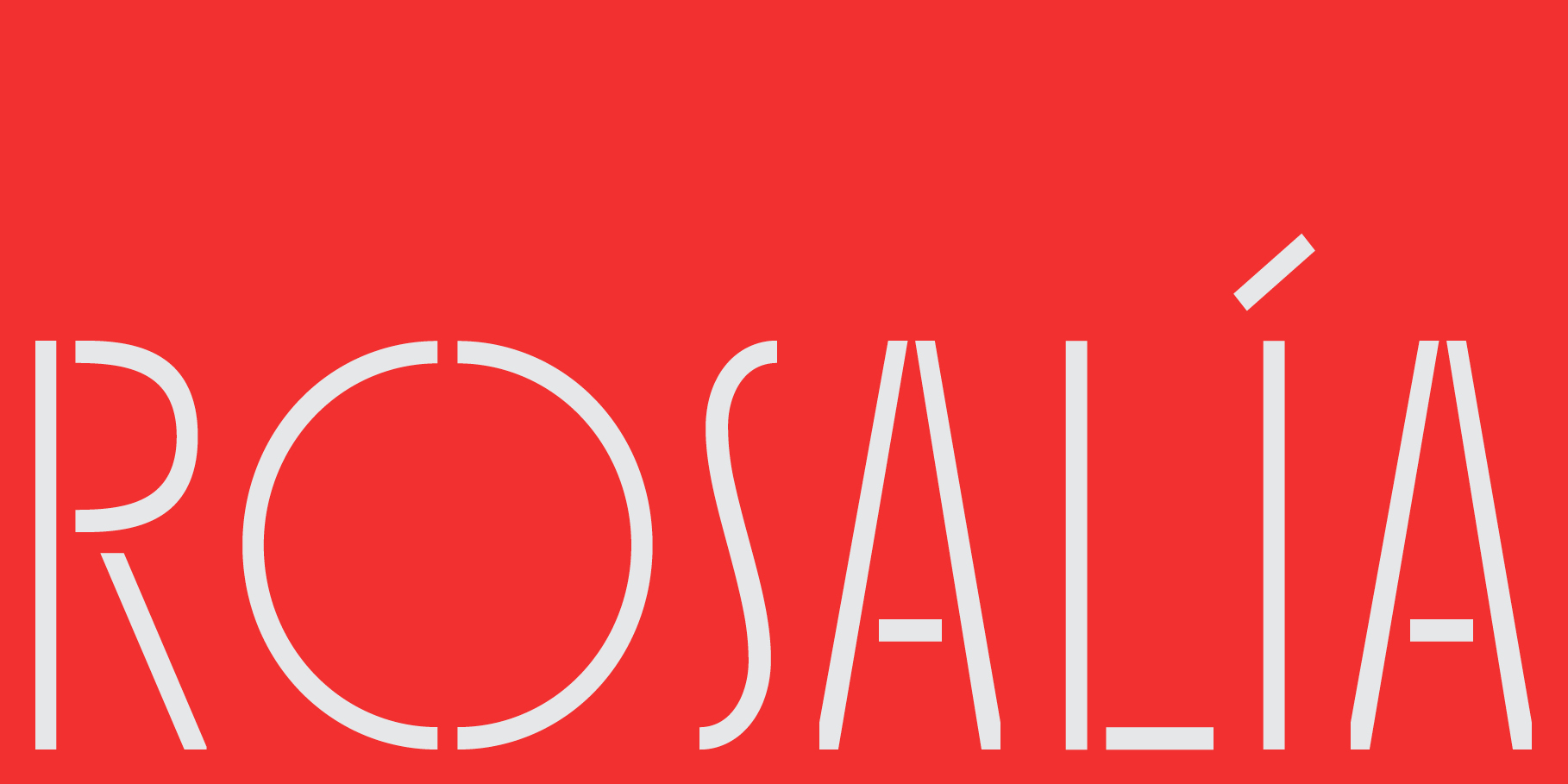
SISTERS is a lively set of stencil display typefaces designed by Laura Meseguer. The family features four fresh fonts that share foundational principles of construction yet complement each other—as sisters do—by celebrating their differences. Variations in contrast, weight, and design characteristics result in four distinct styles dubbed One through Four. This cool quartet contains no lowercase, asserting the family’s rightful place in the titling typography space. Sisters allows you to communicate in the most of the languages based on the Latin alphabet. The available encodings are: Basic Latin, Latin-1 Supplement, Latin-2 Central European; Latin Plus.
Font of the Month
Sisters was chosen by Stephen Heller as “Font of the Month” where he wrote: Stencil letters, as a genre, have both a timeless and timely quality. They straddle the gamut in their respective looks and timeframes, from industrial functionality to symbolic modernity to futurist stylism. The four-member family called “Sisters One”, “Two”, “Three” and “Four” elegantly designed by Laura Meseguer covers the entire aesthetic and chronological scope. (…) “Sisters” is influenced by Meseguer’s large collection of vintage art deco examples of type specimens, printed ephemera, street and shop signs, and placards, much of which she has shared in situ in her frequent social media posts. Knowing Meseguer’s roots contributes to an appreciation of her exacting contemporary alphabets. These “Sisters” are designed to get along well with each other and can be used individually or in mix-and-match combinations. The four “Sisters” are, however, an insular, self-contained unit that does not work in harmony with members of other families. So, it is advised to avoid pairing them even with first cousins, aunts, or uncles. Meseguer has created a closely knit system that works beautifully within the nuclear family structure.
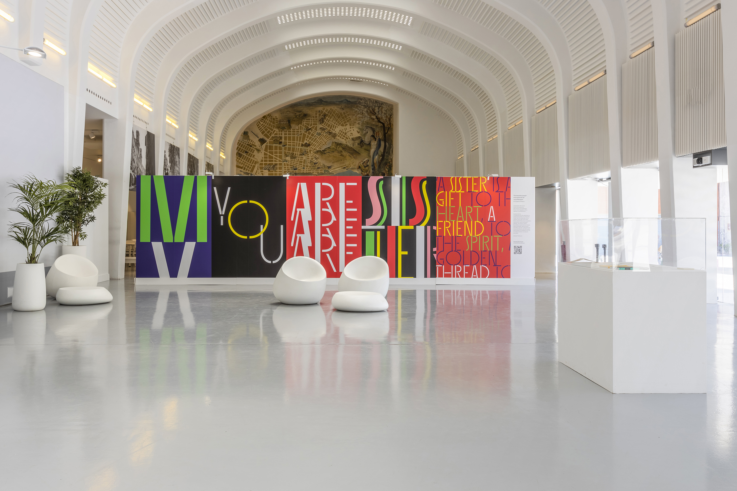
SISTERS has been widely used by designers all over, and also it had its own space at la Minipanera de Lleida and at The Beautiful People exhibition, where the Sisters Wall, a piece of 8×2 metres consisted of an explosion of words that claim women’s relevance not only in design but in society.
If you want to see SISTERS in use, please visit this page Sisters in use
Type designer: Laura Meseguer
Sisters name: Eider Corral
Specimen Graphics: Gerard Joan
Animation: Anaïs Polo
Text: Tamye Riggs